

Al Khail Square Destination Branding.
Al Khail Square
Abu Dhabi.
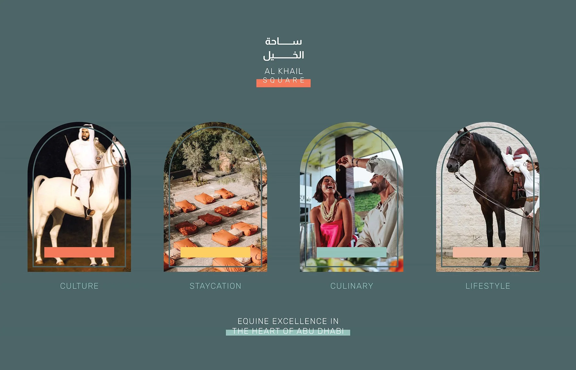
Reimagining what today's luxury equestrian lifestyle looks like.
Creative Dialog developed the visual identity for the newly formed Al Khail Square — Abu Dhabi's premier equestrian-led lifestyle destination.
Building on the firm's foundational work with the Abu Dhabi Equestrian Club, the team designed a playful, future-forward identity rooted in the destination's architectural arches and underscored by nostalgia, culture and storytelling.
Expertise: Brand Strategy, Naming & Positioning + Creative
Sectors: Mixed-Use, Retail
Location: Abu Dhabi, United Arab Emirates
Objective
Working on another direct engagement under the auspices of the President of the UAE, H.H. Sheikh Mohamed bin Zayed Al Nahyan, and continuing the firm's work with the Abu Dhabi Equestrian Club, Creative Dialog was tasked with developing the visual identity for the newly formed Al Khail Square.
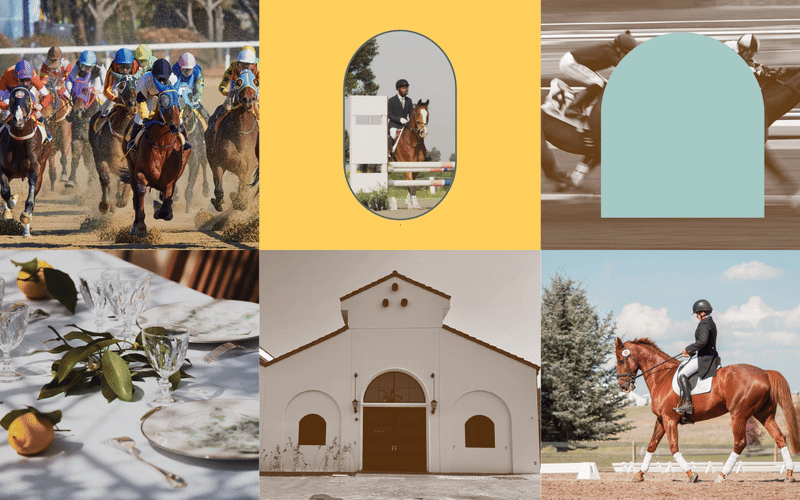
Al Khail Square builds on the legacy of the Abu Dhabi Equestrian Club, which has evolved from a racing-based equine sanctuary into a premier venue for equestrian excellence and exclusive events — where hospitality, horse ownership, stabling and equine lifestyle come together in one destination. The completely re-imagined precinct incorporates bespoke F&B offerings, the new invitation-only Jockey Club, wellness facilities, and luxury retail and resort-focused hospitality including glamping — positioning the destination as one of the finest equine-led venues in the world.
Our Approach
Creative Dialog approached the brief as both an identity-building exercise and an audience-broadening study — recognising that the destination's commercial ambition extended well beyond the traditional equine and horse-racing fan base. The goal was a brand identity that signalled distinction within the equestrian category while remaining genuinely accessible to a wider audience.
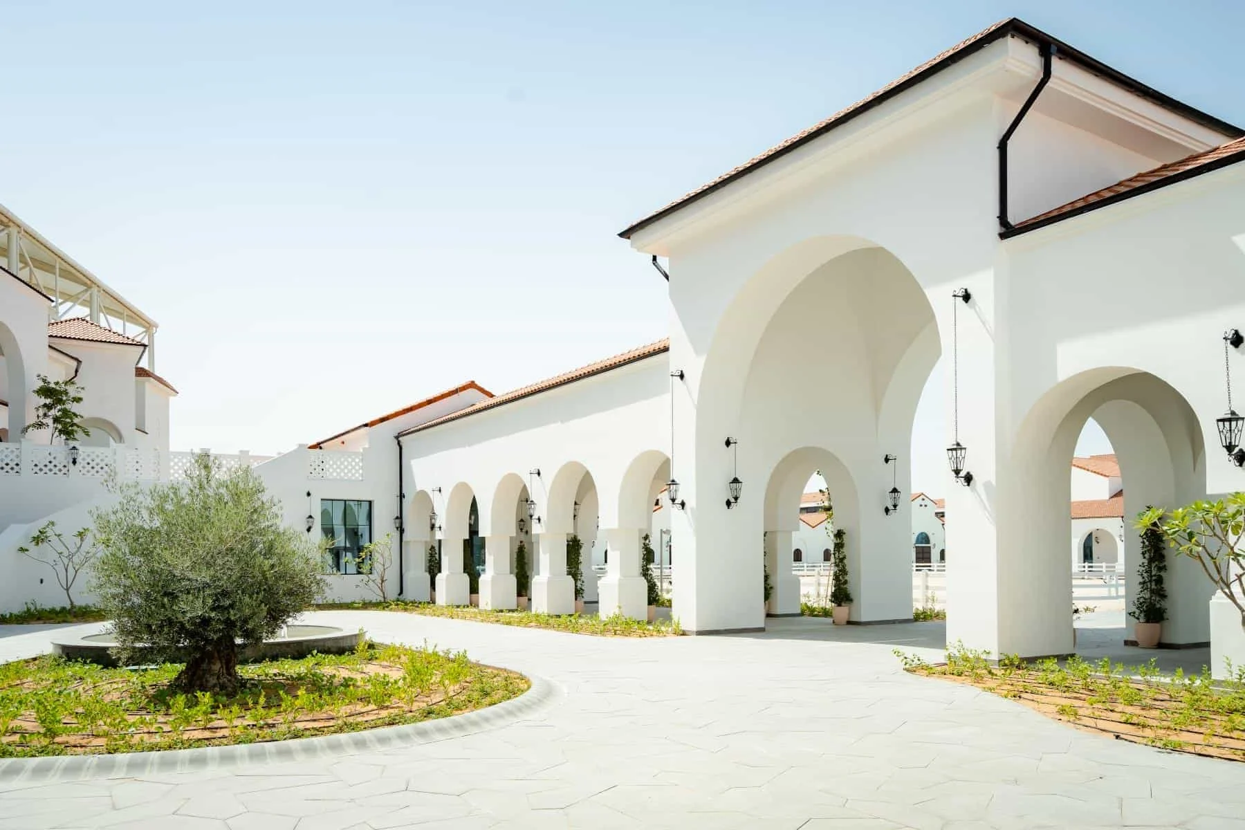
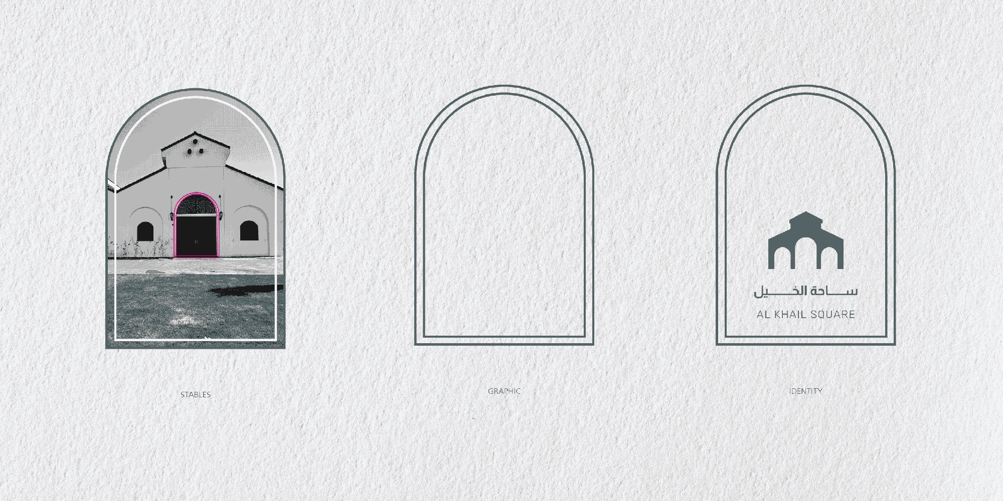
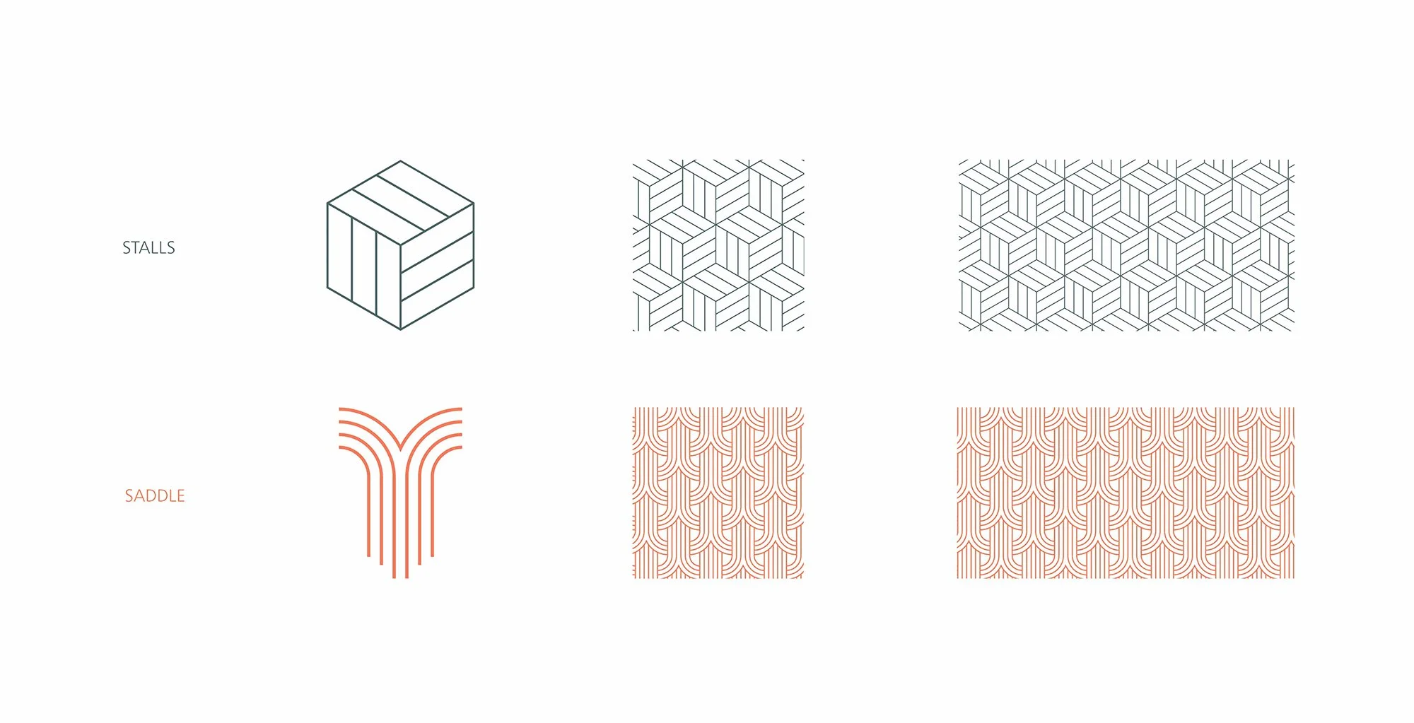
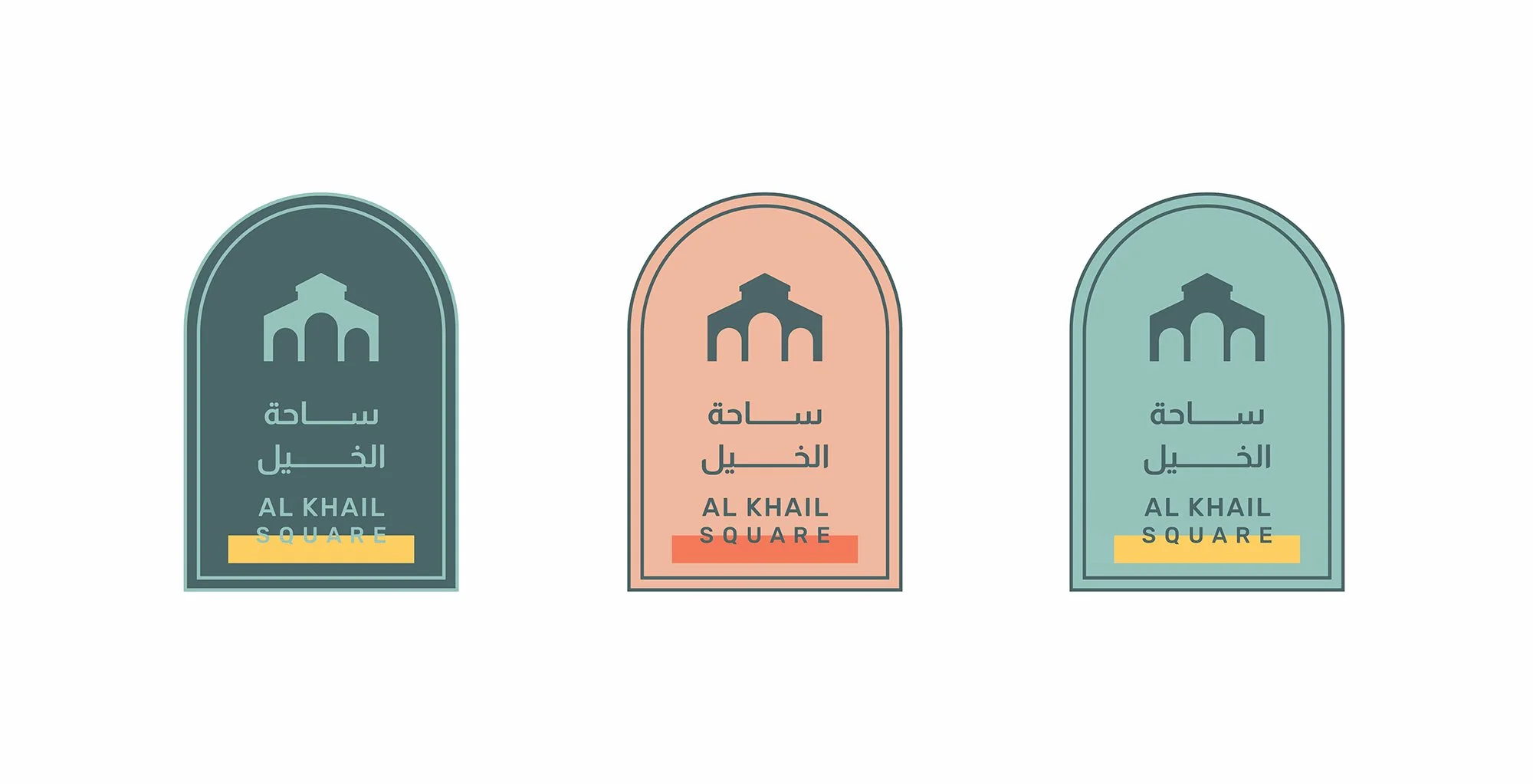
_We drew design inspiration directly from the destination's architectural vernacular, where the strong use of building arches can be seen across the site.
_We translated the arches into the foundation of the main identity and the primary graphic device, building a language that permeates the structure of the brand across multiple applications and frames content in a variety of ways.
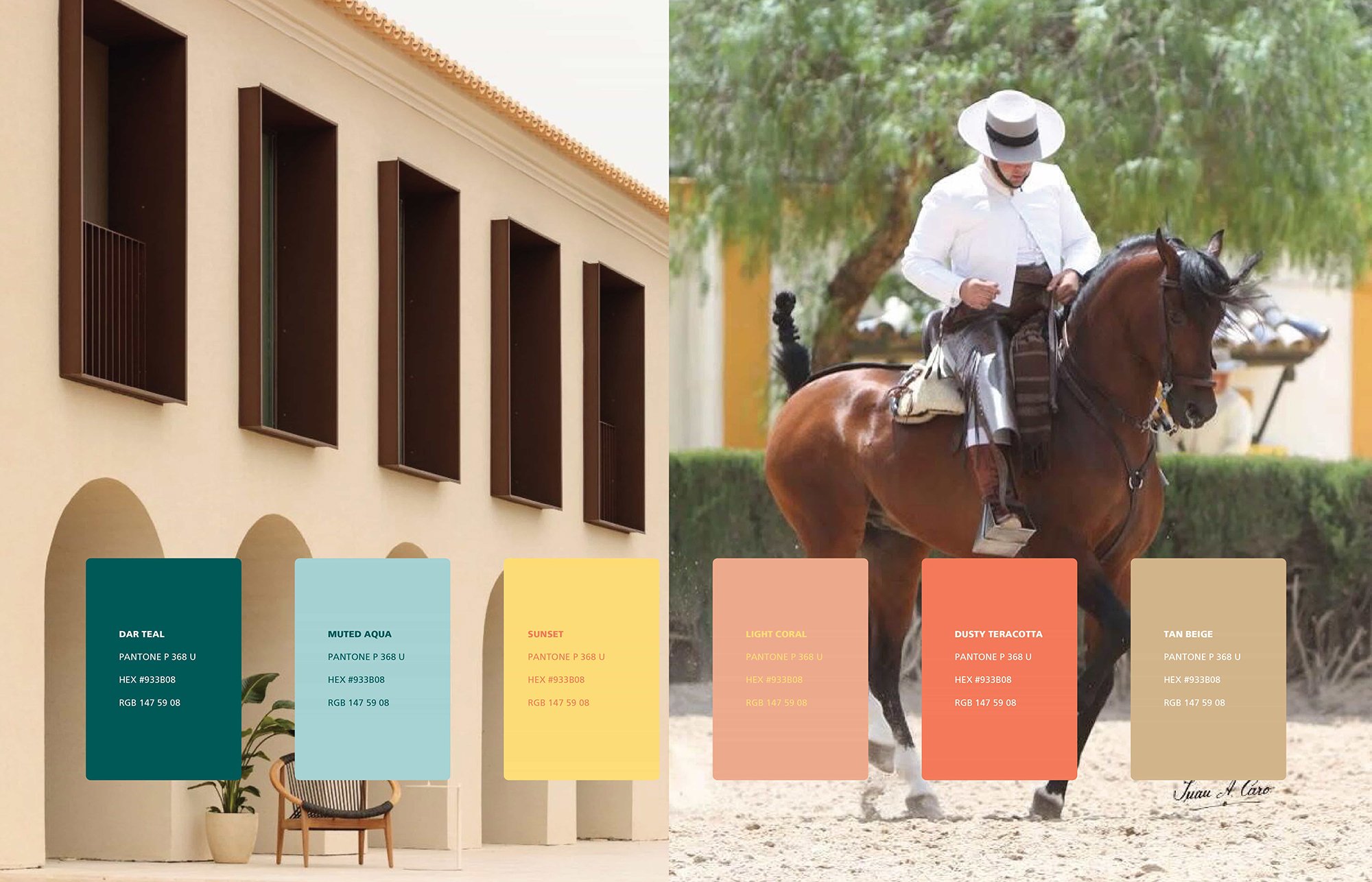
_We deliberately broke from the expected palette for an equine destination in the Middle East, adopting a colour palette that mixes pastel tones with the bold graphic language in a highly original and quirky way.
_We developed the identity to read as future-forward yet underscored by nostalgia, culture and storytelling — playful in tone, sophisticated in detail.
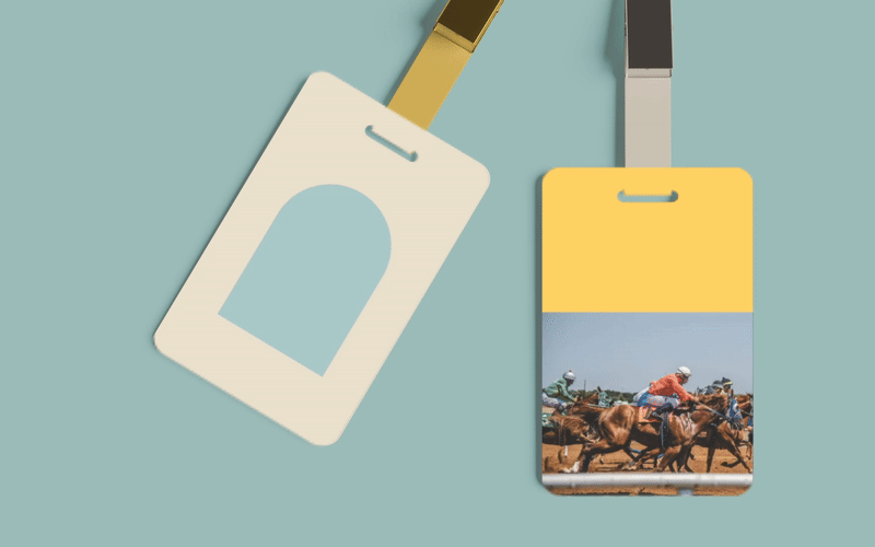
_We applied the identity across a complete brand application toolkit ready for environmental, digital, print and merchandise rollout across every visitor and stakeholder touchpoint.
The Outcome
The completed identity delivers a brand system that broadens Al Khail Square's appeal well beyond its traditional category while staying true to its cultural roots. Playful yet sophisticated, future-forward yet anchored in heritage — the identity establishes the destination's place as one of the world's finest equine-led venues, and signals quietly that there is nothing quite like it in the region.
What We Delivered
Brand Strategy & Positioning
Visual Identity System
Logo, Wordmark & Graphic Device (Architectural Arches)
Pastel-Led Colour Palette
Typography & Information Design
Brand Application Toolkit (Environmental, Digital, Print, Merchandise)
Brand Guidelines & Implementation Support


