

Al Khail Avenue Mall Wayfinding
Al Khail Avenue Mall.
A unique wayfinding system for the city's newest retail destination.
Creative Dialog rebuilt the visitor experience strategy for one of Dubai's most ambitious new retail destinations.
Taking on a project already in motion and under significant delay, the team replaced an underperforming wayfinding scheme with a modular, architecturally-led system that carries visitors confidently from arrival to exit.
Expertise: Wayfinding Strategy, Signage Design + Implementation
Sectors: Retail, Mixed-Use
Location: Dubai, United Arab Emirates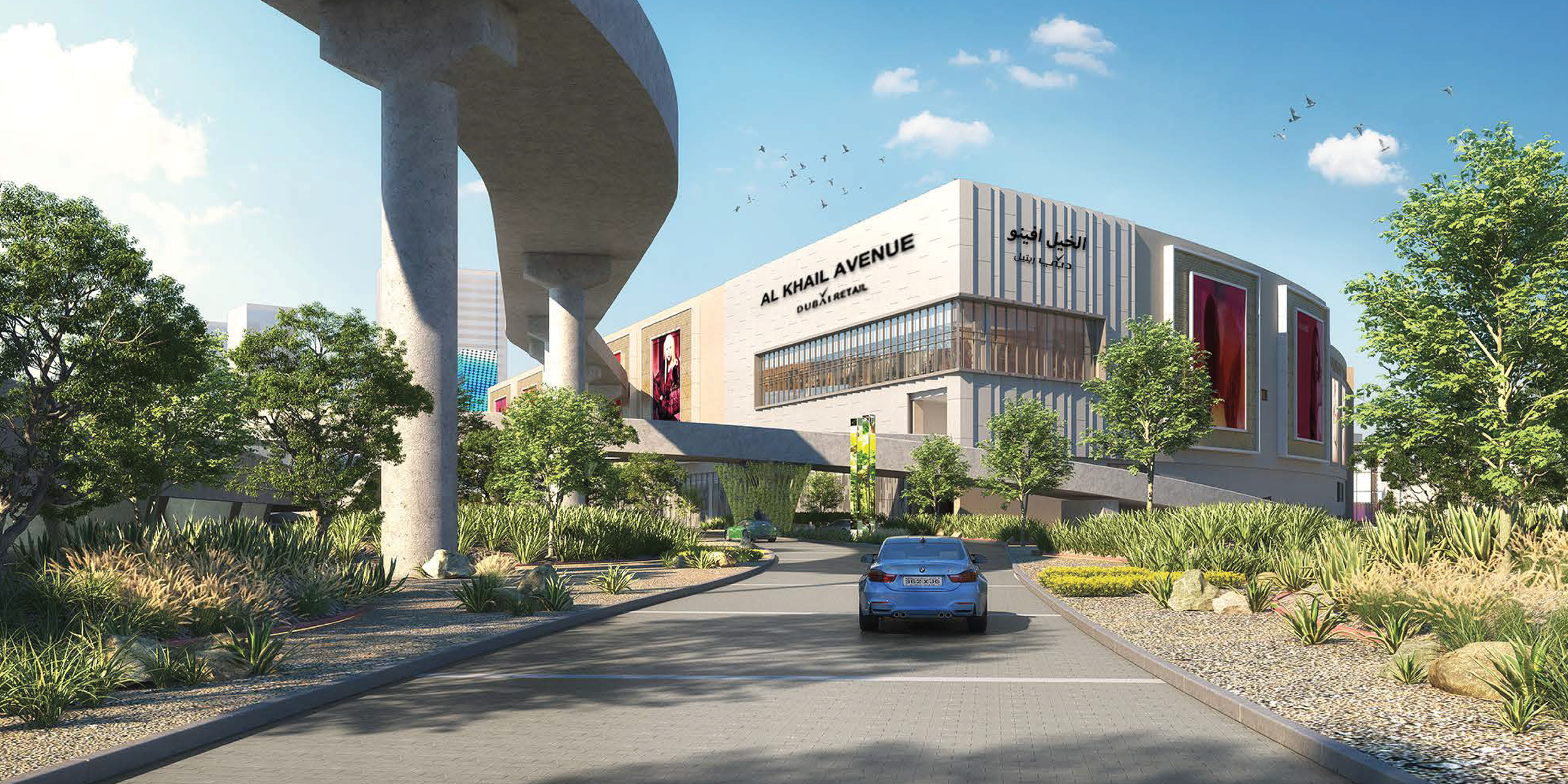
Objective
With a legacy wayfinding scheme already in place — and a project under serious delay and subsequent redesign — Creative Dialog was approached by Nakheel Retail to re-imagine the visitor experience strategy and, with it, the overarching wayfinding approach for this large-scale retail destination.
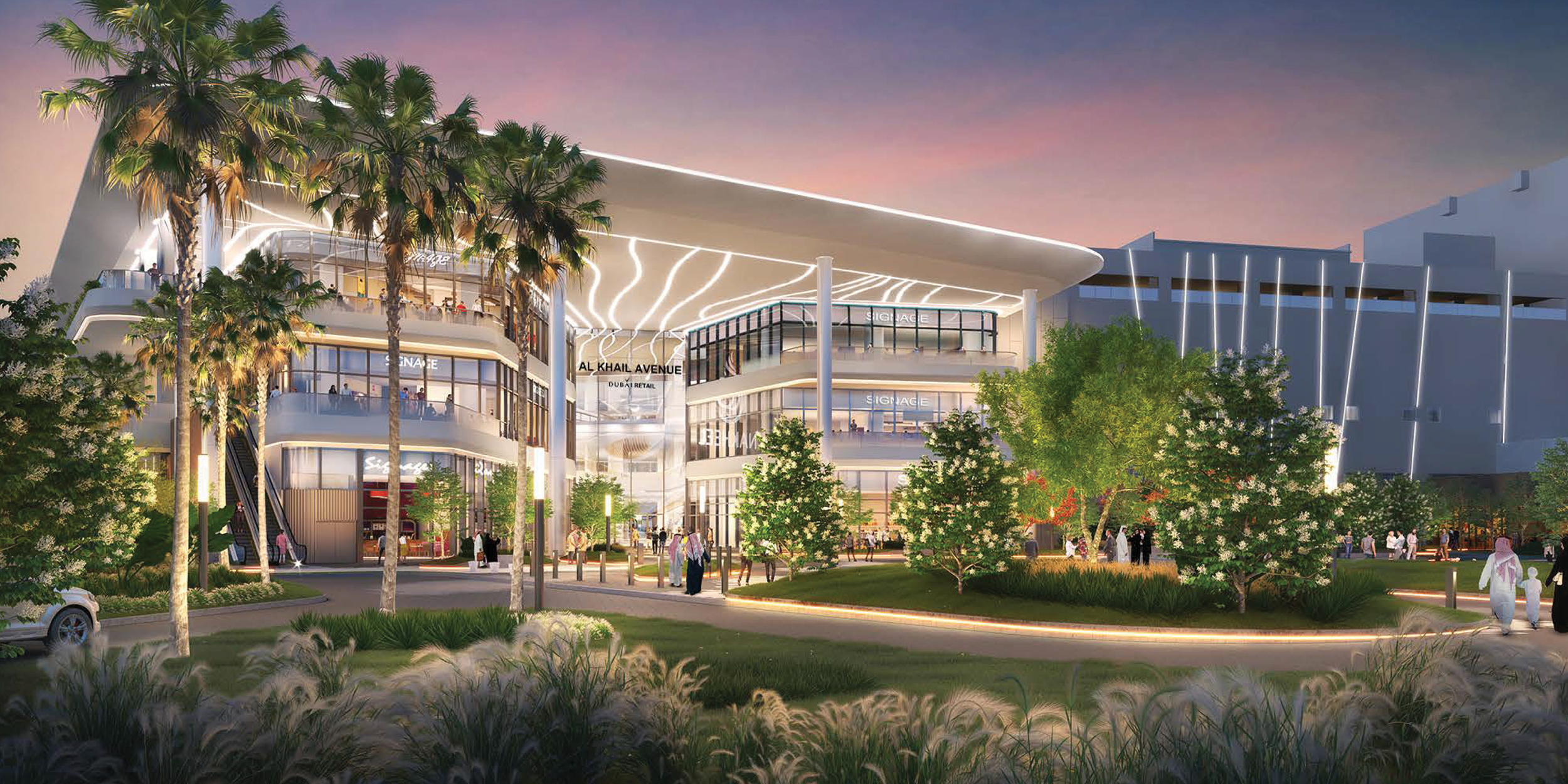
A detailed peer review confirmed what client observations had already suggested: the existing scheme had structural deficiencies, both in terms of strategic application and the style of the signage system itself. The brief was to design a wayfinding family that genuinely supported the architecture of the mall, scaled across every visitor touchpoint, and carried the confidence expected of a tier-1 Dubai retail destination.
Our Approach
Creative Dialog approached the engagement as a strategy-first reset rather than a signage refresh — recognising that the underperforming scheme reflected a deeper absence of a coherent visitor experience strategy. The goal was a wayfinding family that genuinely supported the architecture of the mall and performed equally well in operational and customer-facing zones.
_We undertook a site-wide navigation audit and a peer review of the legacy scheme, documenting structural deficiencies across strategic application and signage system design.
_We mapped visitor journeys from arrival through car park, mall floors and exit, establishing a clear visitor experience strategy that informed every wayfinding decision downstream.
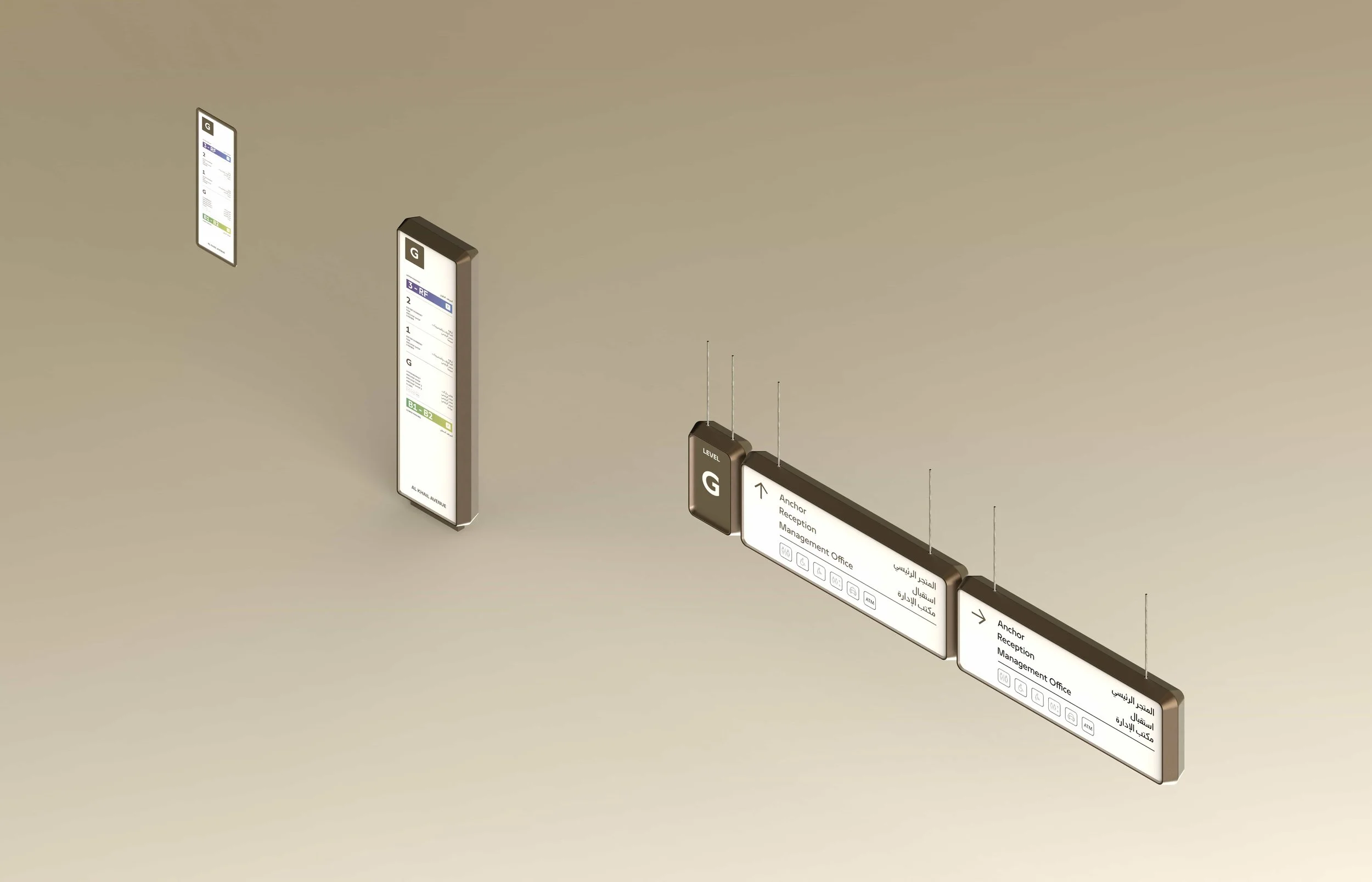
_We developed a bilingual (Arabic and English) information hierarchy and typography system, calibrated for legibility at distance and refinement at close range.
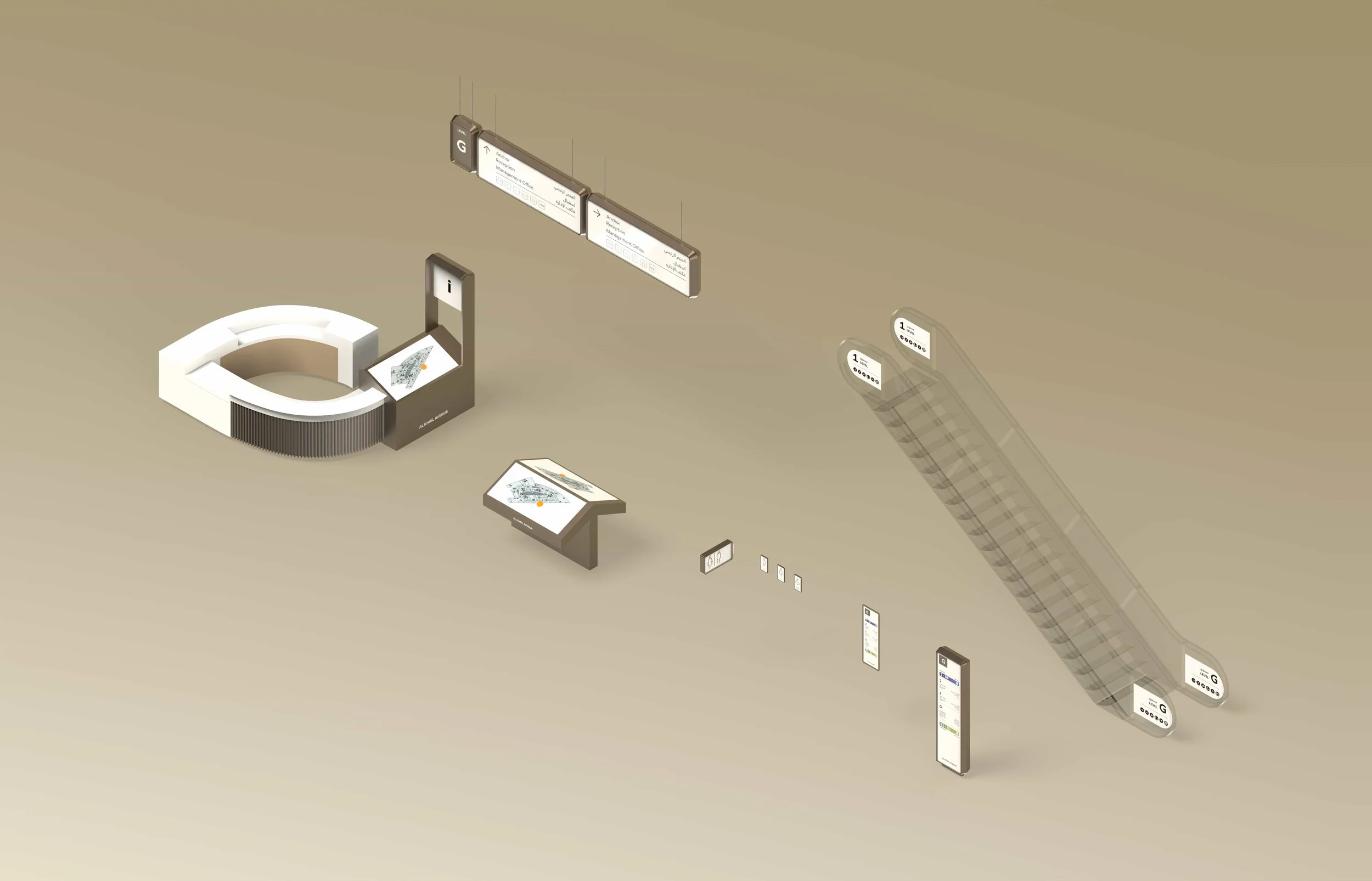
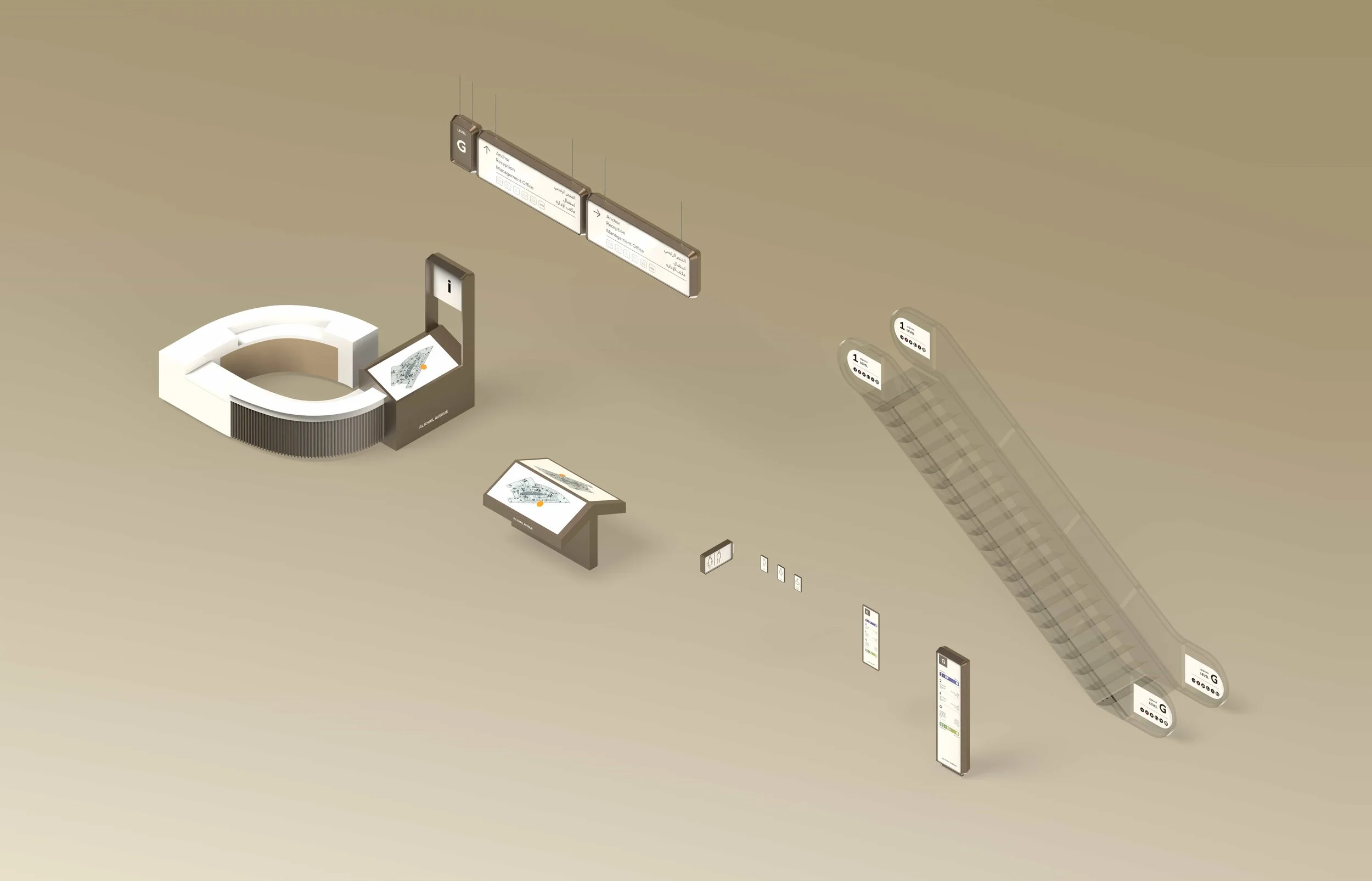
_We designed a modular sign family across primary, secondary and tertiary wayfinding tiers — scalable, architecturally responsive and consistent in tone across every visitor touchpoint.
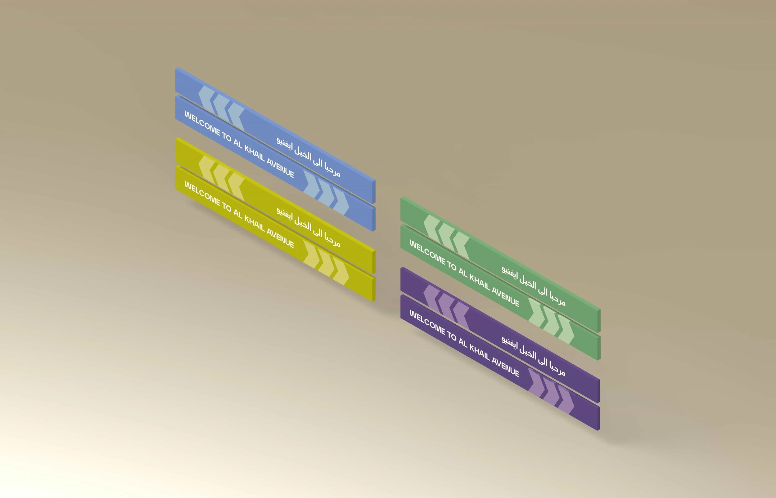
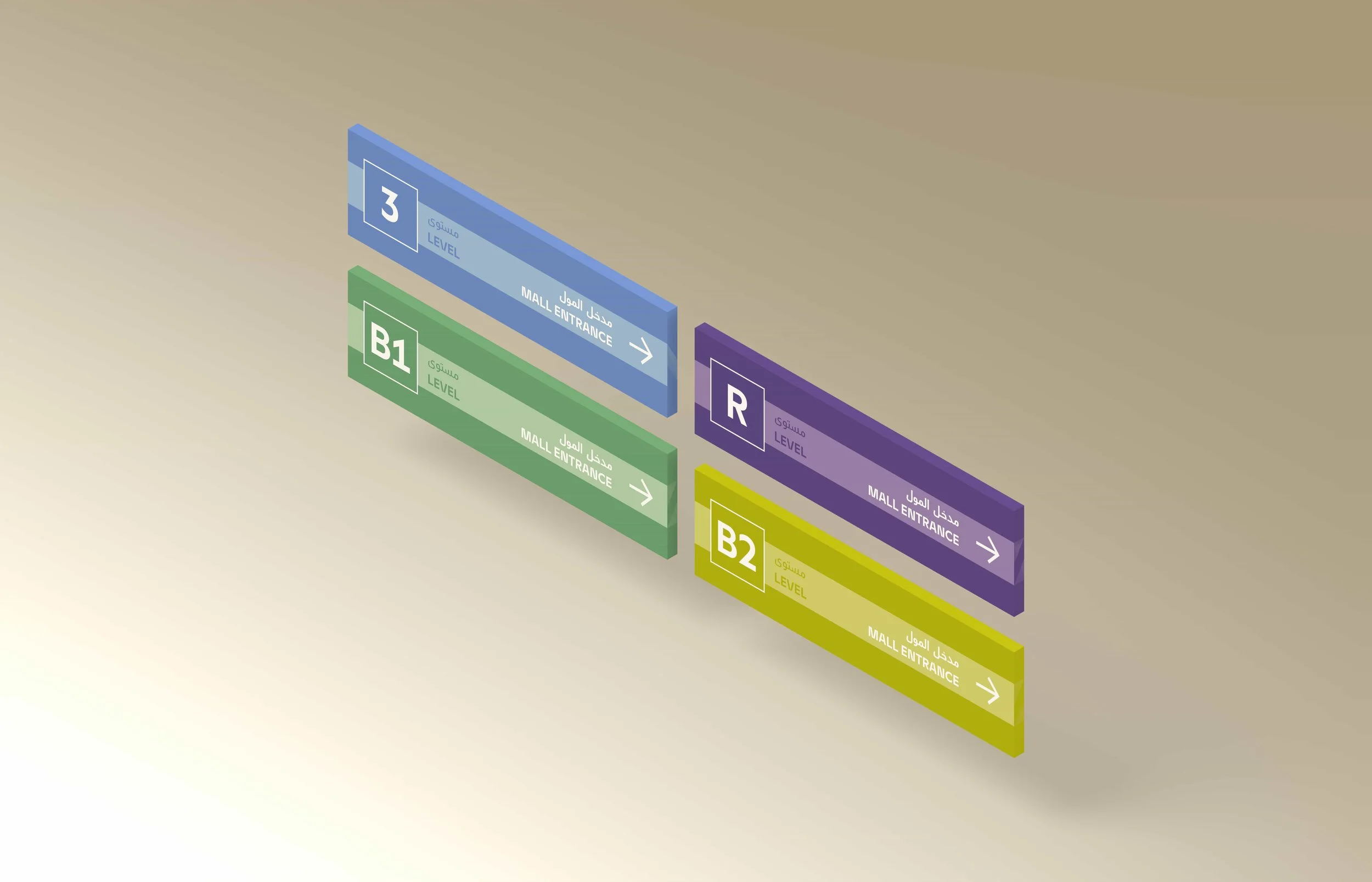
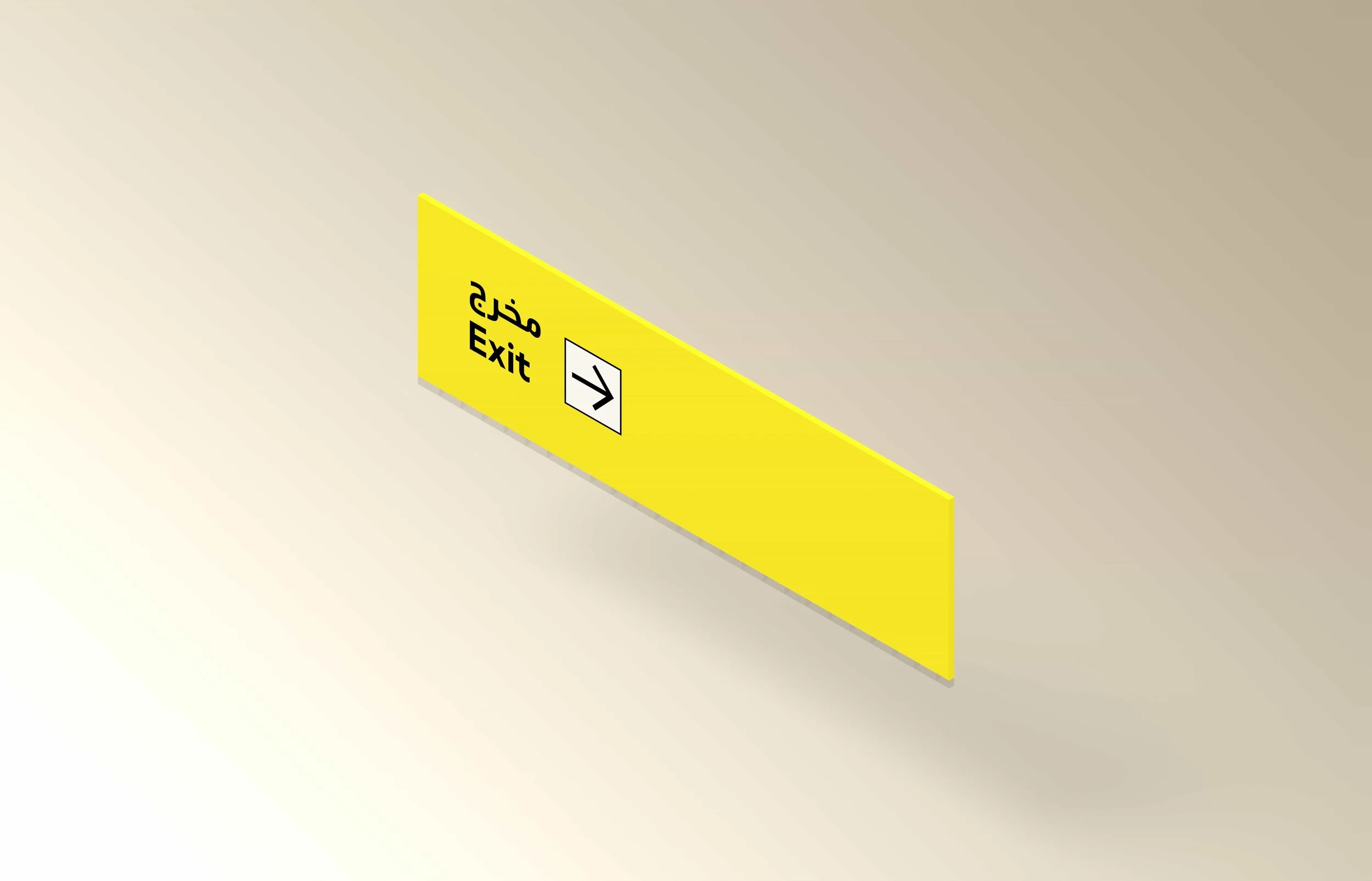
_We extended the system into car park and threshold sign typologies, including environmental graphics that maintain the design language without competing with the architecture.
_We delivered technical documentation, tender-ready drawings and on-site implementation support to ensure the design intent translated into the built outcome.
The Outcome
The completed system delivers a coherent, architecturally-respectful navigation experience across one of Nakheel's flagship retail assets — proving that wayfinding done well does not announce itself, it simply makes the destination work. The tapered signage family rewards close attention: fine details, deep anodised bronze, restrained typography, generous spacing. The material and colour palette is pared back and quietly confident: a deep anodised bronze outer frame paired with a white sign body, with brown-black text and pictograms to maximise legibility.
What We Delivered
Wayfinding Strategy & Visitor Journey Mapping
Site-Wide Navigation Audit
Bilingual Signage Family Design across Primary, Secondary and Tertiary tiers
Car Park Wayfinding & Environmental Graphics
Pictogram & Iconography System
Technical Documentation & Tender-Ready Drawings
On-Site Implementation Support