
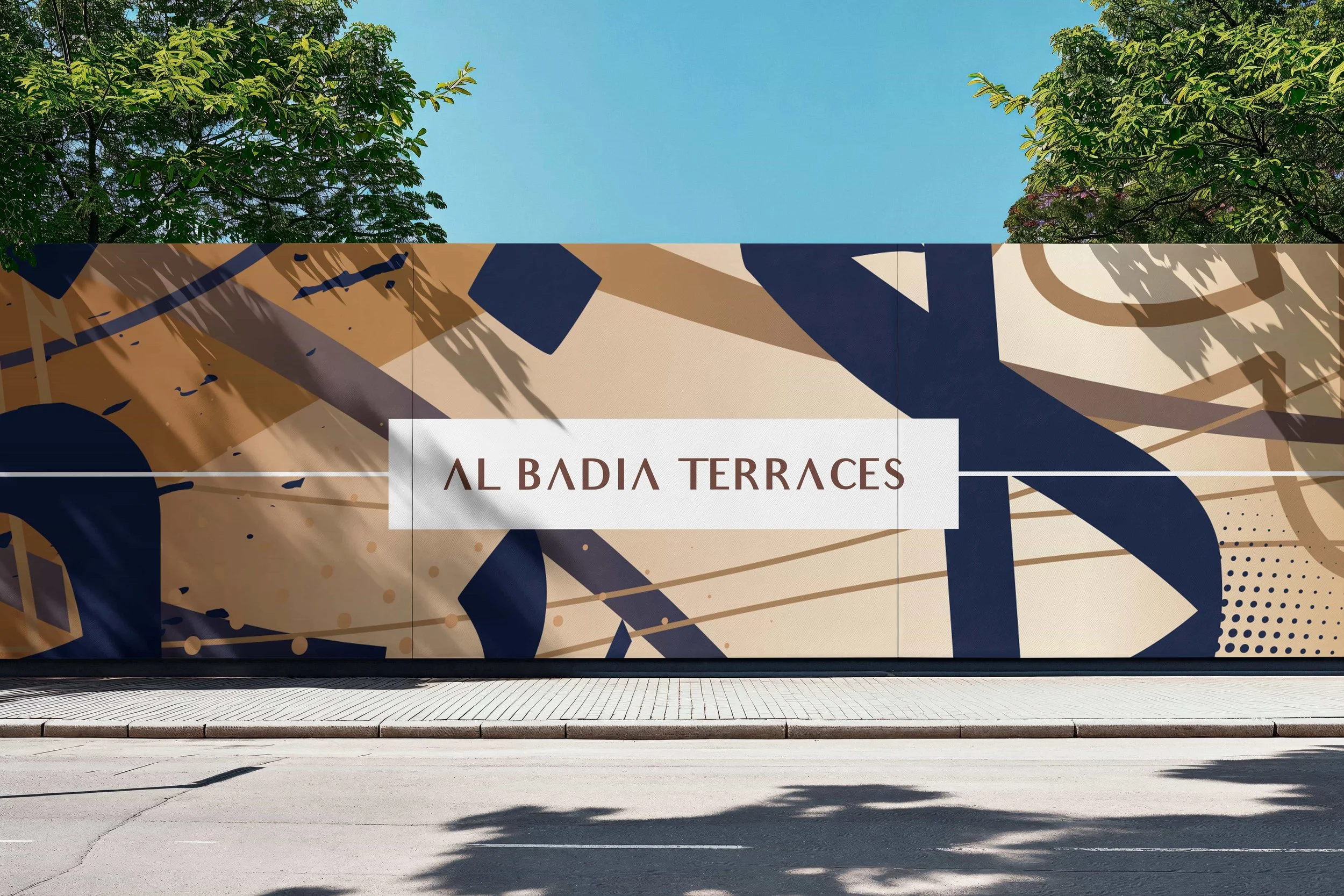
Al Badia Terraces Festival City Destination Branding.
Al Badia Terraces.
Rebranding Festival City's latest lifestyle-focused residential development.
Creative Dialog developed the brand identity for Al-Futtaim Group Real Estate's latest residential community at Dubai Festival City.
Anchored by the tagline 'closer to everything you love' and a two-track visual system that switches between formal and fun, the team paired Arabic-inspired calligraphic artworks with a modern, approachable typographic register to deliver an identity not often associated with real estate marketing.
Expertise: Brand Strategy, Naming & Positioning + Creative
Sectors: Residential, Mixed-Use
Location: Dubai Festival City, Dubai, United Arab Emirates
Objective
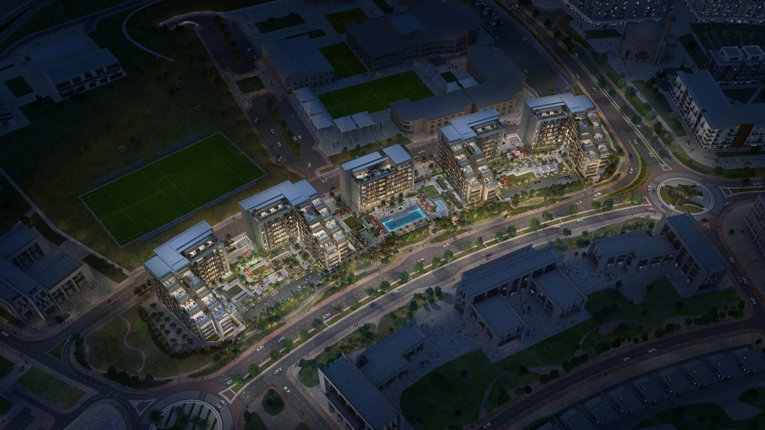
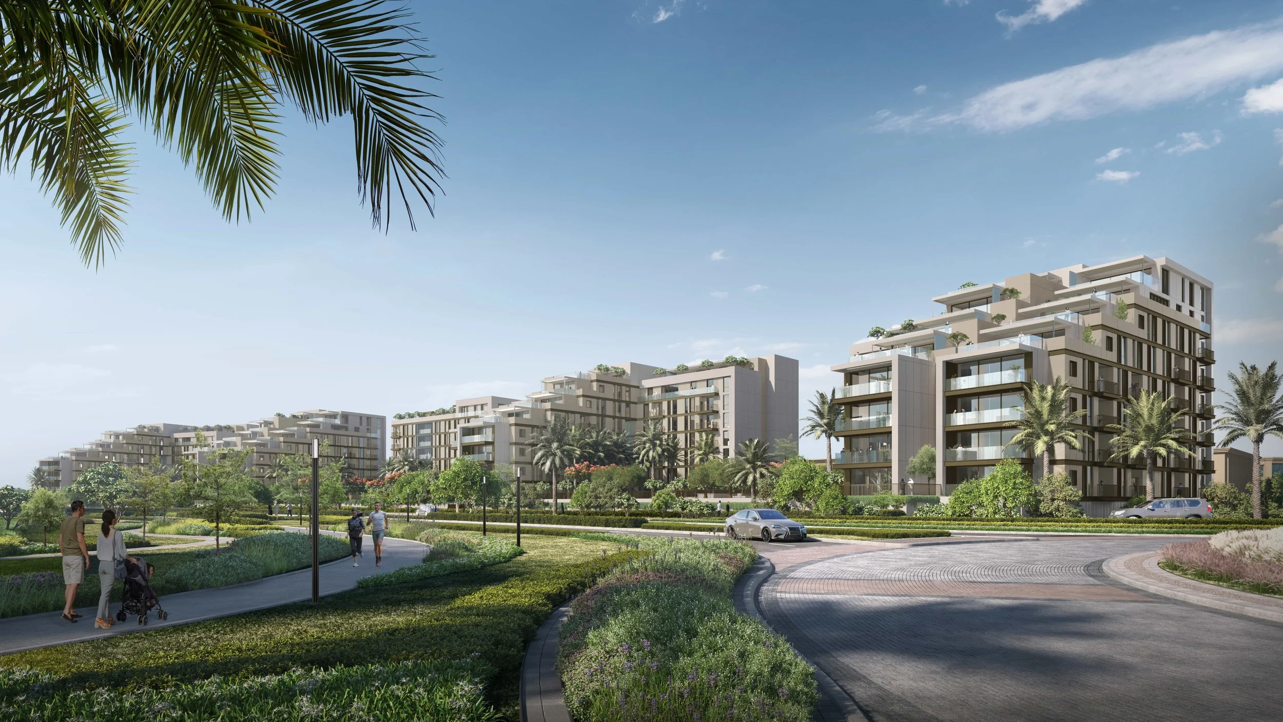
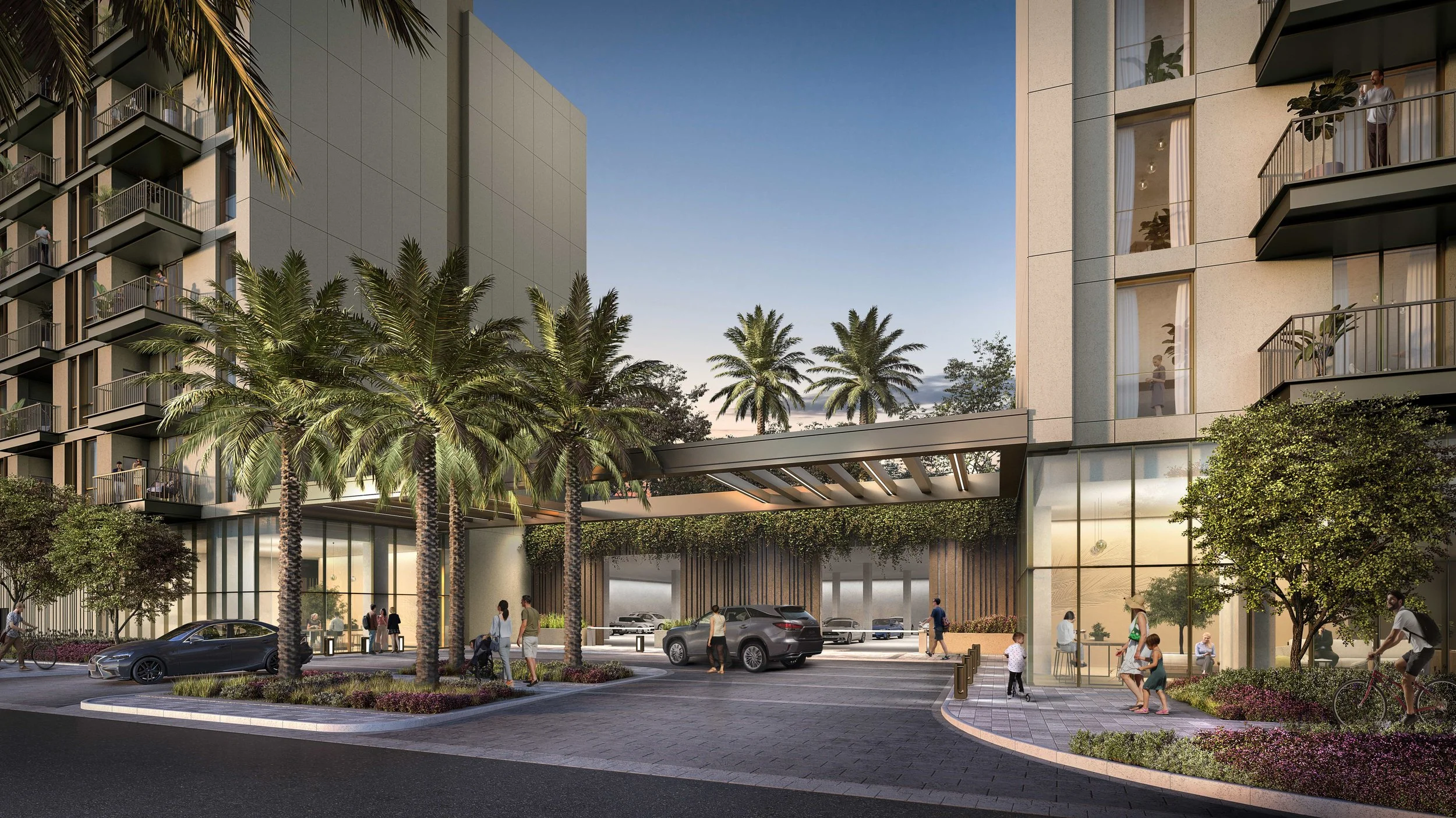
Al Badia Terraces is the new residential enclave being developed by Al-Futtaim Group Real Estate within Dubai Festival City. Set in lush, private landscaped gardens embraced by nature's calm, Al Badia Residences is an exclusive retreat comprising spacious low-rise apartments and Mediterranean-style townhouses — nestled within the greater Al Badia district and offering close proximity to all the amenities Dubai Festival City has to offer.
Creative Dialog was appointed to develop the brand identity that would position the development for its target audience: design-conscious residents looking for sanctuary within a connected, lifestyle-led mixed-use community. The brief called for an identity that could communicate both the residential calm of the gardens and the connectivity of the wider district.

Our Approach
Creative Dialog approached the brief as a positioning and translation exercise — recognising that the destination's identity needed to communicate both serenity and connectivity to a bilingual audience. The goal was a brand system not commonly seen in real estate marketing — modern, elegant, approachable and culturally rooted in equal measure.
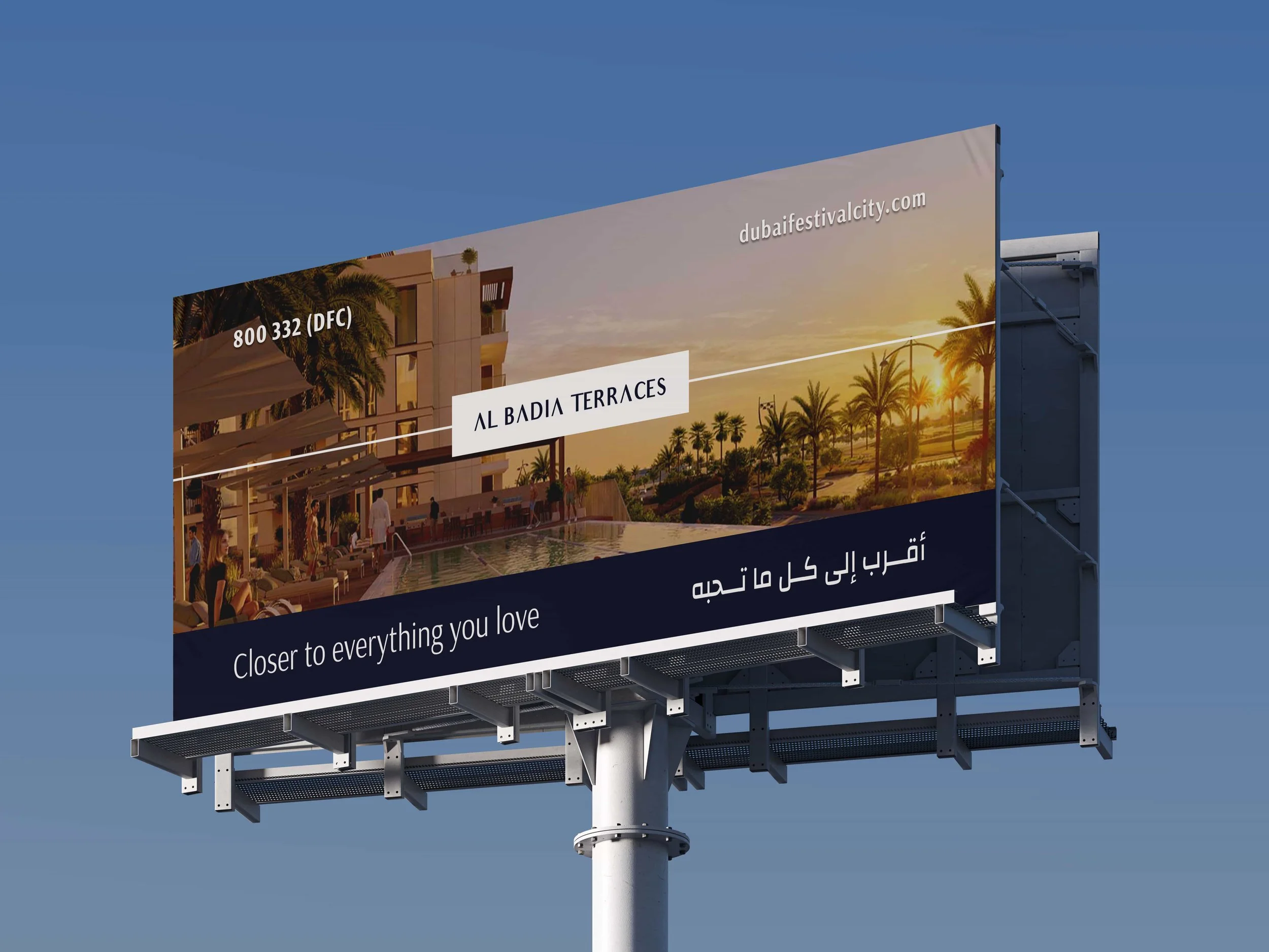
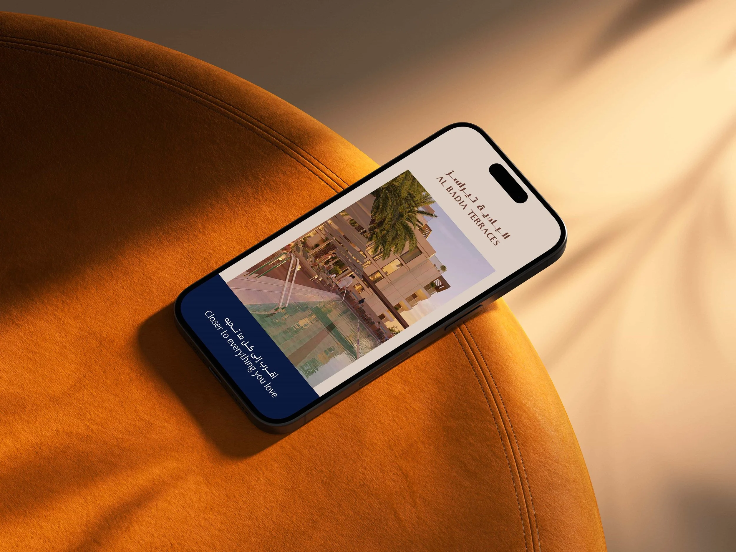
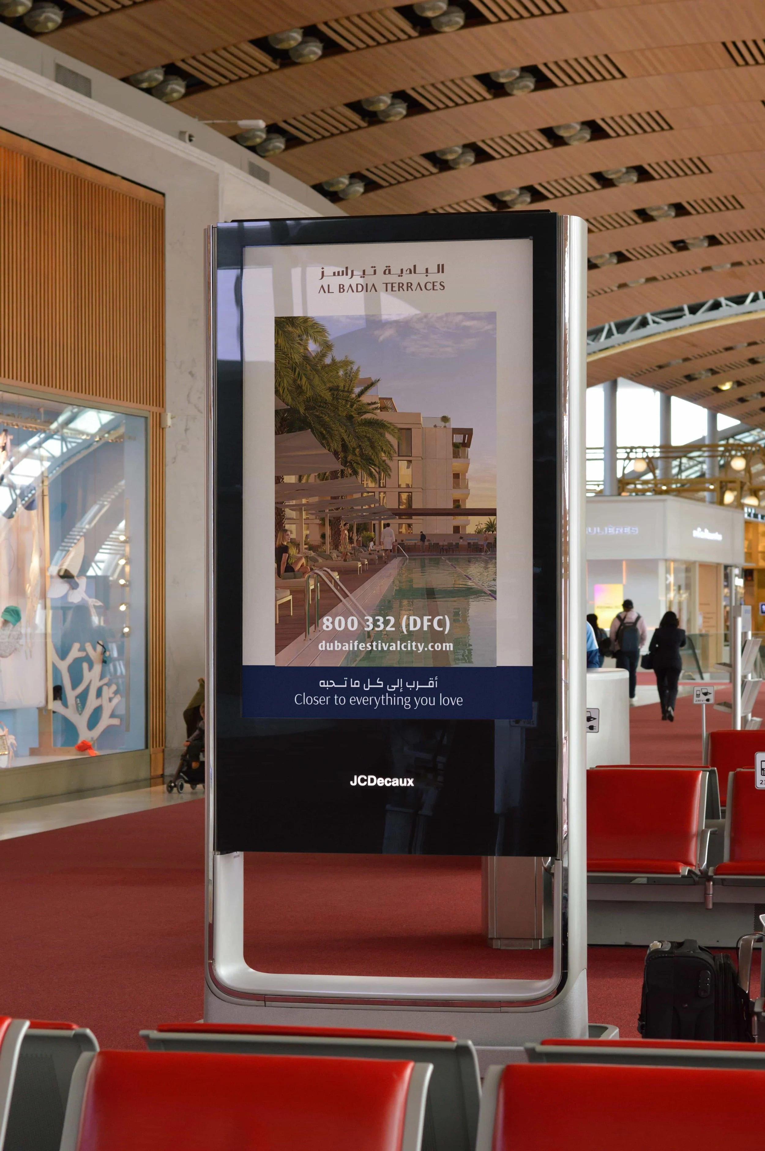
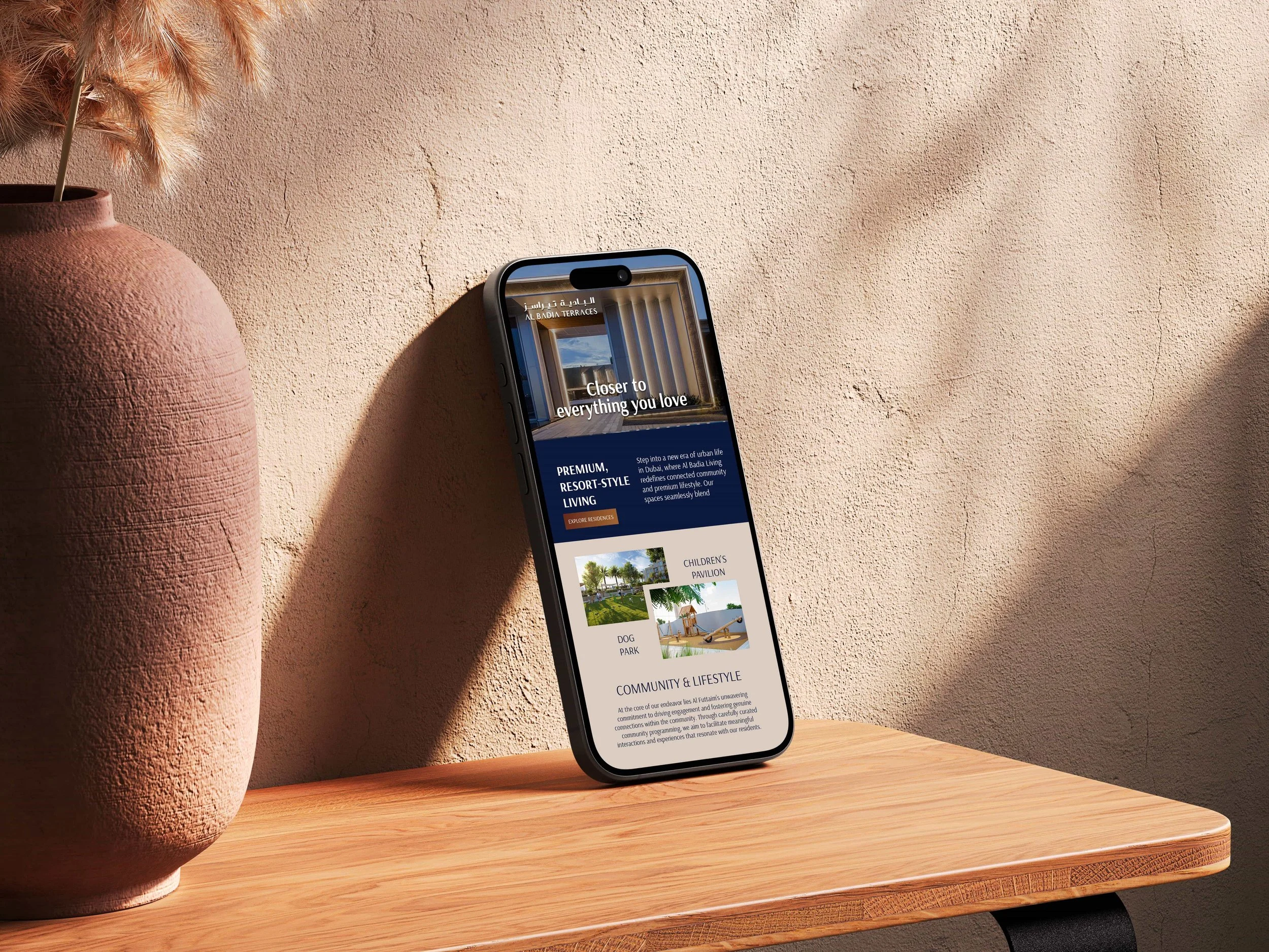
_We anchored the positioning around the notion of being 'closer to everything you love', capturing the central location of the community in relation to Dubai's key destinations.
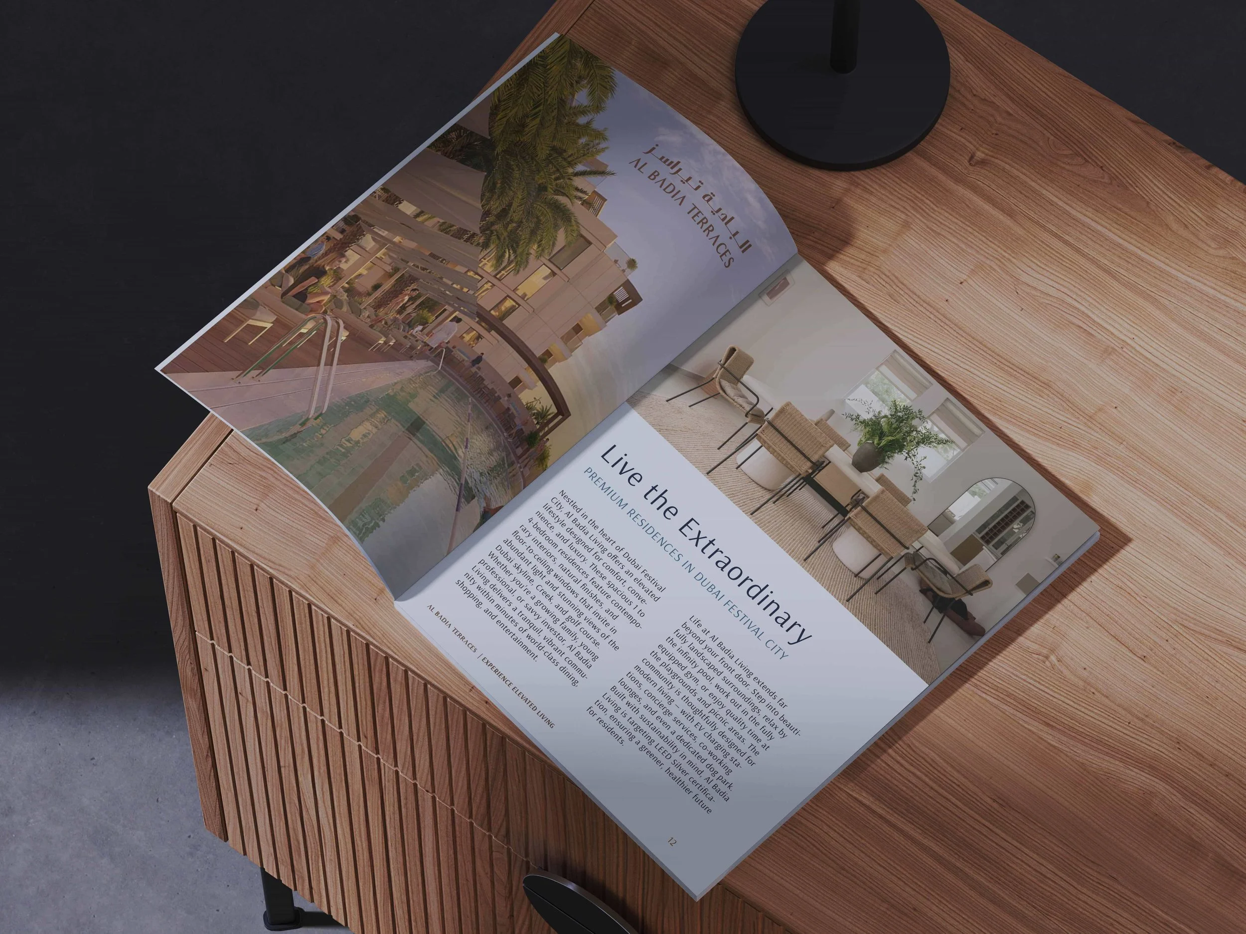
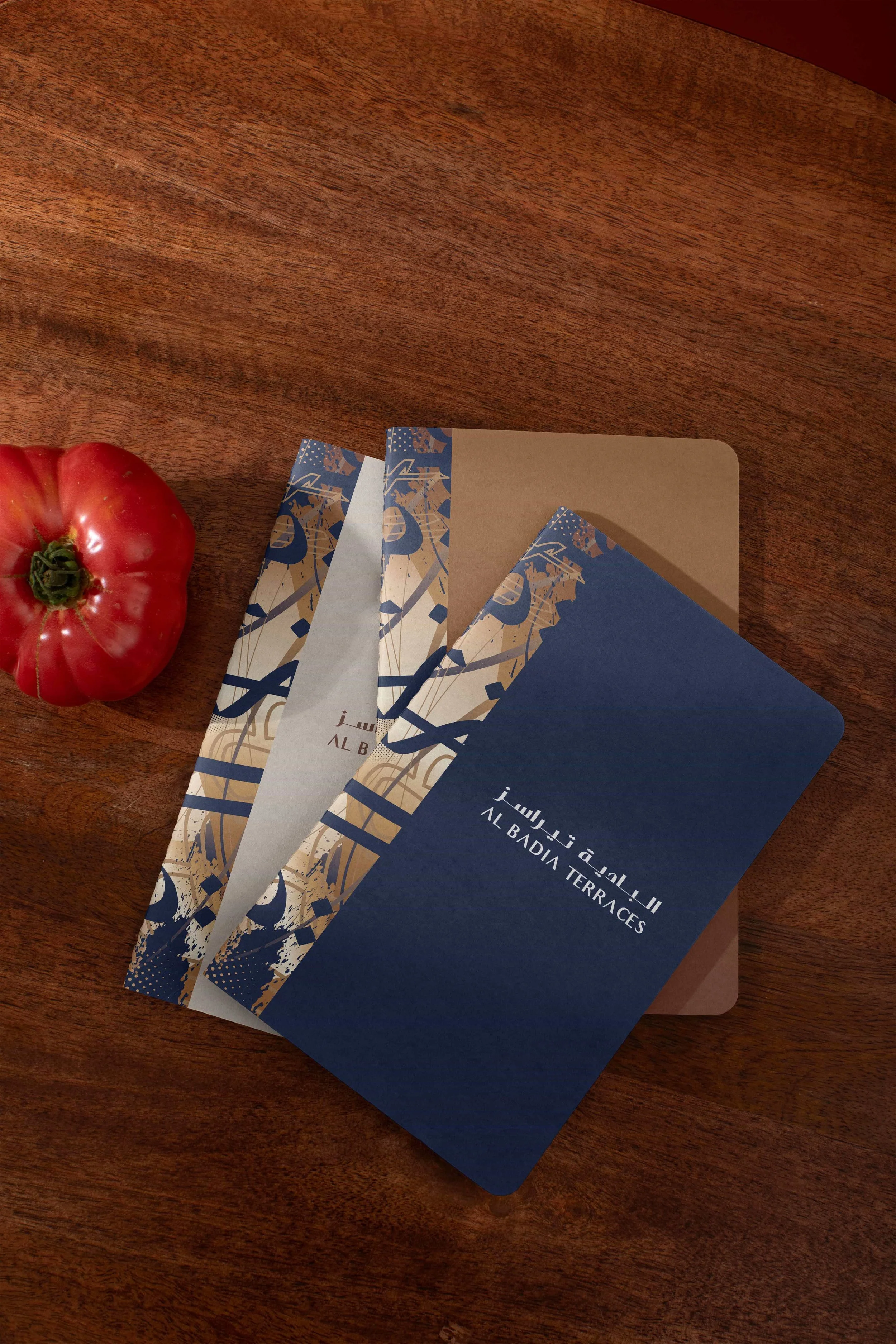
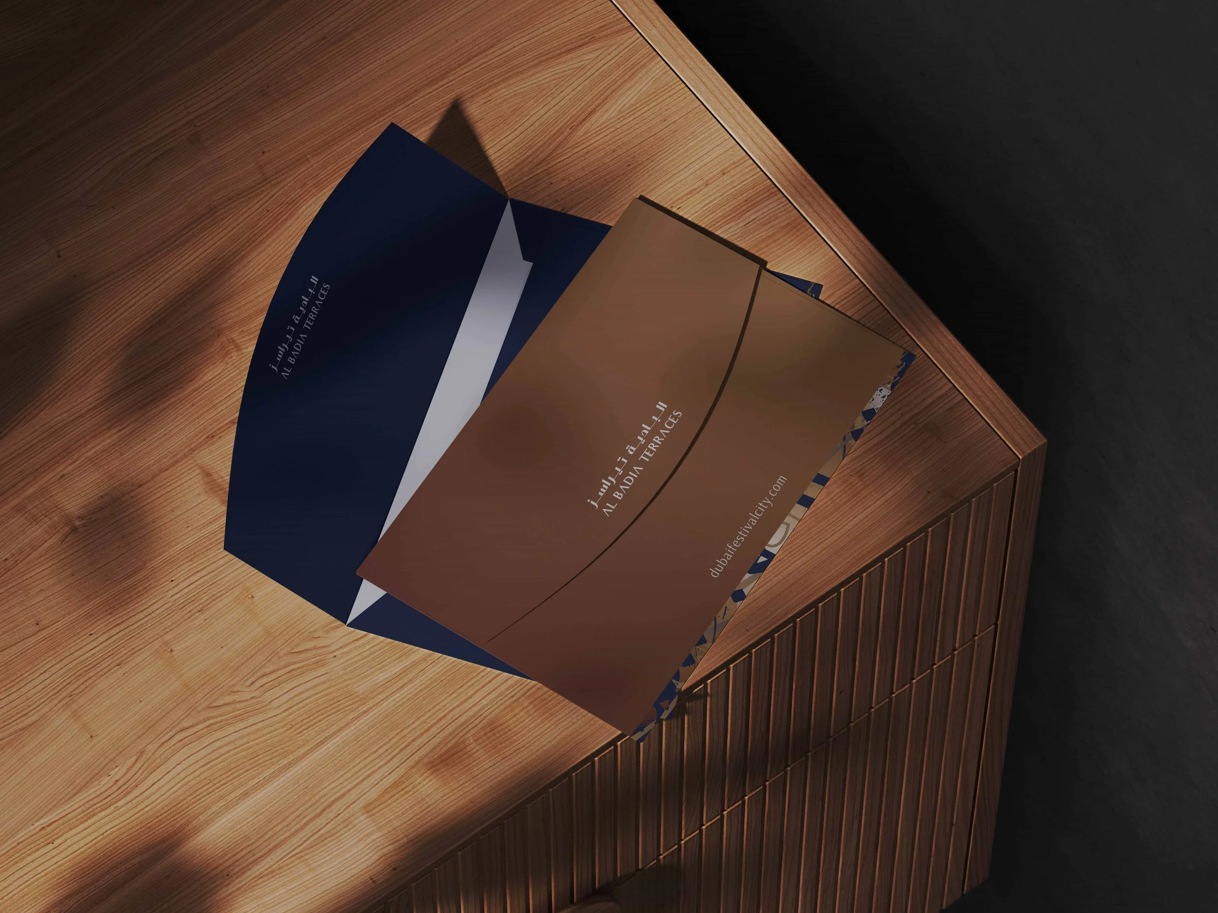
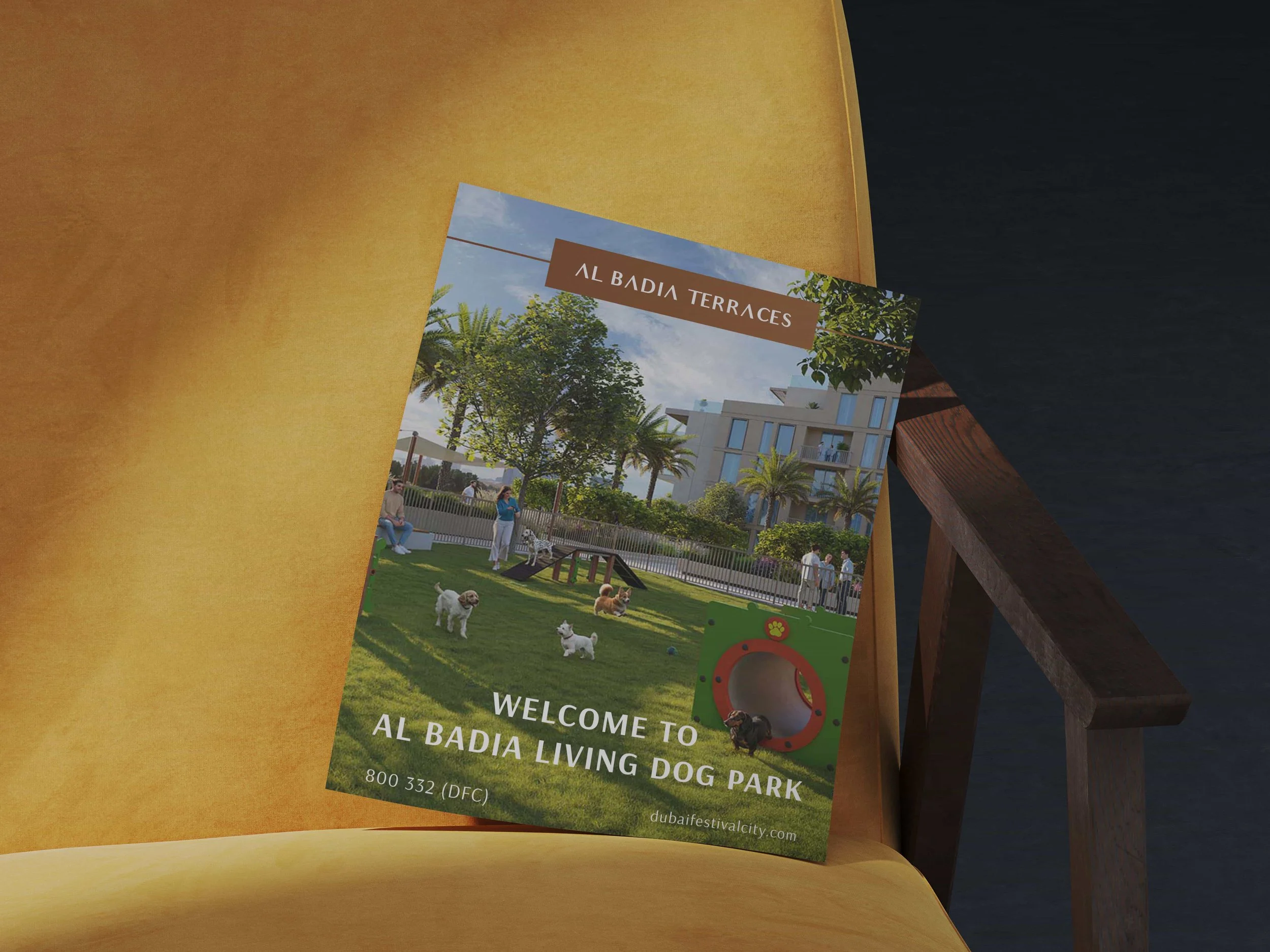
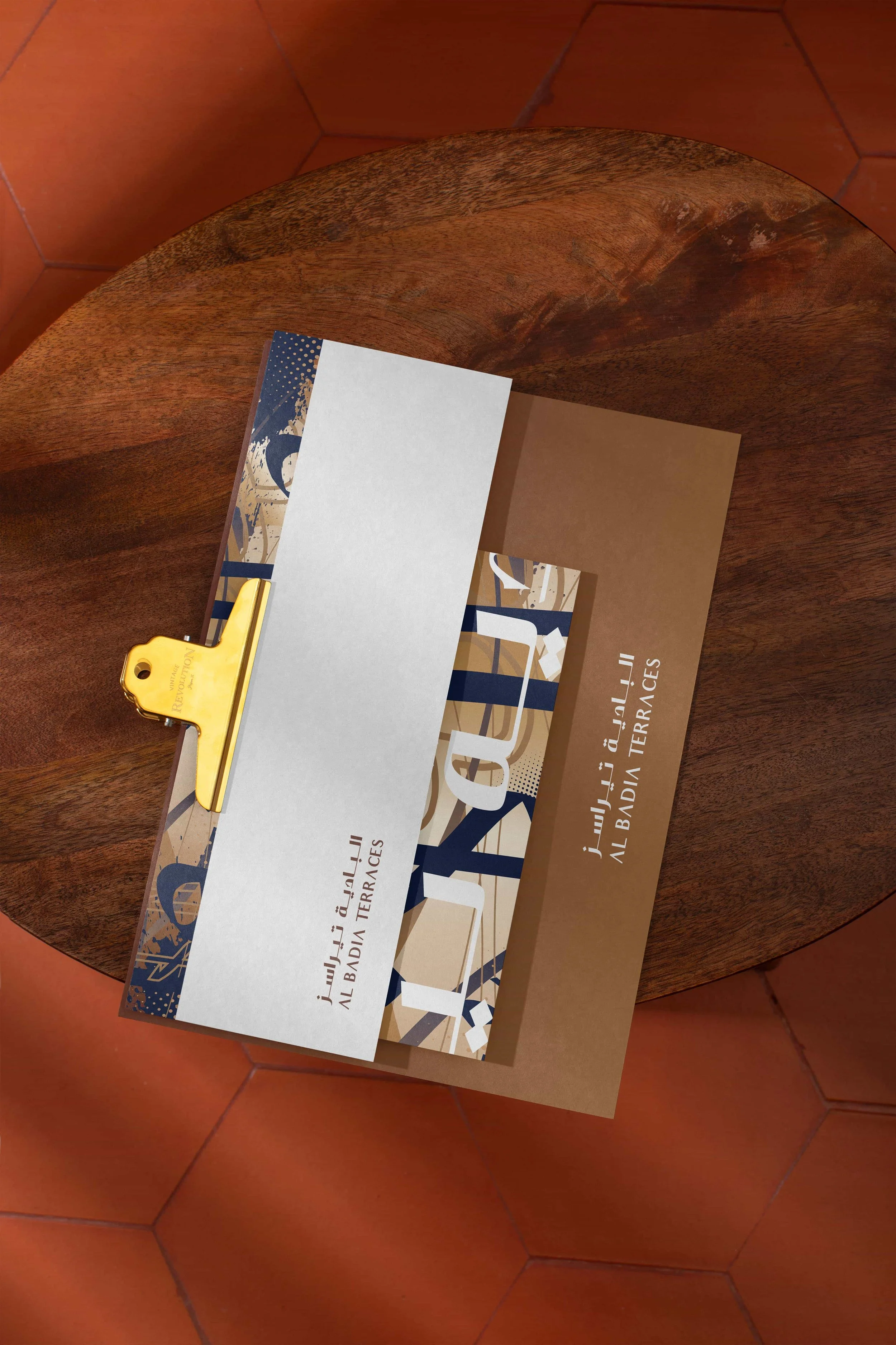
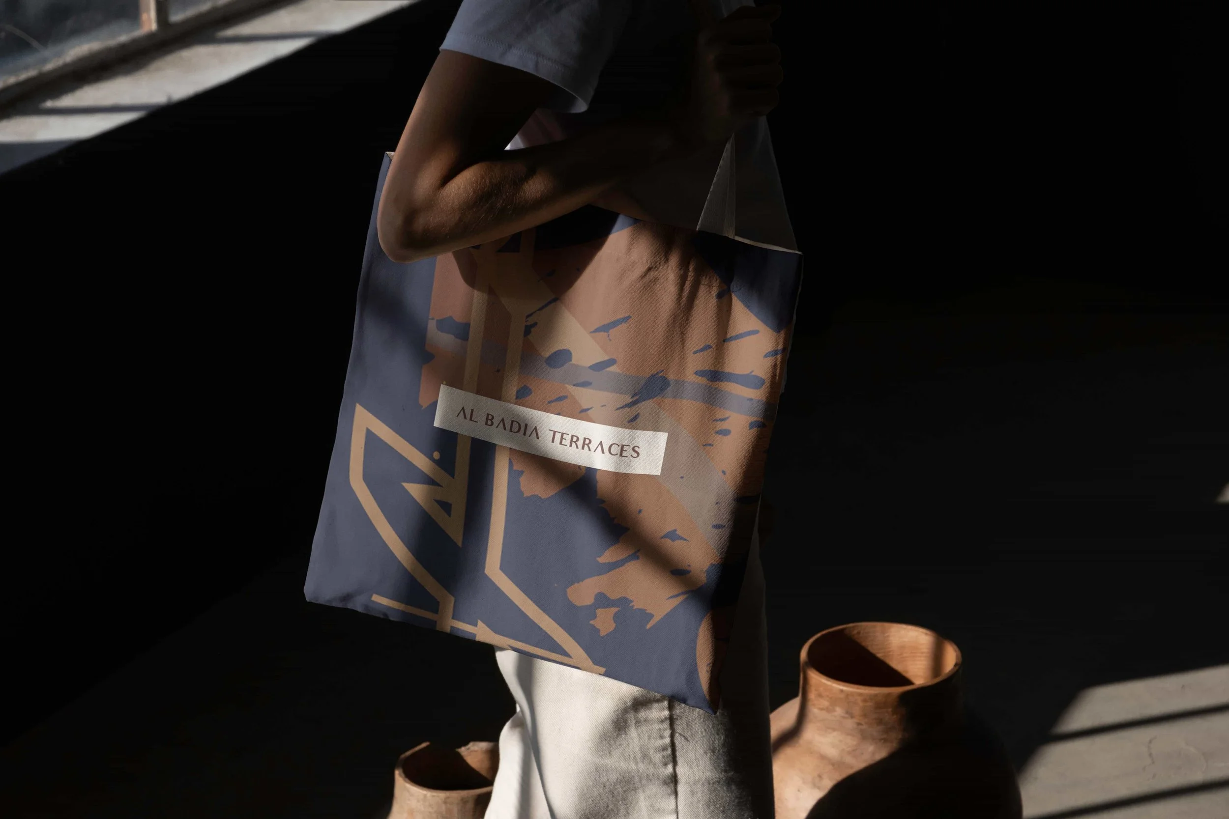
_We developed a series of one-off Arabic-inspired calligraphic artworks for use across a range of media and branding opportunities — appealing directly to the Arabic-speaking audience while introducing a layer of creativity rarely associated with residential marketing.
_We built a two-track visual identity system that can be switched between formal and fun, giving the brand the range required to serve marketing, sales and ambient resident touchpoints.
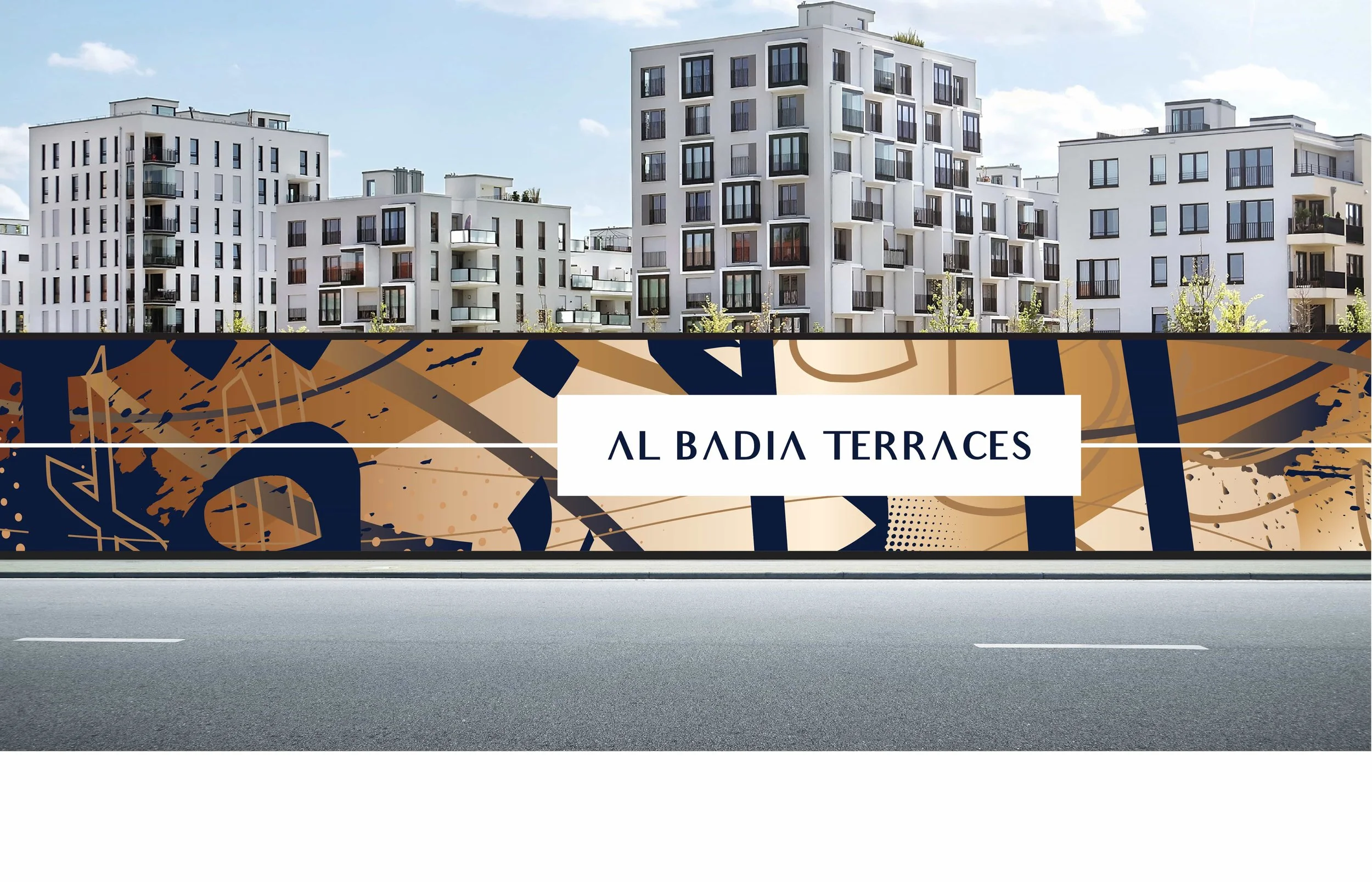
_We applied an open and approachable typography set that works well across both visual styles, paired with warm earthy tones and a deep blue for a distinctive, elevated feel.
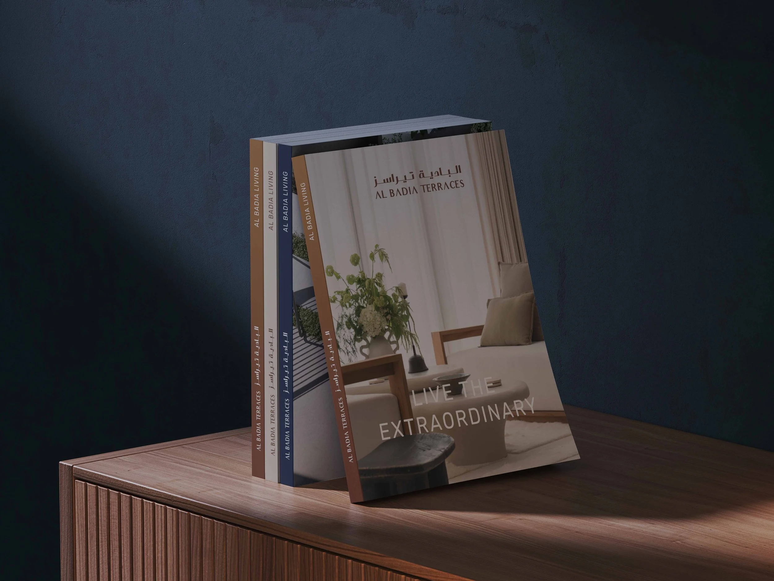
_We developed a series of detailed collateral pieces highlighting the proximity of community amenities and the central location of the development, complemented by graphic floor plans and associated sales marketing materials.
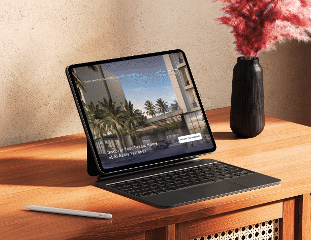
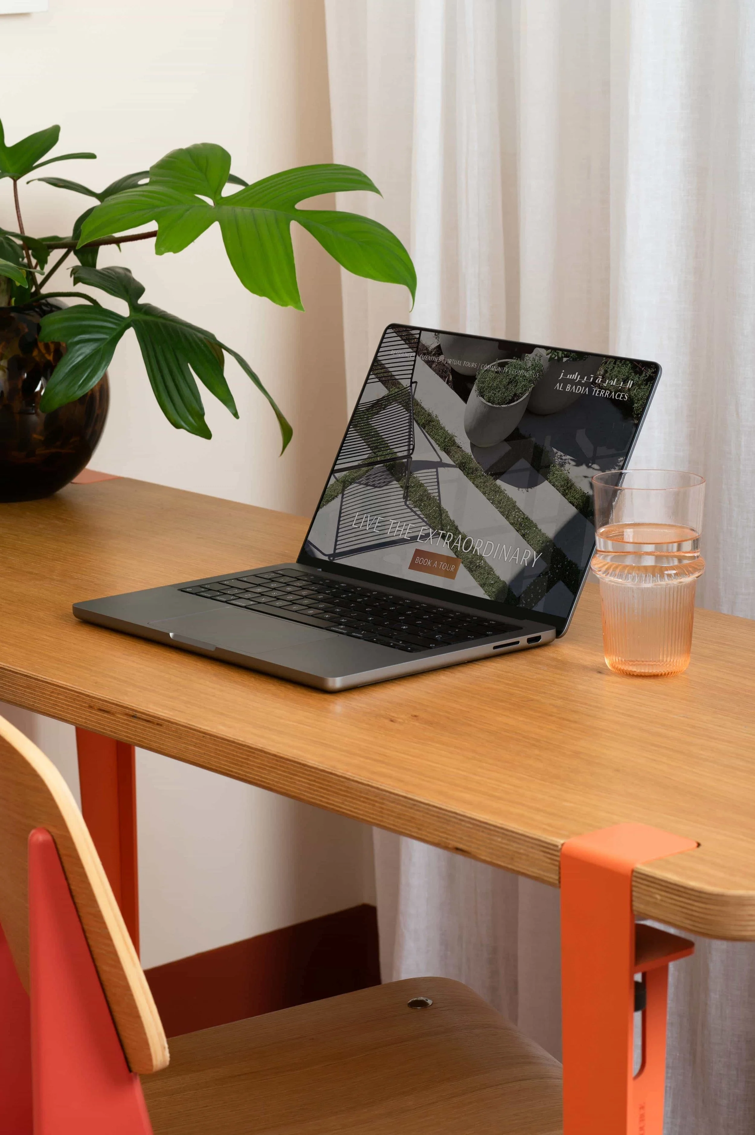
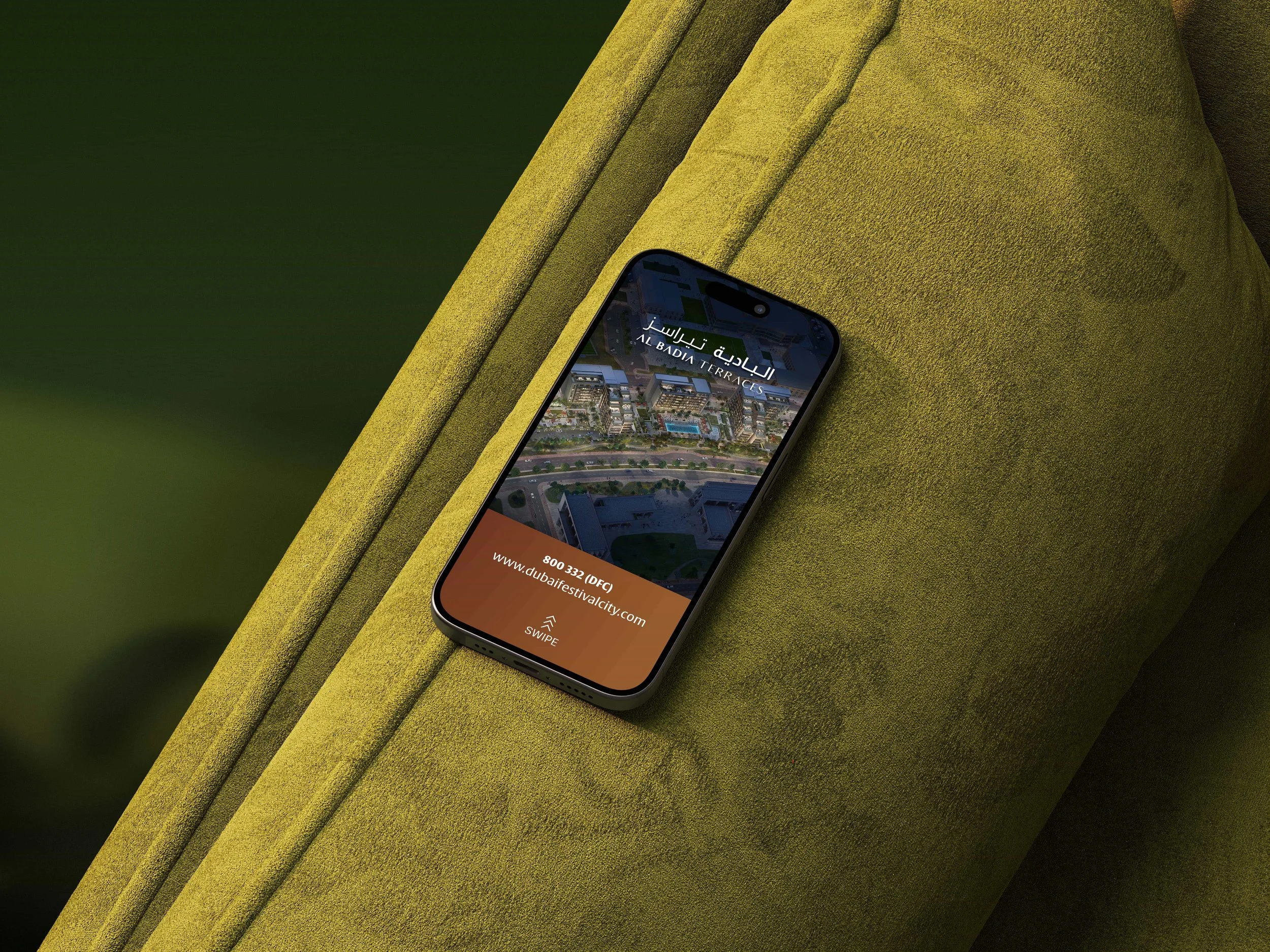
_We extended the system to digital — micro-site, social media graphic elements, related template layouts — and to outdoor applications across advertising and signage formats.
The Outcome
The completed identity delivers a brand system that gives Al-Futtaim's residential development a distinctive voice within Dubai Festival City's wider mixed-use ecosystem. Modern and elegant in execution, calligraphic and culturally rooted in expression, and confidently dual-language in application — an identity that does the unusual job of standing out in a category where most brands look the same.
What We Delivered
Brand Strategy & Positioning
Brand Tagline ('Closer to Everything You Love')
Arabic Calligraphic Artworks
Two-Track Visual Identity System (Formal & Fun)
Dual-Language Typography
Colour System (Warm Earthy Tones + Deep Blue)
Sales & Marketing Collateral with Graphic Floor Plans
Digital Identity (Microsite, Social Media, Templates)
Outdoor Application Suite