
West Walk Doha Destination Branding.
West Walk Doha.
Creating Doha's next place to be.
Creative Dialog delivered the destination branding for Energy City Qatar's flagship mixed-use retail and hospitality development in Doha.
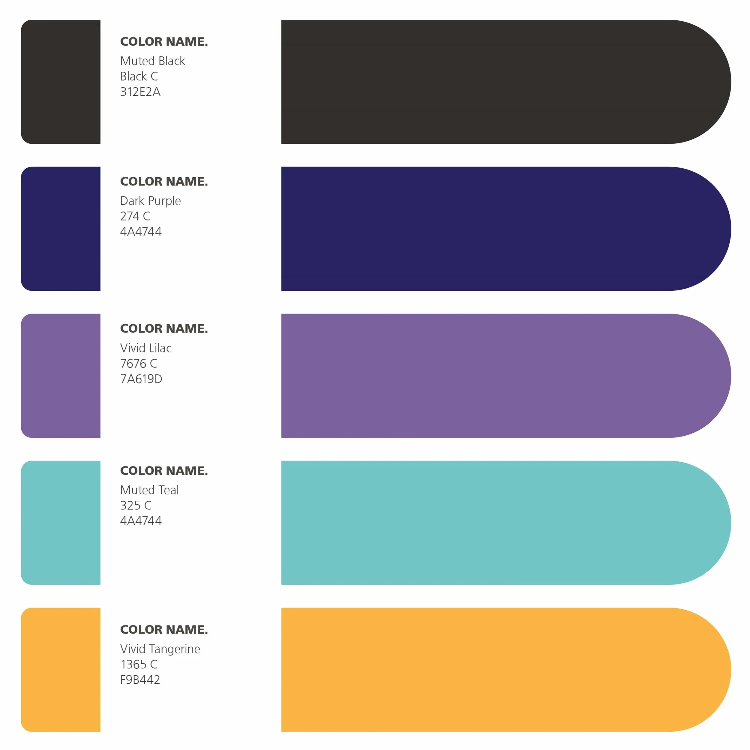
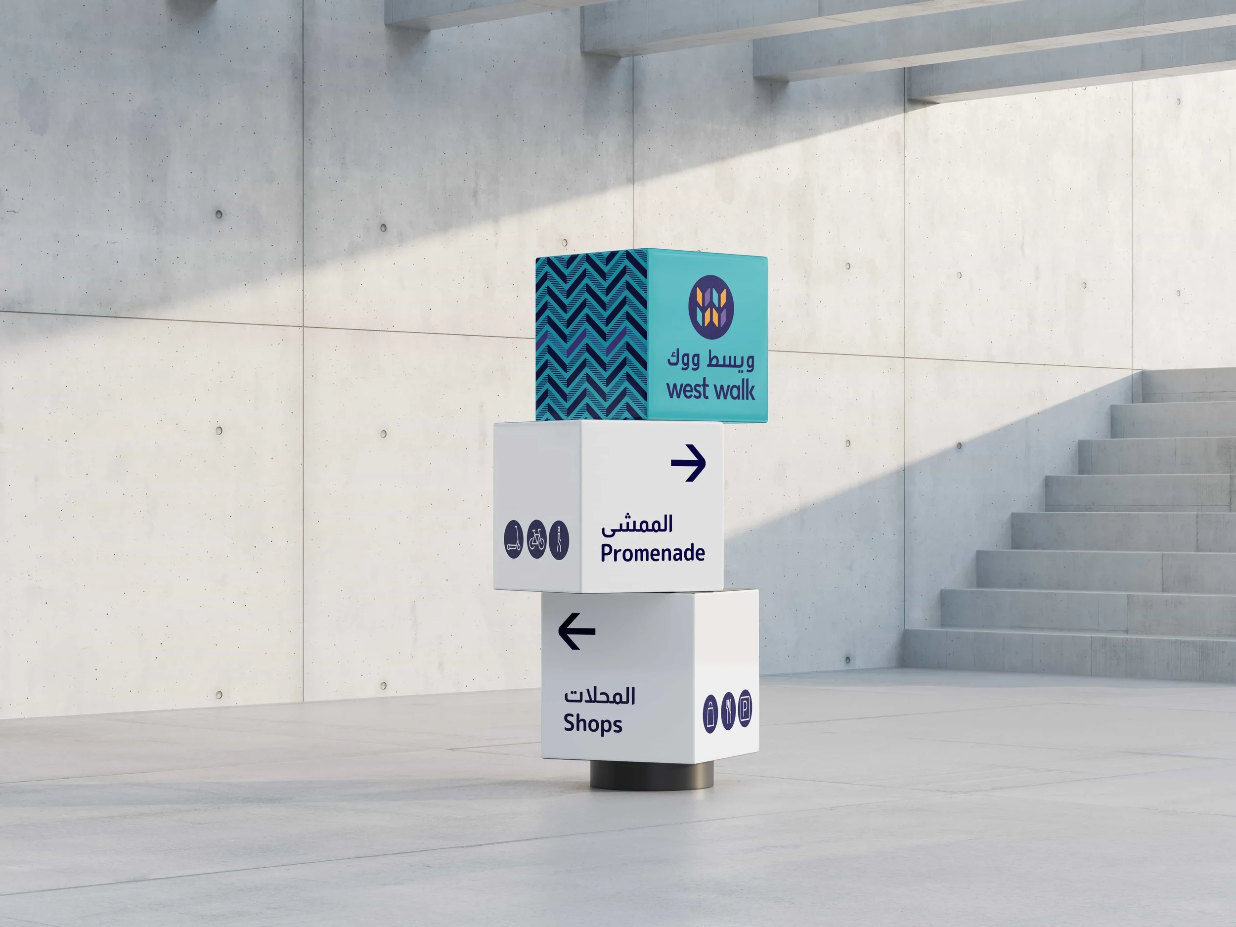
Working on a two-year partnership that covered every facet of the visitor journey, the team built an identity around a contemporary reinterpretation of the Qatari Ghitra and a deliberately unconventional palette of deep purple, teal and tangerine — quietly signalling that this was retail with a difference.
Expertise: Brand Strategy, Naming & Positioning + Creative
Sectors: Mixed-Use, Retail, Hospitality
Location: Doha, Qatar
Objective
When Energy City Qatar approached Creative Dialog to collaborate on their flagship destination, the brief presented an opportunity to roll the firm's full creative and strategic output into a holistic approach covering every facet of the project from a visitor journey perspective. The destination was West Walk — Doha's next retail-and-lifestyle destination — and the engagement became a two-year partnership to bring the place to life.
The brief was to develop a brand identity for a destination that needed to stand out clearly within Doha's competitive landscape, while also reading as confidently local and culturally rooted.
Our Approach
Creative Dialog approached the brief as an opportunity to break with category convention — recognising that Doha's retail and lifestyle landscape was already crowded with conventional brand expressions. The goal was an identity that quietly signalled difference at every level, from typography through to colour palette through to cultural reference.
_We began with a city-wide and regional competitive analysis to firmly establish where the new destination sits within the competitive landscape.
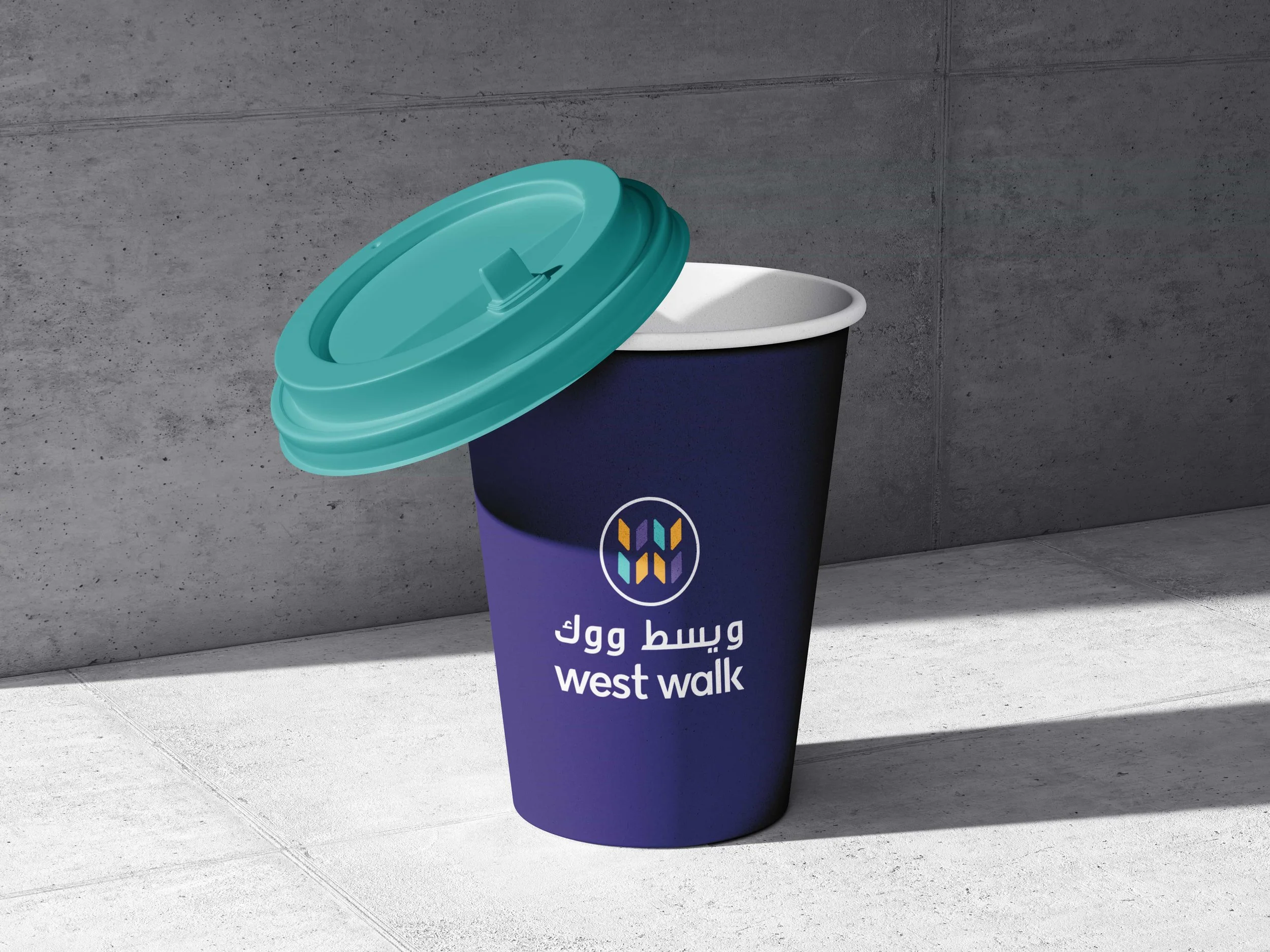
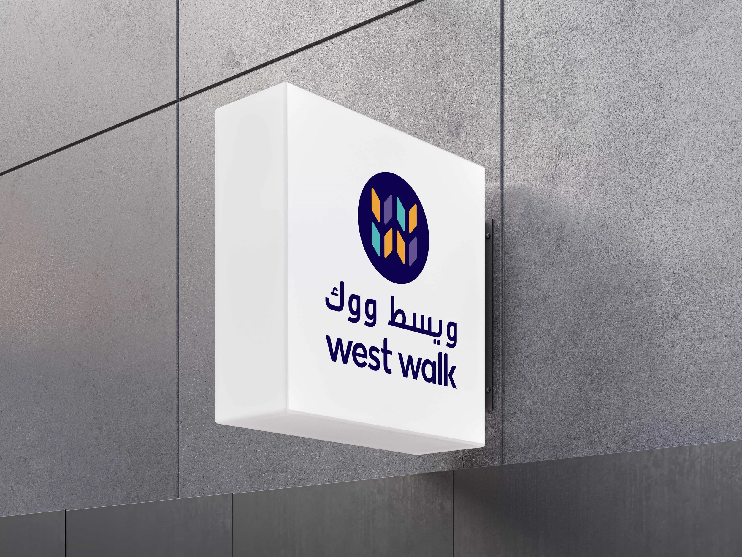
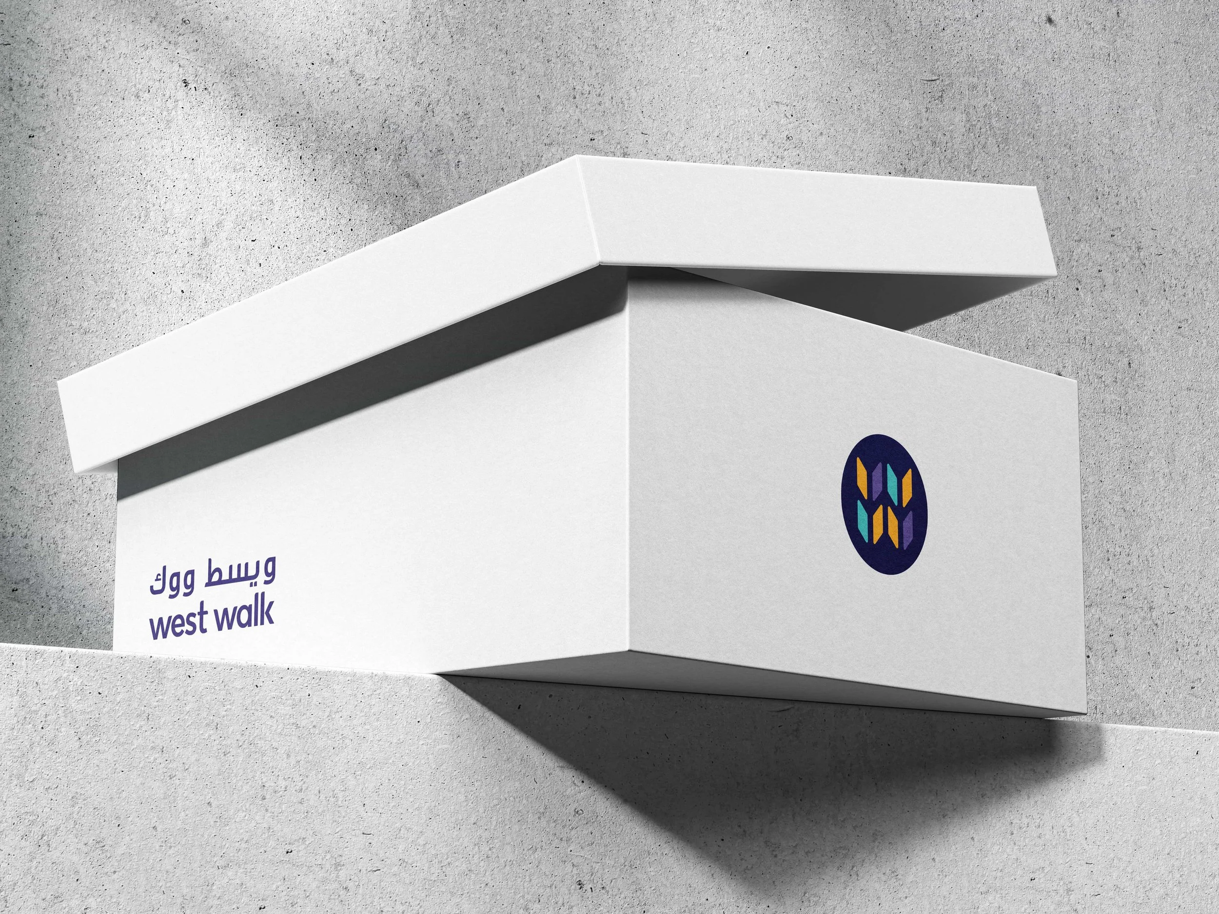
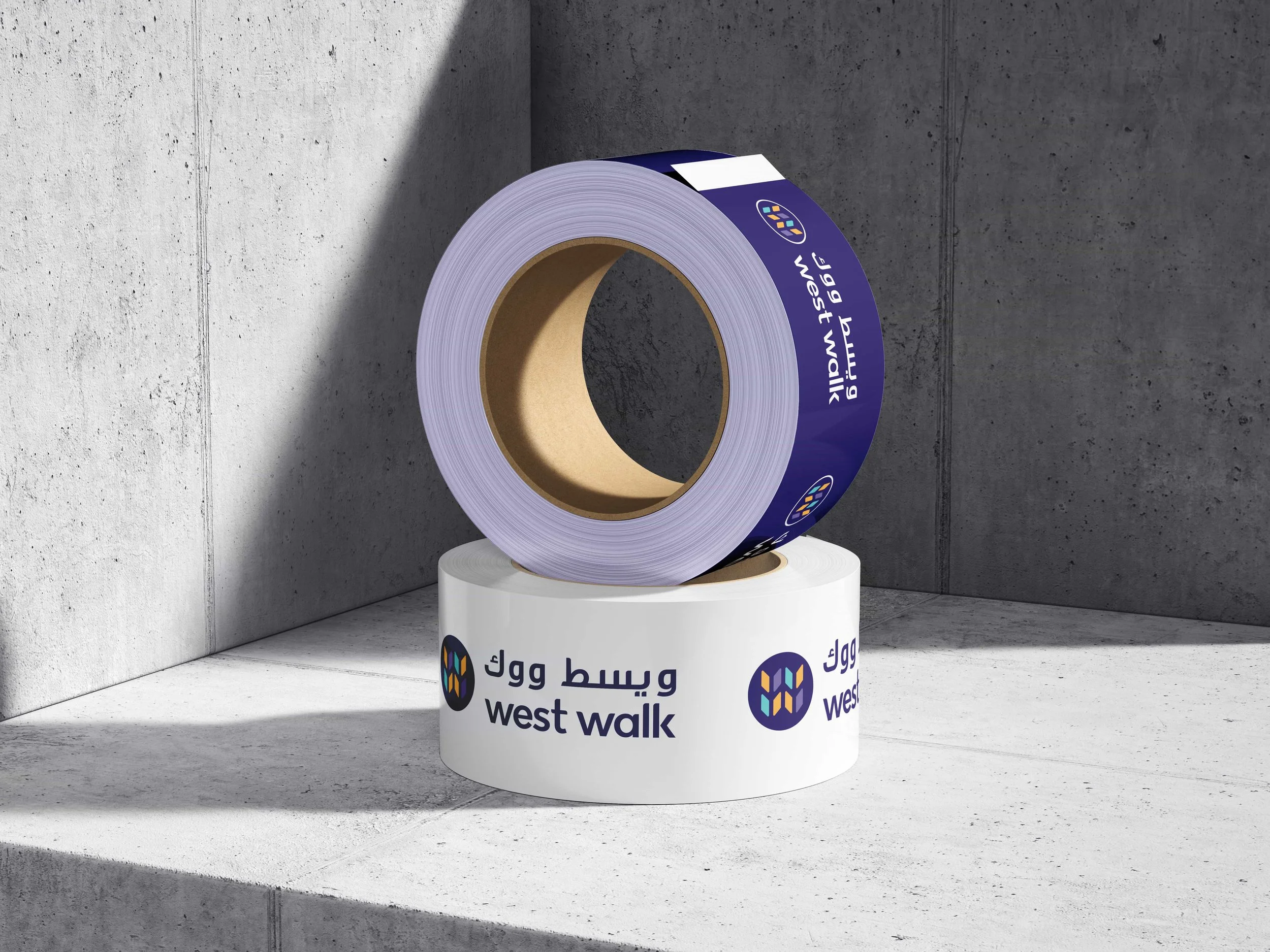
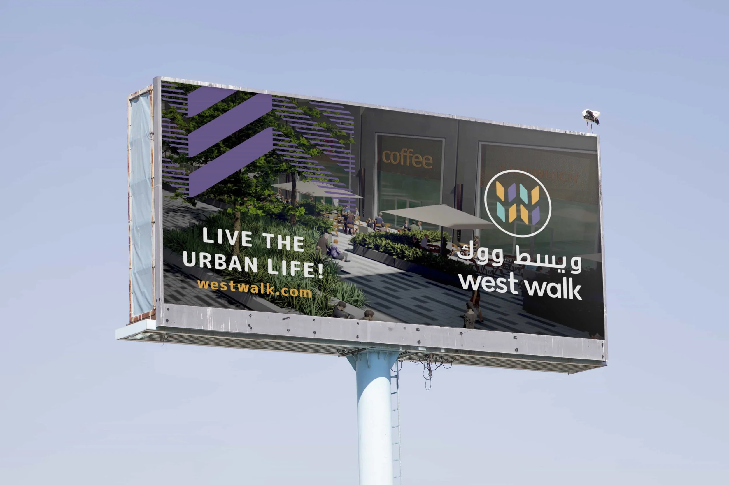
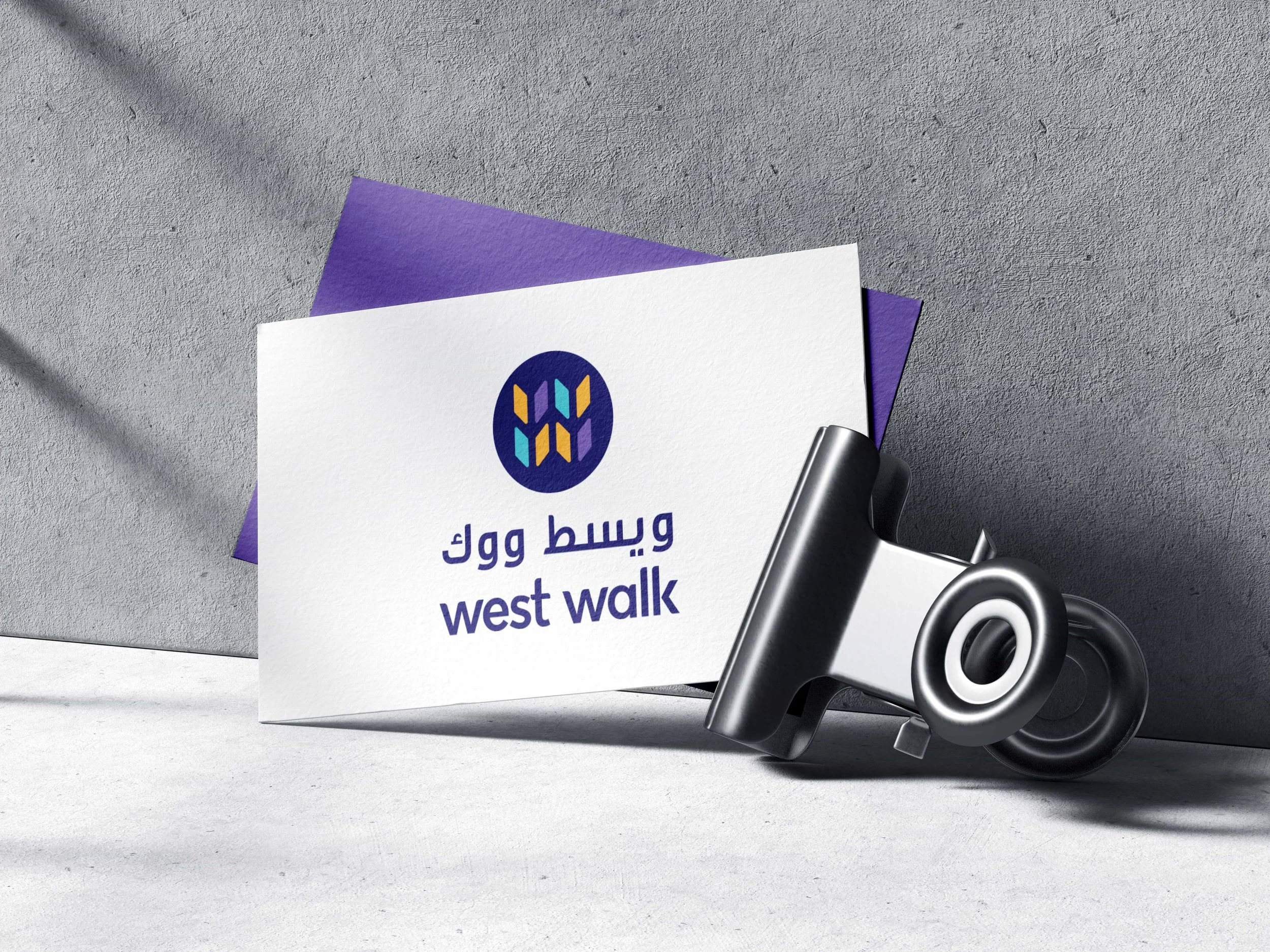
_We adopted an all-lowercase wordmark — a clear break with tradition and an immediate signal that the destination is quirky and approachable rather than corporate.
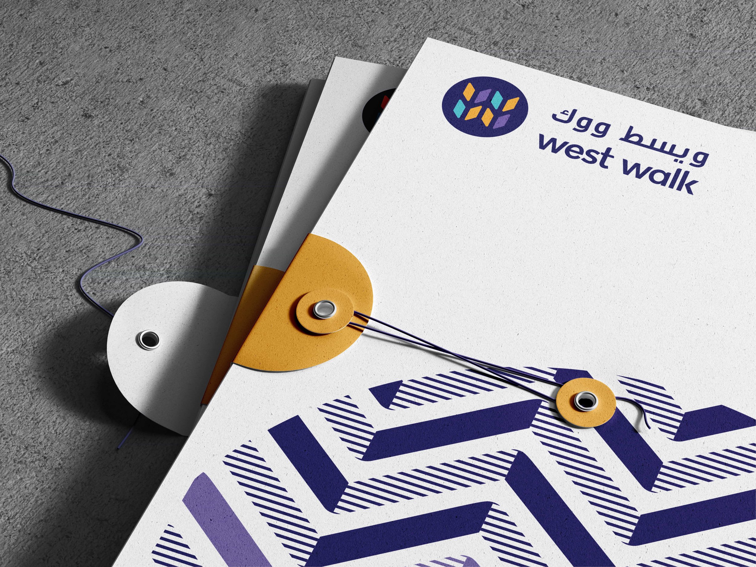
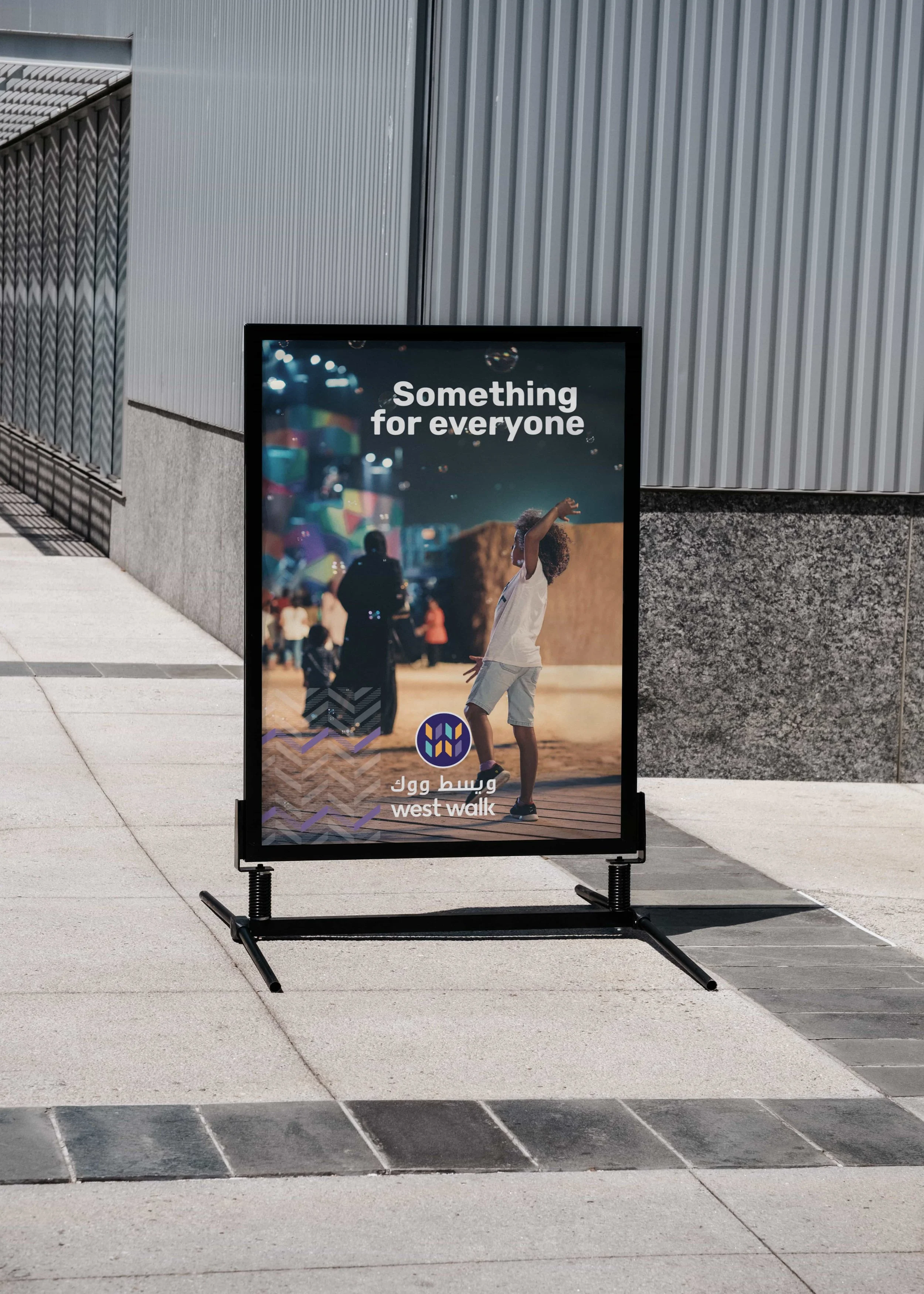
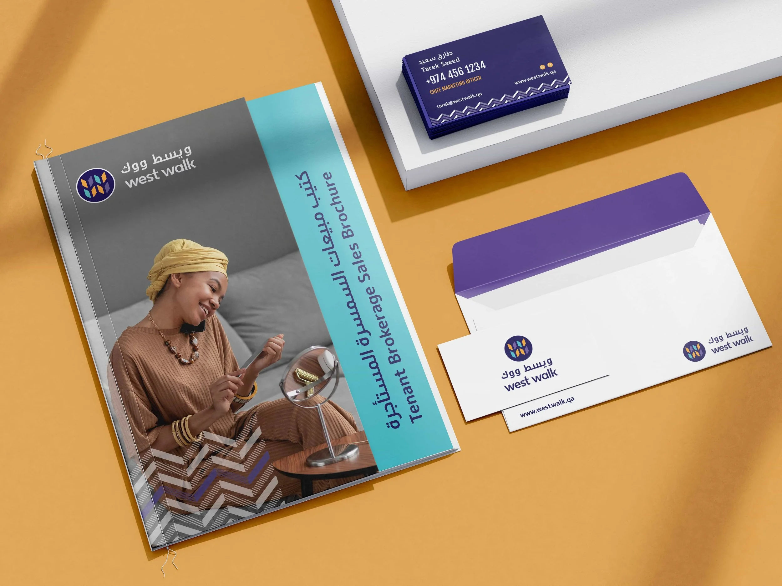
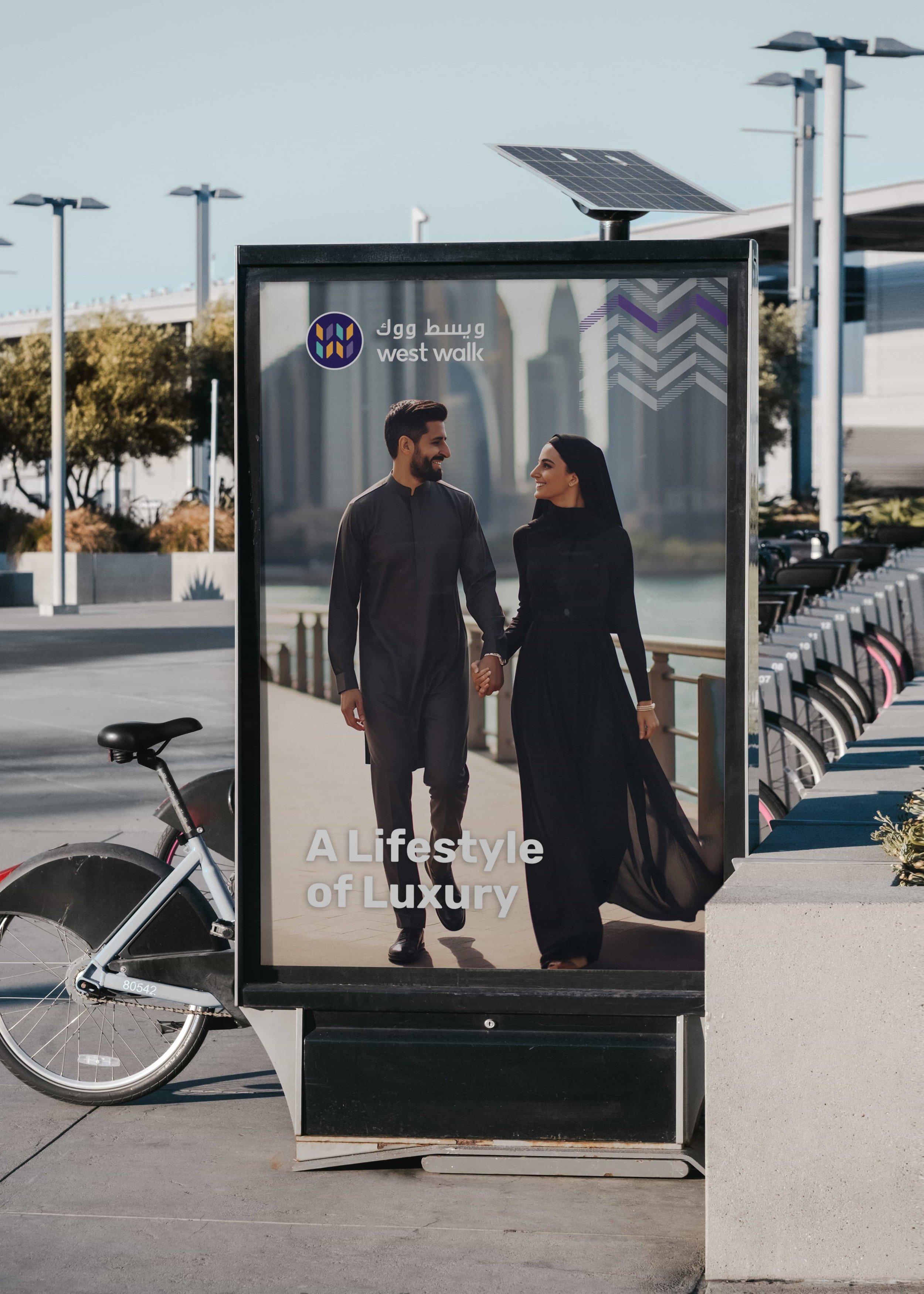
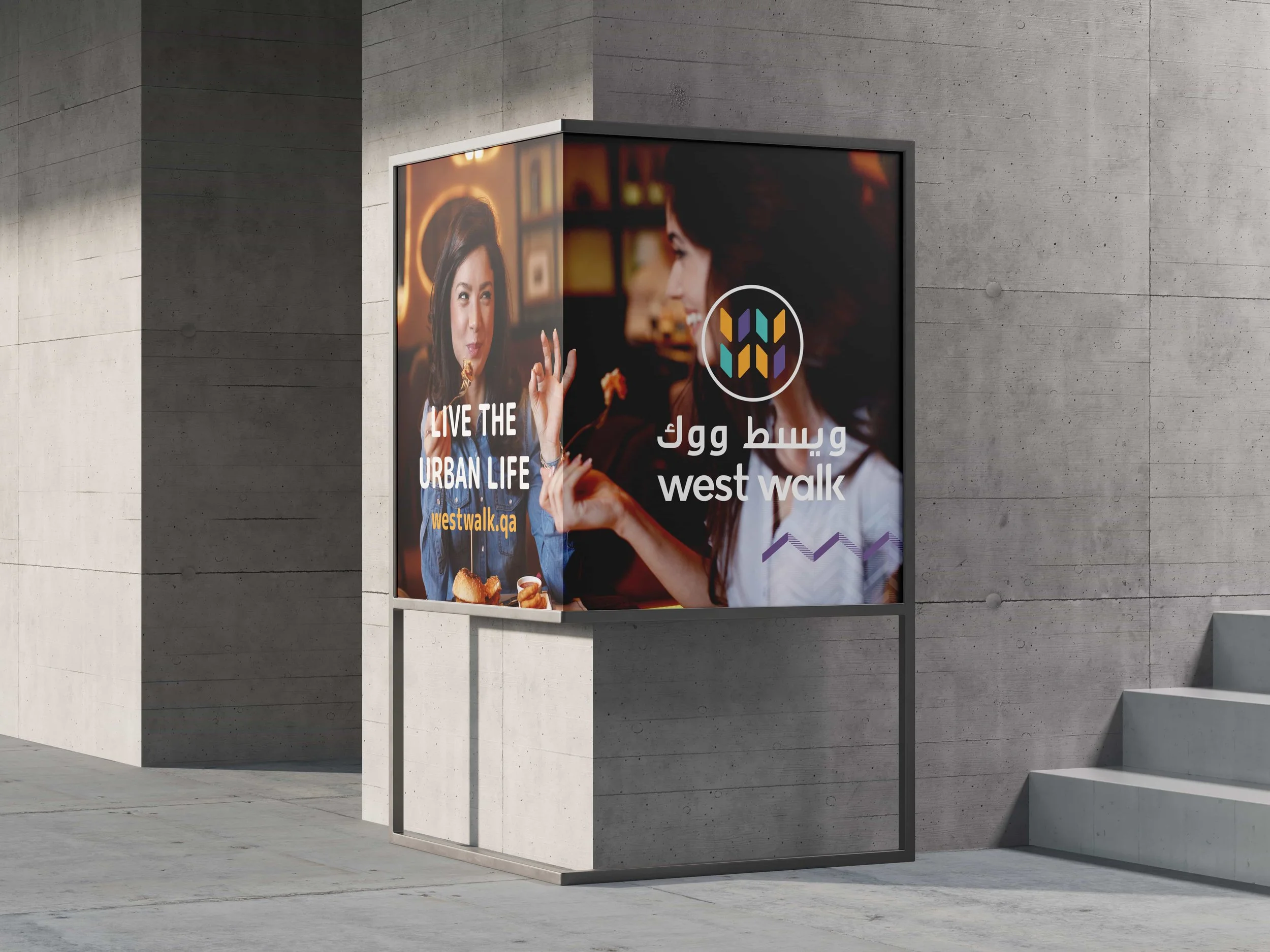
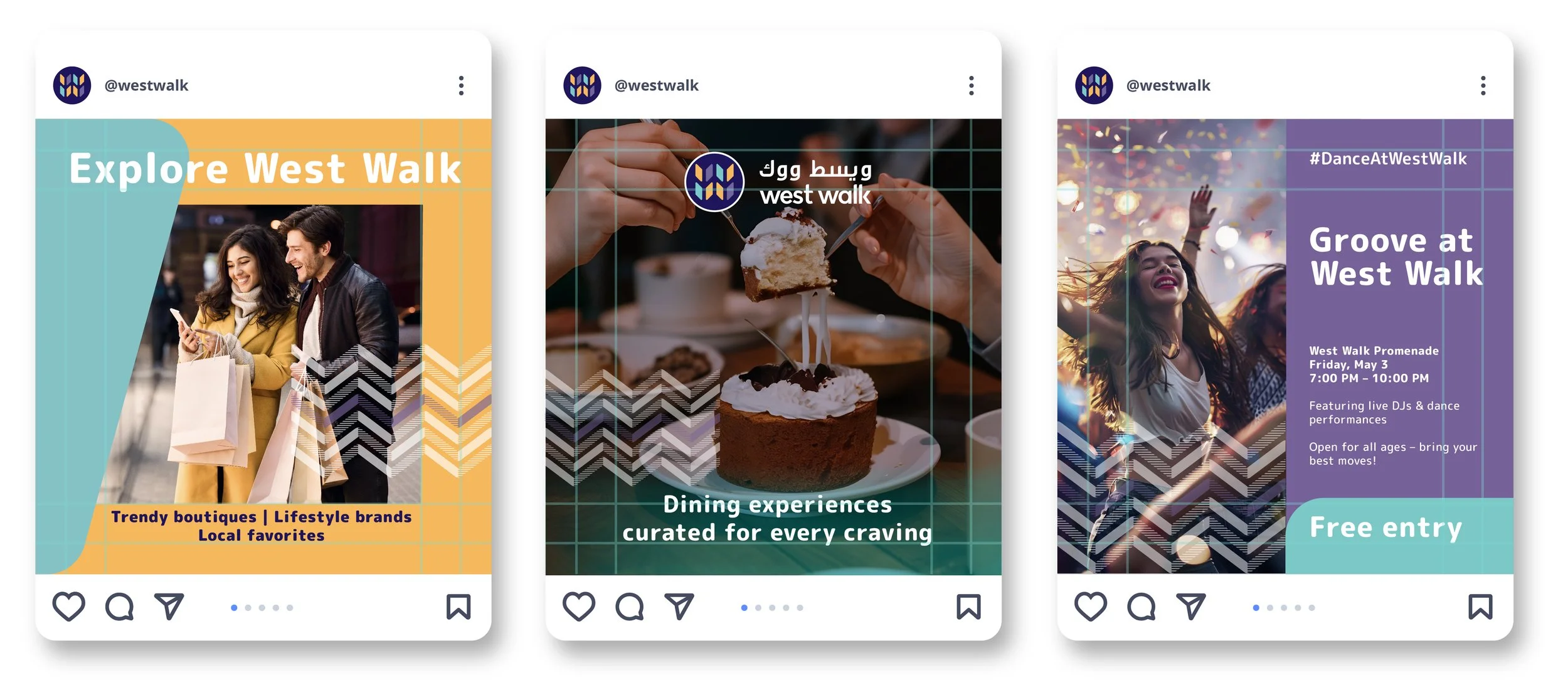
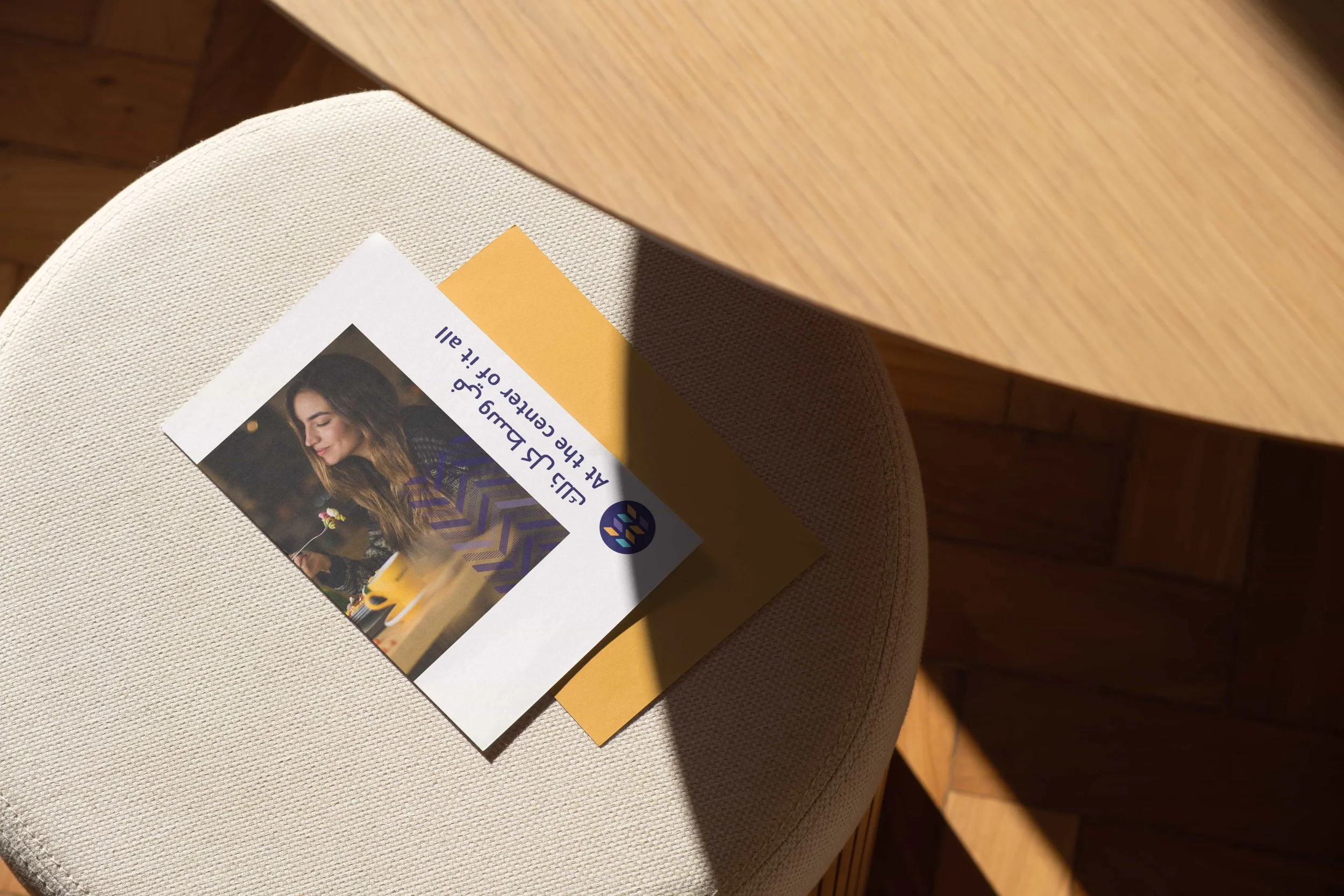
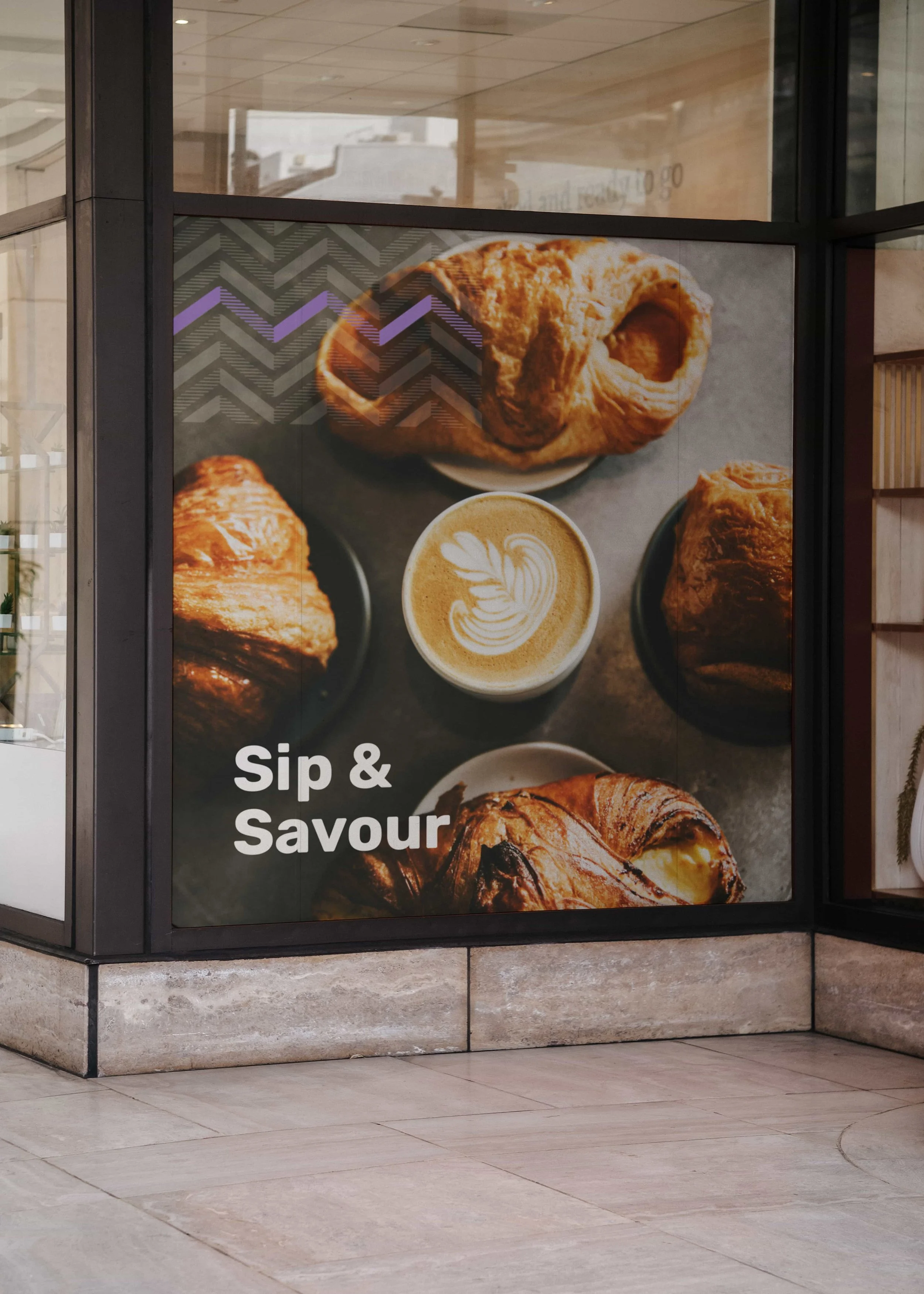
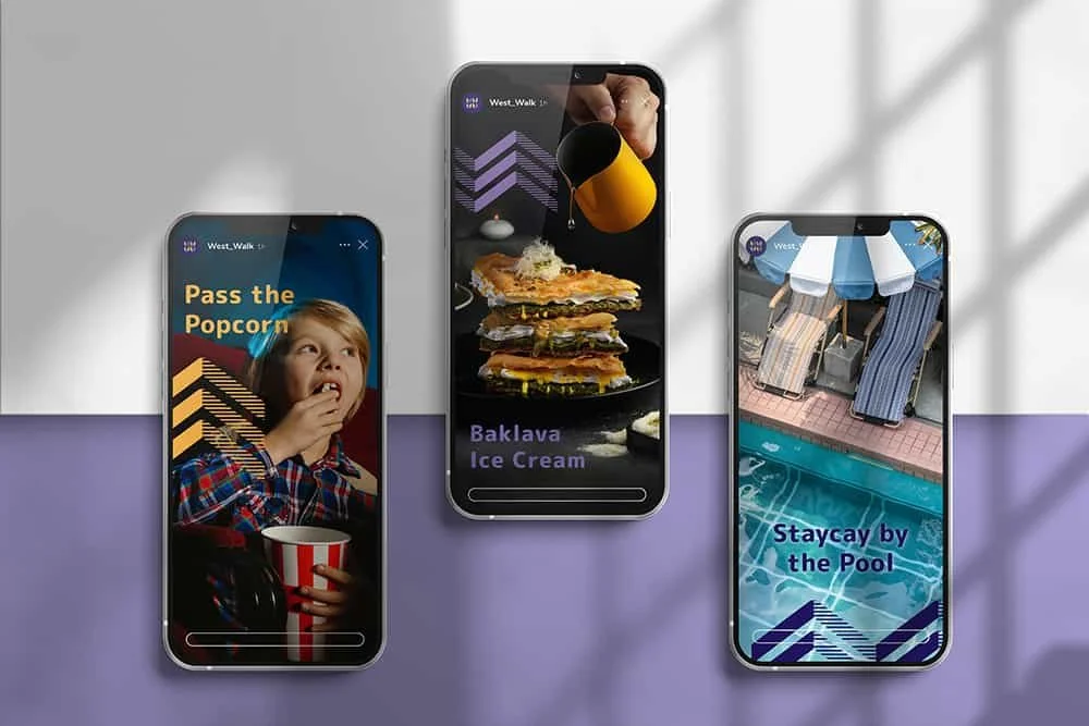
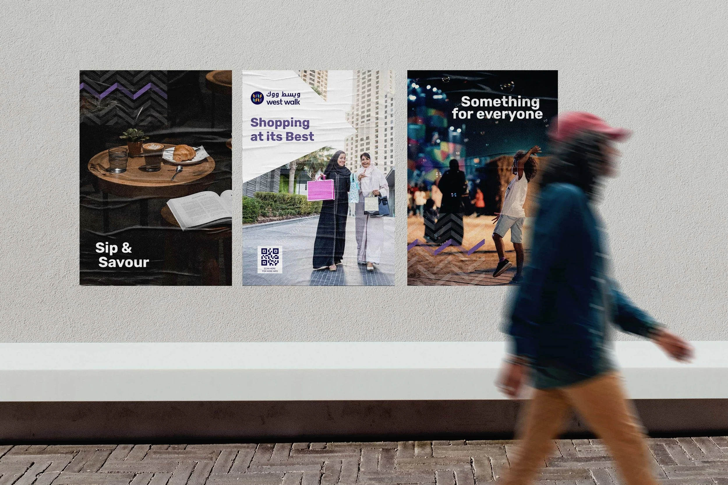
_We developed a unique reinterpretation of the Qatari Ghitra as the graphic pattern that runs throughout brand implementation, and used the same reinterpretation as the basis for the wordmark itself.
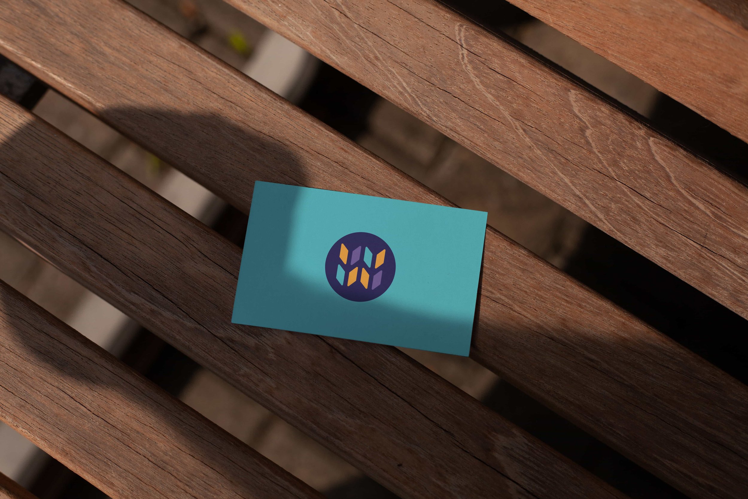
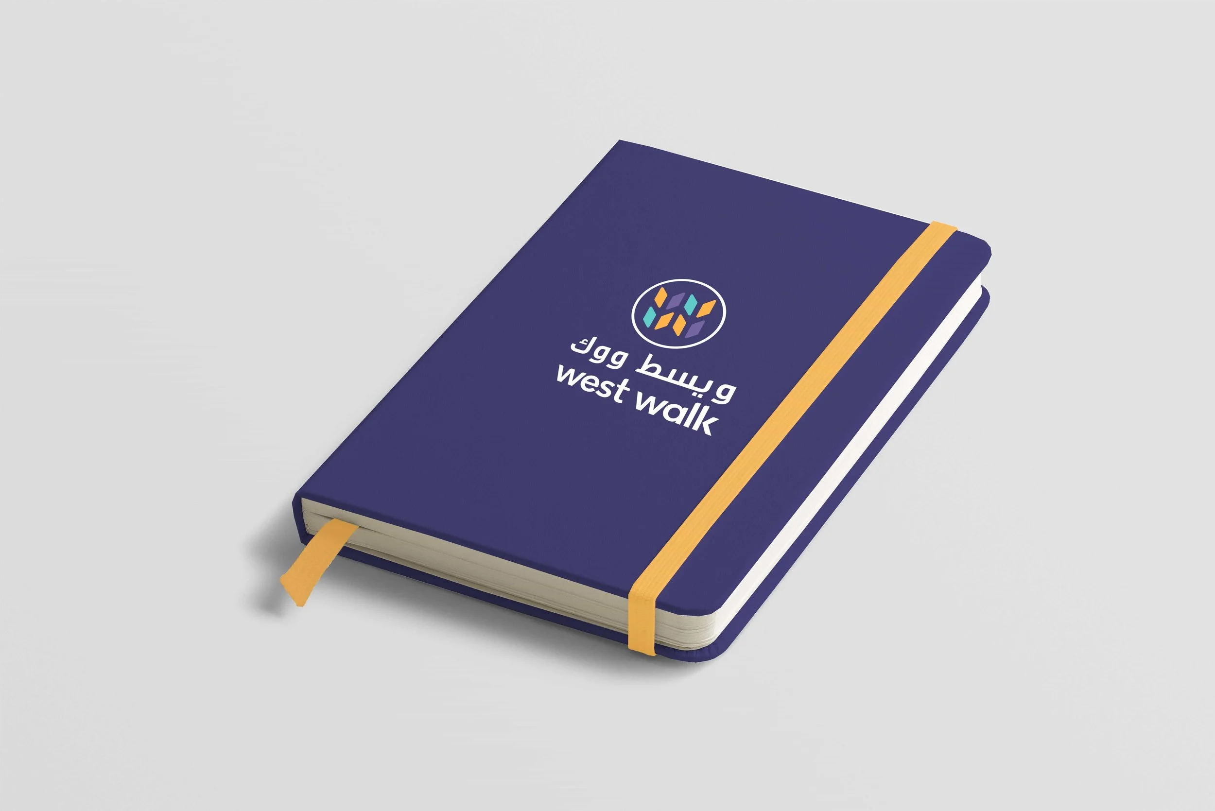
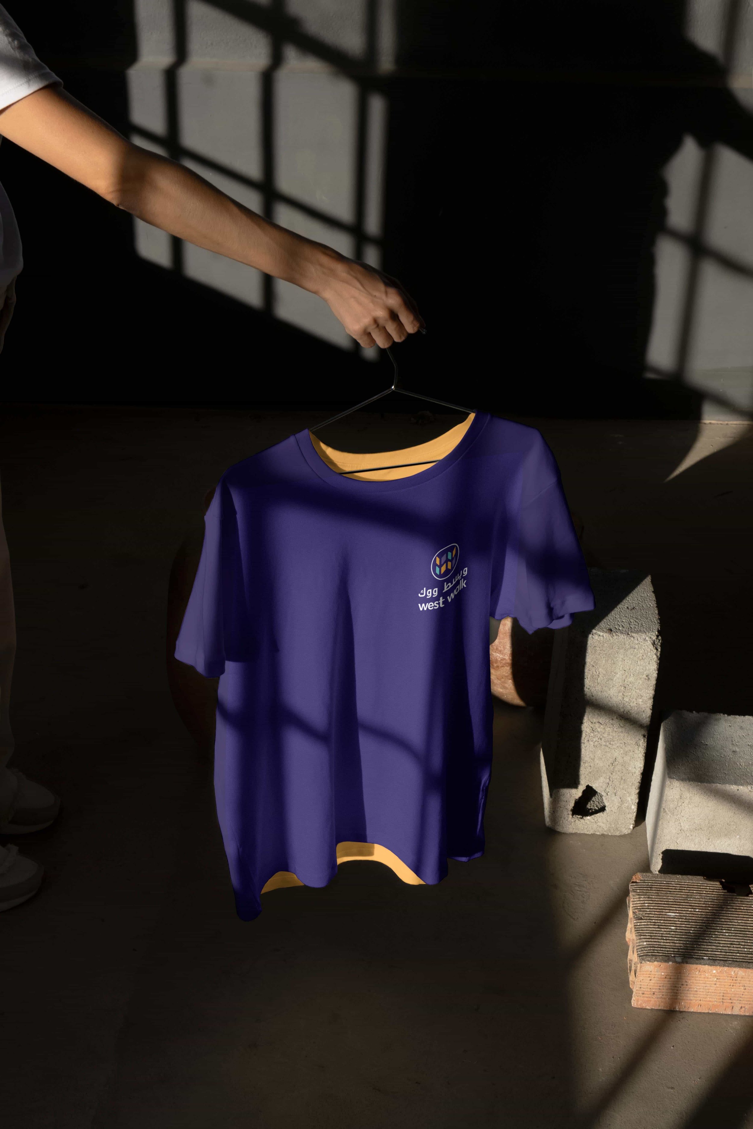
_We deliberately broke from the expected use of local colours, adopting deep purple paired with teal and tangerine across a stylised W graphic device — colours not typically associated with the region or the category.
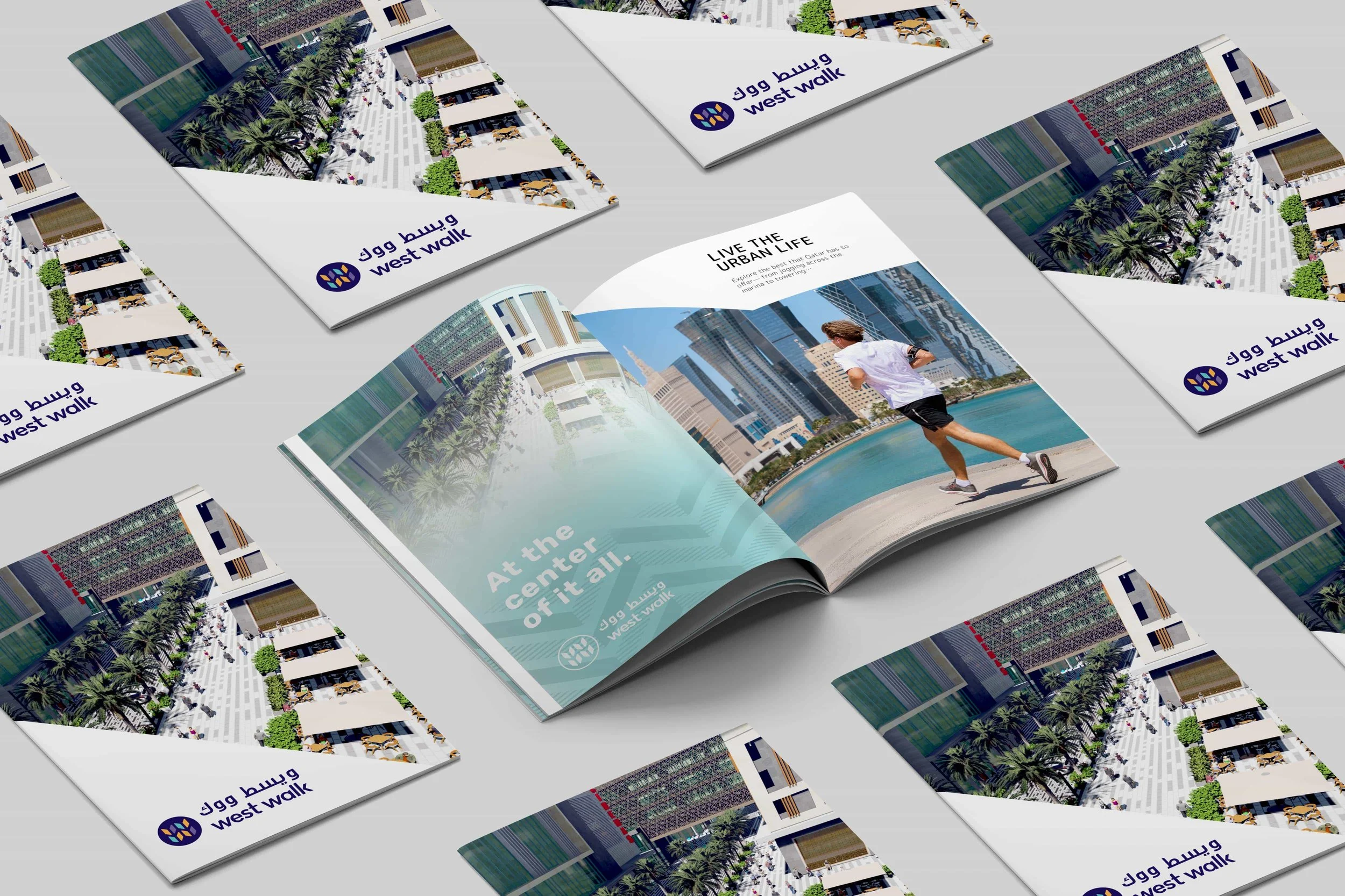
_We balanced the visual register so that the resulting identity reads as upbeat and sophisticated, quirky yet considered.
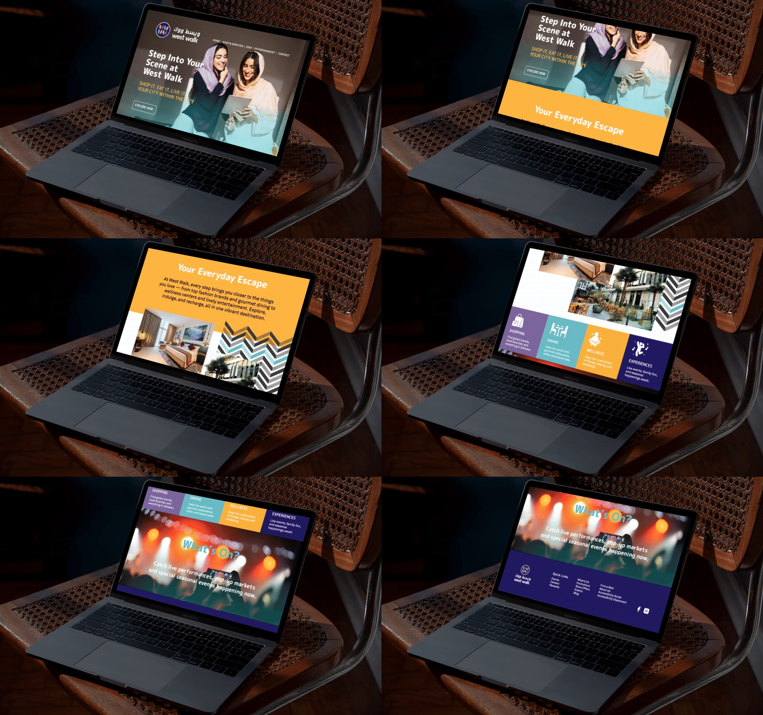
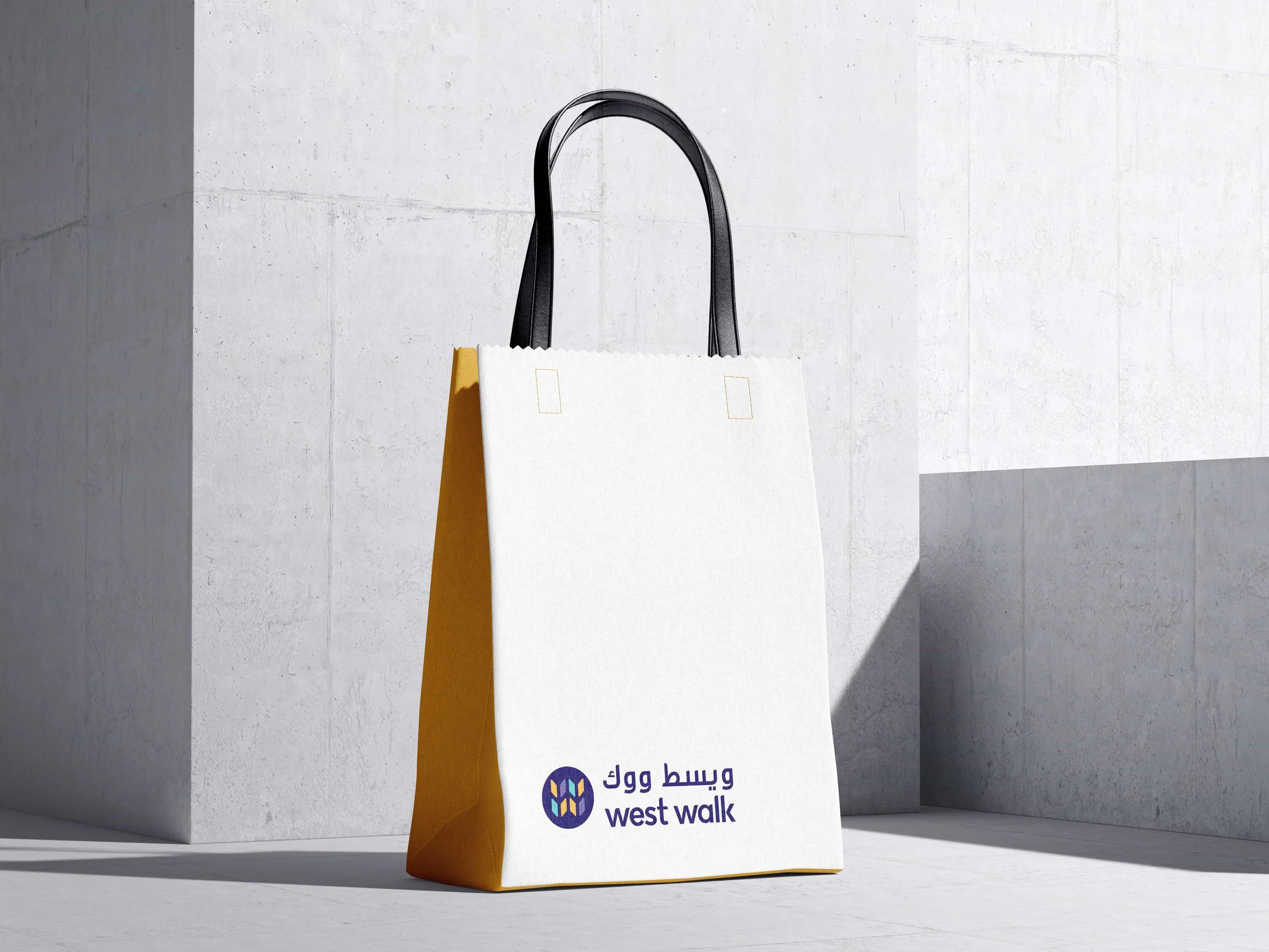
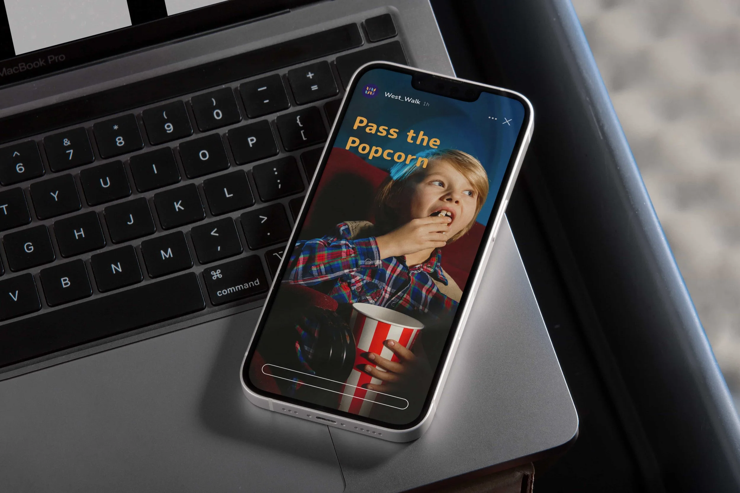
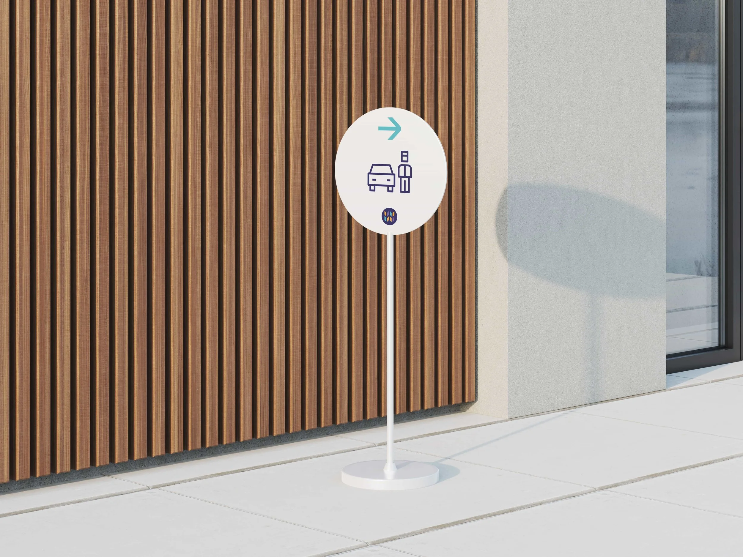
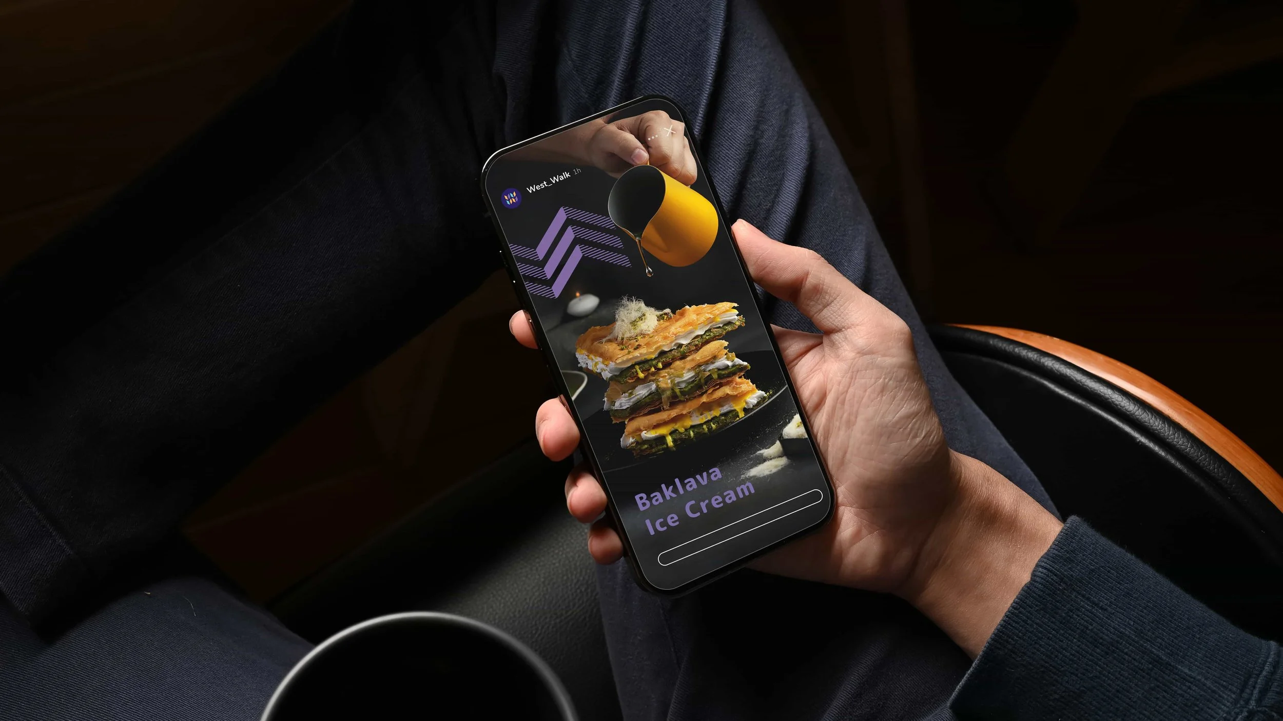
_We extended the identity across a complete suite of visitor touchpoints, including website and social media, magazine and marketing materials, signage, accessories and related merchandise.

The Outcome
The completed identity gives West Walk a confidently distinctive position within Doha's retail-and-lifestyle landscape — culturally rooted through the Ghitra reinterpretation, but unmistakably contemporary through the lowercase wordmark and unconventional colour palette. A destination brand that does the unusual thing of looking nothing like its competitors while still feeling completely of the place.
What We Delivered
Brand Strategy & Positioning
City-Wide & Regional Competitive Analysis
Visual Identity & Wordmark (All-Lowercase)
Qatari Ghitra Reinterpretation as Graphic Pattern
Stylised W Graphic Device
Colour System (Deep Purple, Teal, Tangerine)
Typography & Information Design
Brand Application Suite (Website, Social, Print, Signage, Merchandise)
Brand Guidelines & Implementation Support