
Vida Dubai Opera Residential Wayfinding
Vida Dubai Opera.
Sleek and vibrant wayfinding design for a downtown icon.
Creative Dialog delivered the wayfinding system for one of Emaar's most distinctive lifestyle-led residential towers.
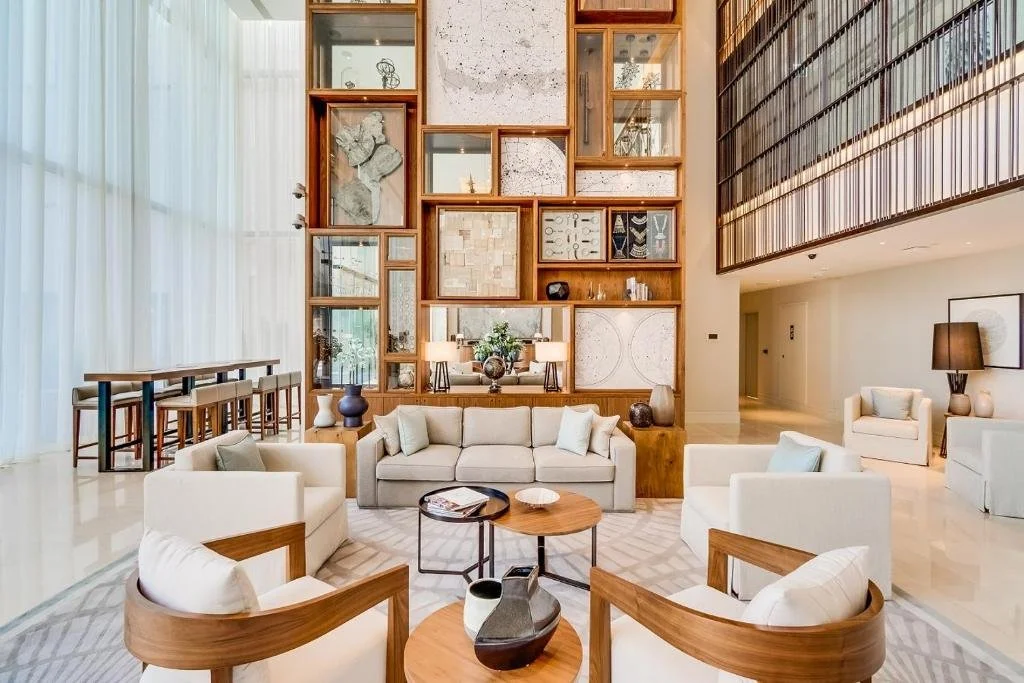
Drawing on the building's Art Deco architectural references and warm interior palette, the team designed a refined signage system that reads as furniture rather than infrastructure — quietly extending the Vida brand's design-forward sensibility into every resident touchpoint.
Expertise: Wayfinding Strategy, Signage Creative Design & Guidelines
Sectors: Hospitality, Residential
Location: Dubai, United Arab Emirates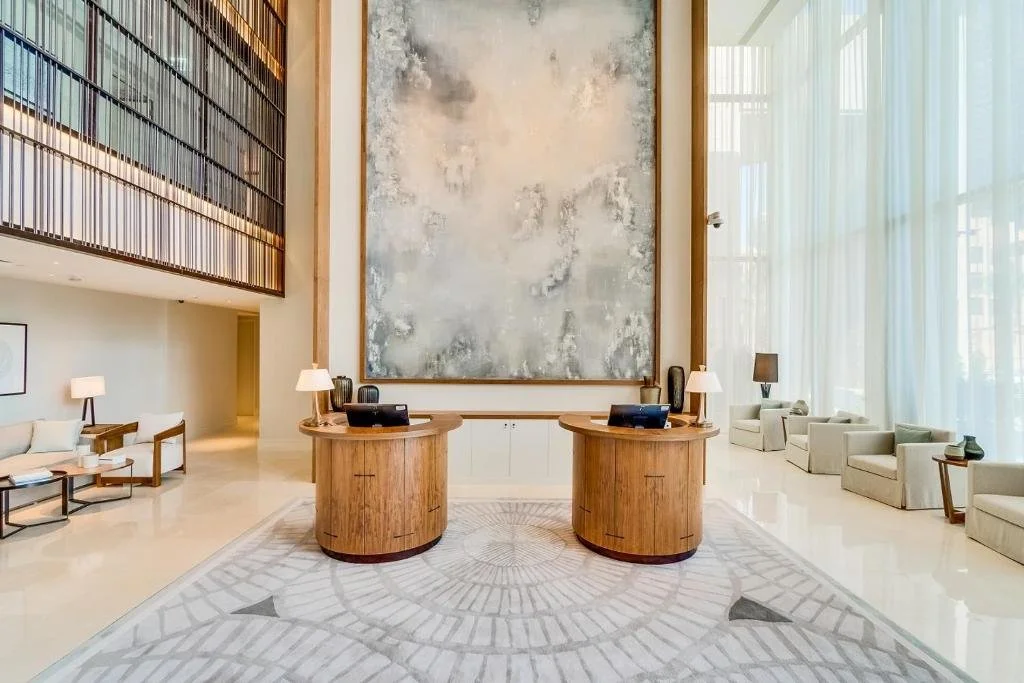
Objective
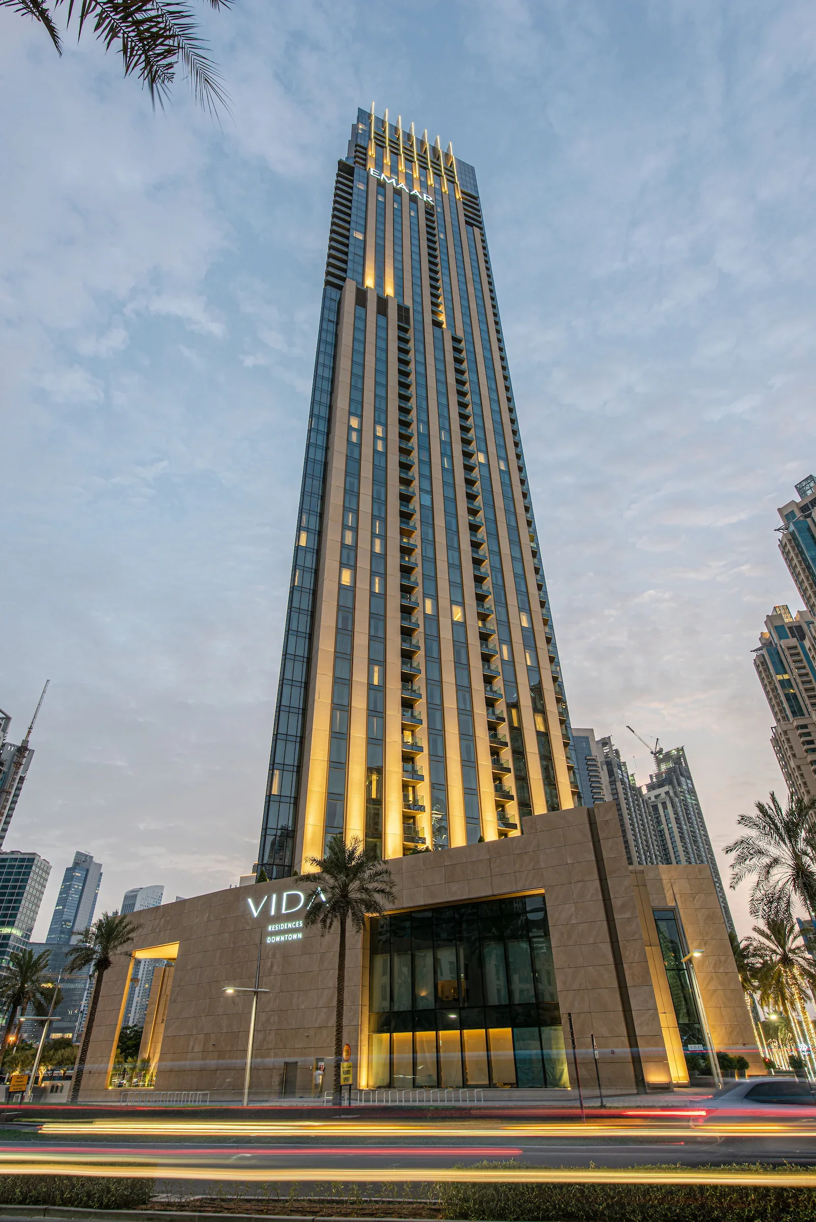
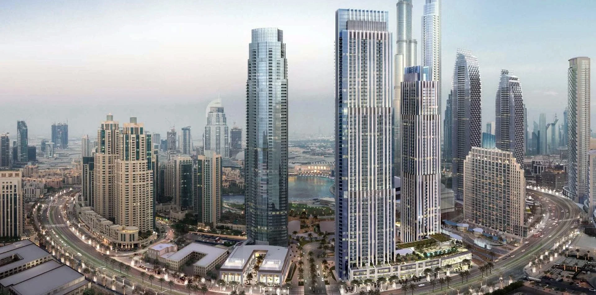
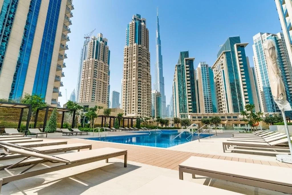
Vida Dubai Opera is a 60-storey serviced apartment tower developed by Emaar Properties in the heart of Downtown Dubai. Designed by NORR Group, the tower draws its architectural expression from a bold fusion of New York Art Deco references and contemporary Dubai design sensibility — a vertical composition of stone and glass that sits confidently among the district's iconic skyline, within direct sight of Burj Khalifa and the Dubai Fountain.
The development comprises approximately 335 fully furnished serviced apartments across one-, two-, three- and four-bedroom configurations, with penthouses occupying the uppermost floors. A three-storey podium houses extensive resident amenities — temperature-controlled swimming pool with Burj Khalifa views, fully equipped fitness centre, children's play area, barbecue terraces and business centre — while a dedicated air-conditioned glass travellator links the residences directly to the adjacent Vida hotel, extending hotel-grade services to apartment residents. Part of Emaar Hospitality Group's Vida Hotels & Resorts brand, the project targeted a design-conscious, cosmopolitan audience. Creative Dialog was appointed to deliver a wayfinding system that lived up to that ambition.
Our Approach
Creative Dialog approached the brief as a design coherence exercise — establishing a refined visual system rooted in the building's own material vocabulary rather than imposing a generic hospitality language. The goal was wayfinding that felt like part of the residential interior, not added on top.
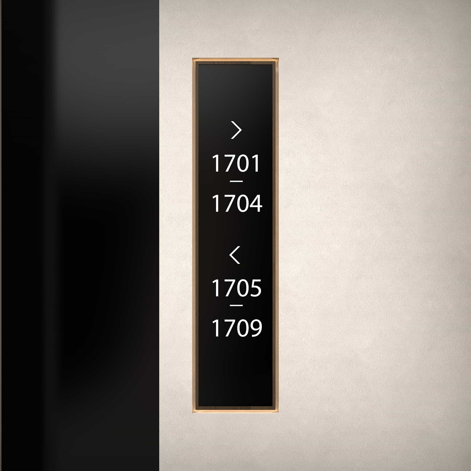
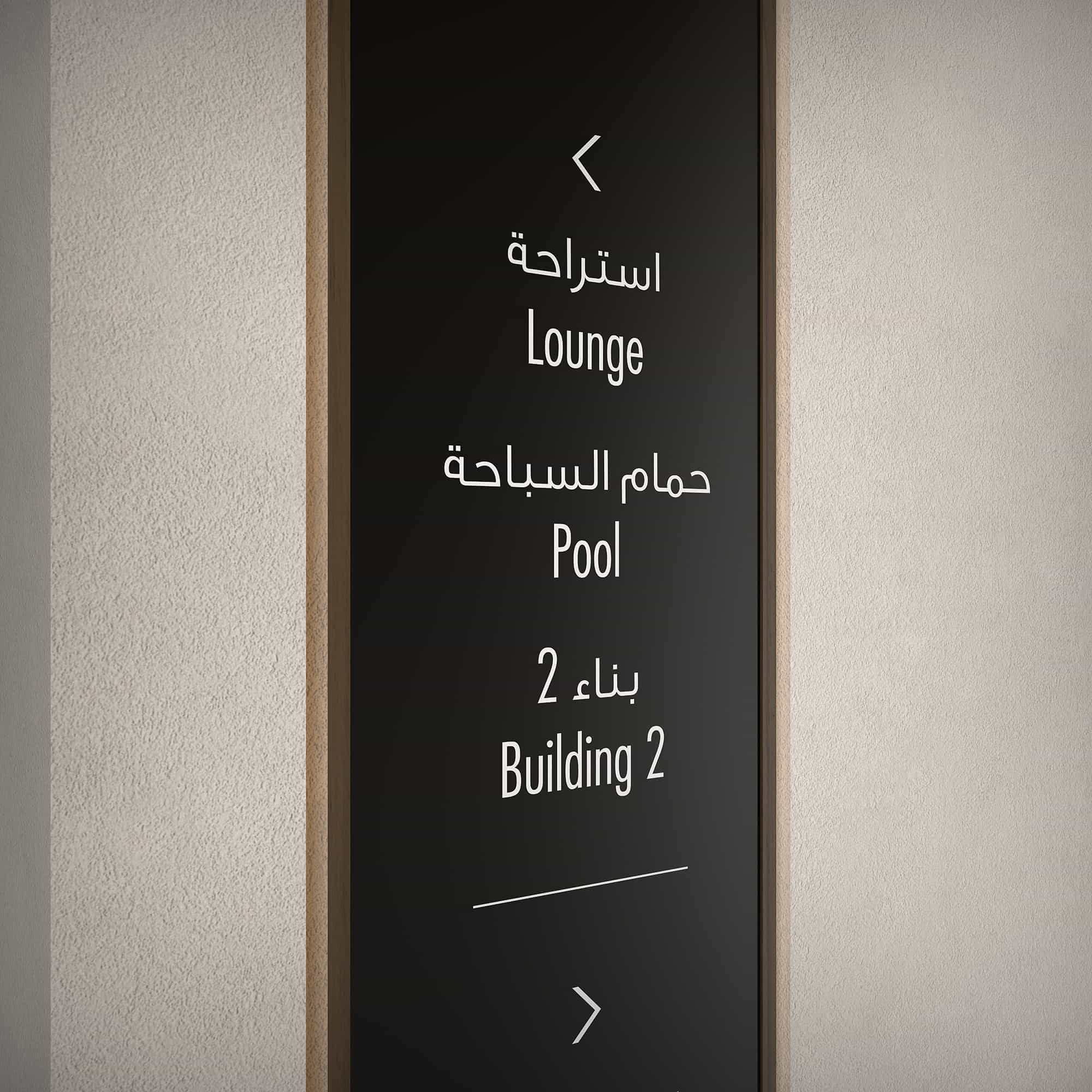
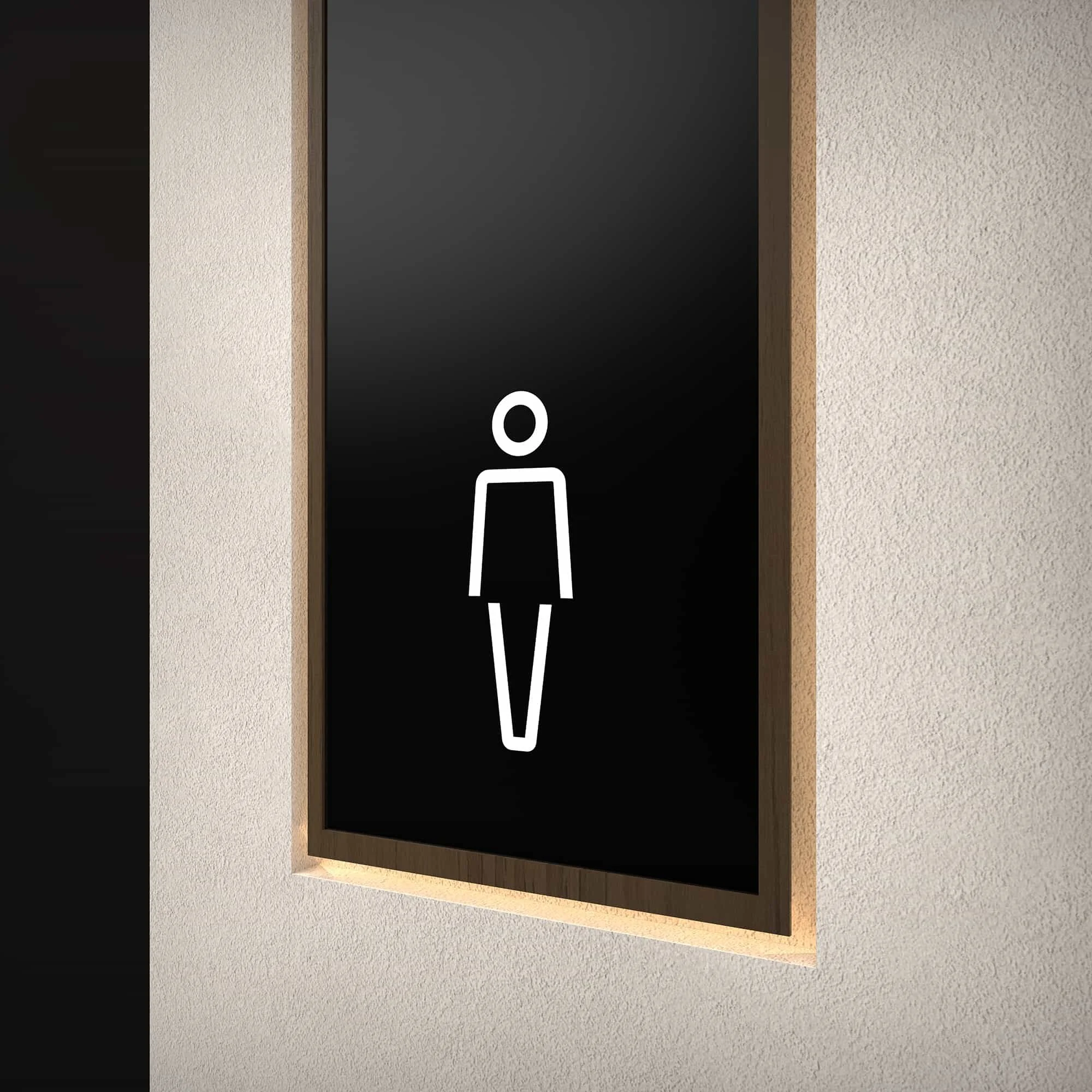
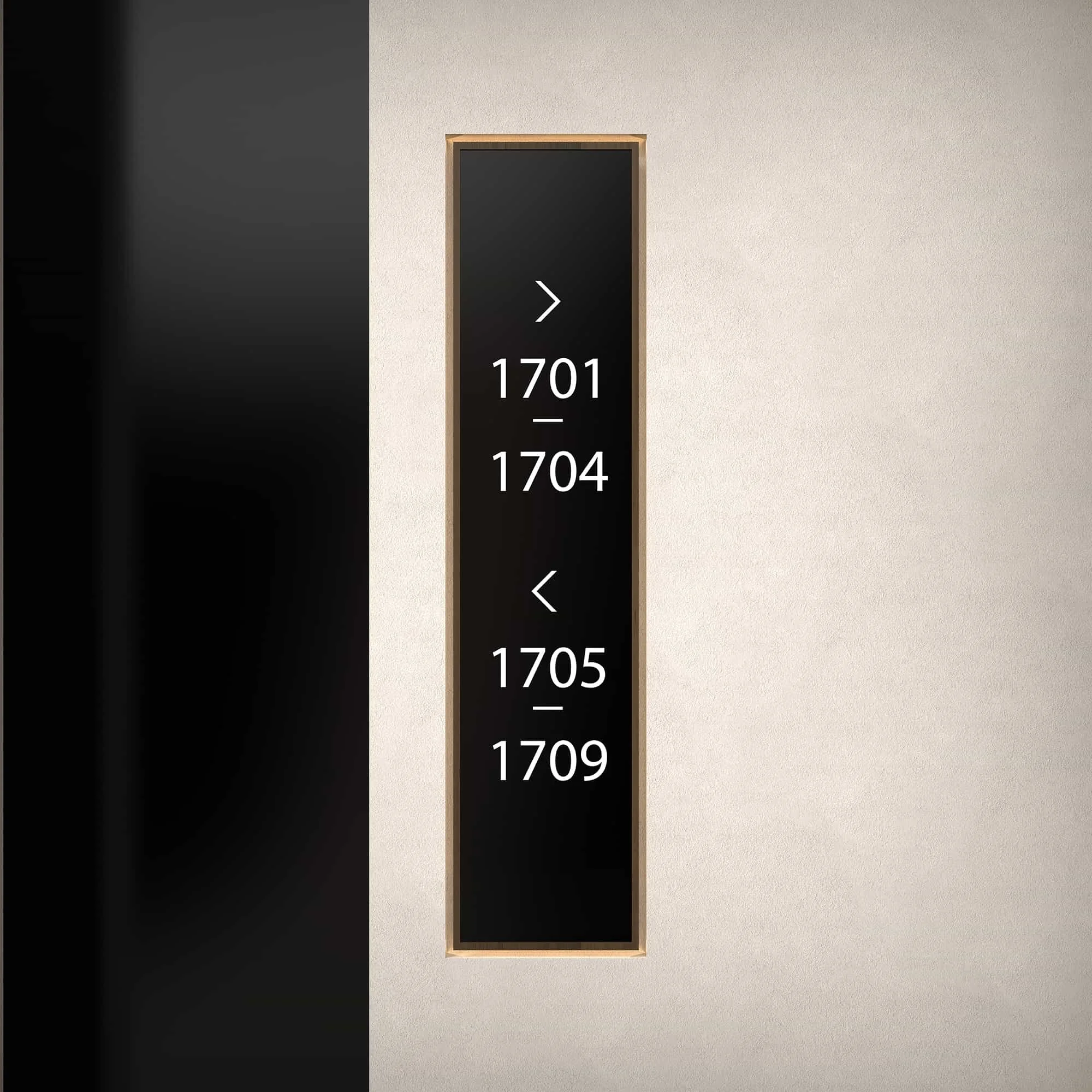
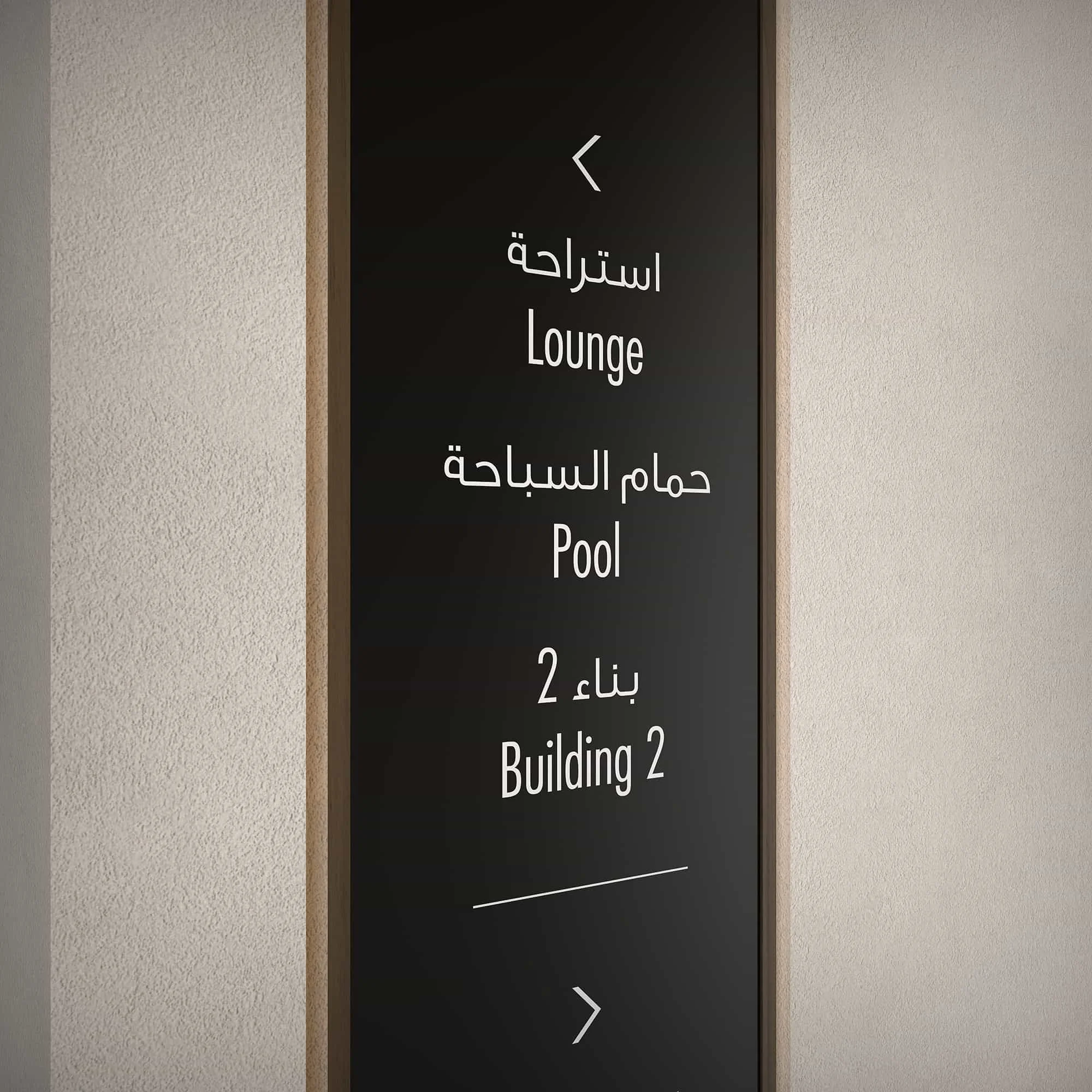
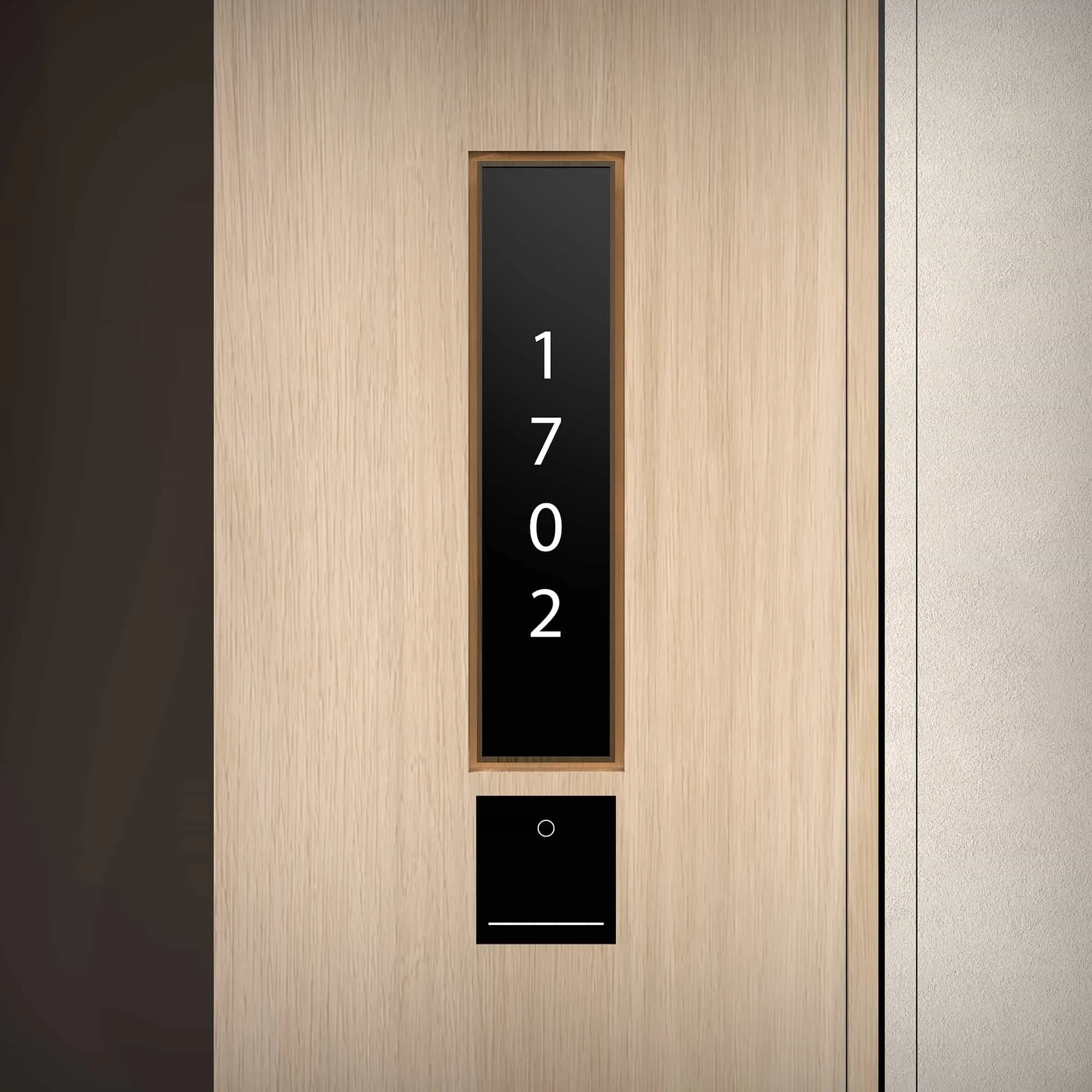
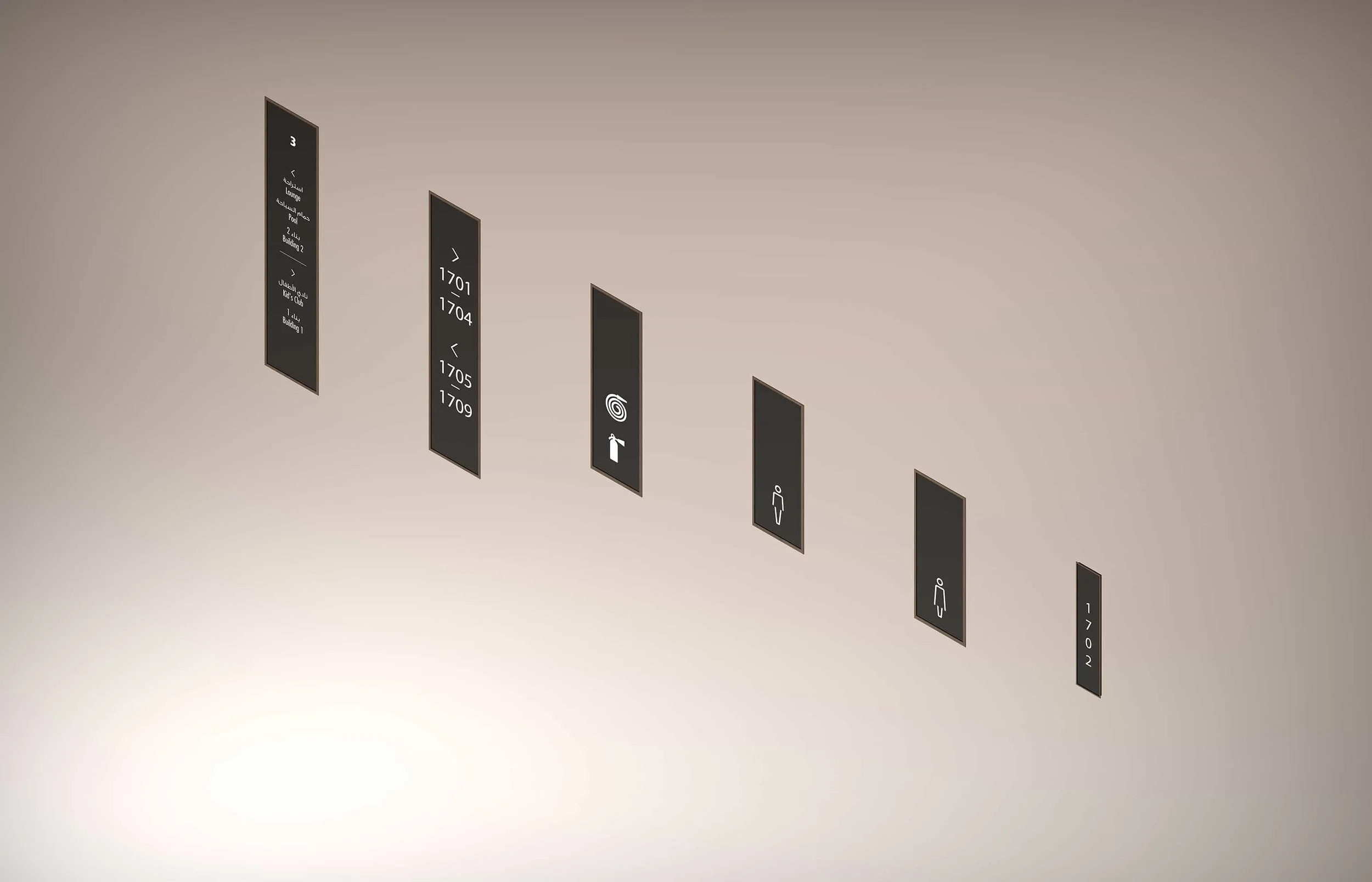
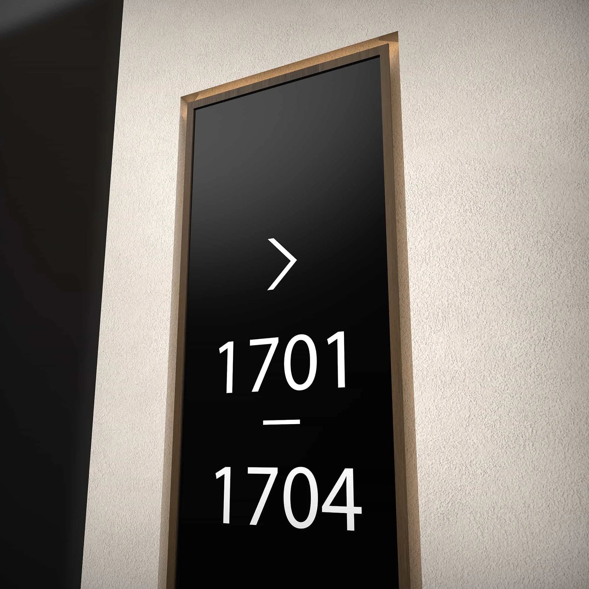
_We grounded the concept in dark, matte-finish sign panels paired with a warm, light wood-grain surround — directly echoing the interior palette of natural timber accents against the building's clean contemporary surfaces, so the kit of parts reads as furniture rather than infrastructure.
_We rendered sign faces in deep charcoal with white typography and custom pictograms, providing strong contrast for immediate legibility.
_We managed the bilingual Arabic–English hierarchy cleanly across all sign types, with Arabic positioned above English to reflect regional convention.
_We applied a consistent chevron directional language — simple, geometric and aligned to the tower's modern aesthetic — for visual consistency at every decision point.
_We scaled the system across three primary types: floor-level directories presenting the level number prominently above grouped destinations; corridor directional signs in a vertical format guiding residents toward room number ranges; and individual unit identification plates discreetly integrated into apartment doors with the four-digit room number in a stacked vertical arrangement.
_We delivered the system with comprehensive signage guidelines to ensure consistency across the building and future-proof the system for the operator.
The Outcome
The overall programme delivers wayfinding that is precise and functional while maintaining the understated, design-forward sensibility that defines the Vida brand. The kit of parts integrates so seamlessly with the residential interiors that it operates almost as part of the furniture — fully present where needed, never overstated. A subtle design layer that supports the brand without ever stealing the room.
What We Delivered
Wayfinding Strategy & Concept Design
Bilingual Arabic–English Sign Family (Primary, Secondary, Tertiary)
Floor-Level Directory Signage
Corridor & Room Identification System
Unit Identification Plates
Typography & Pictogram System
Signage Design Guidelines & Implementation Documentation