
Boka Place Porto Montenegro Mixed-Use Wayfinding
Boka Place.
Sophisticated wayfinding design meets waterfront luxury in Tivat.
Creative Dialog designed the wayfinding system for the flagship mixed-use development at Porto Montenegro.
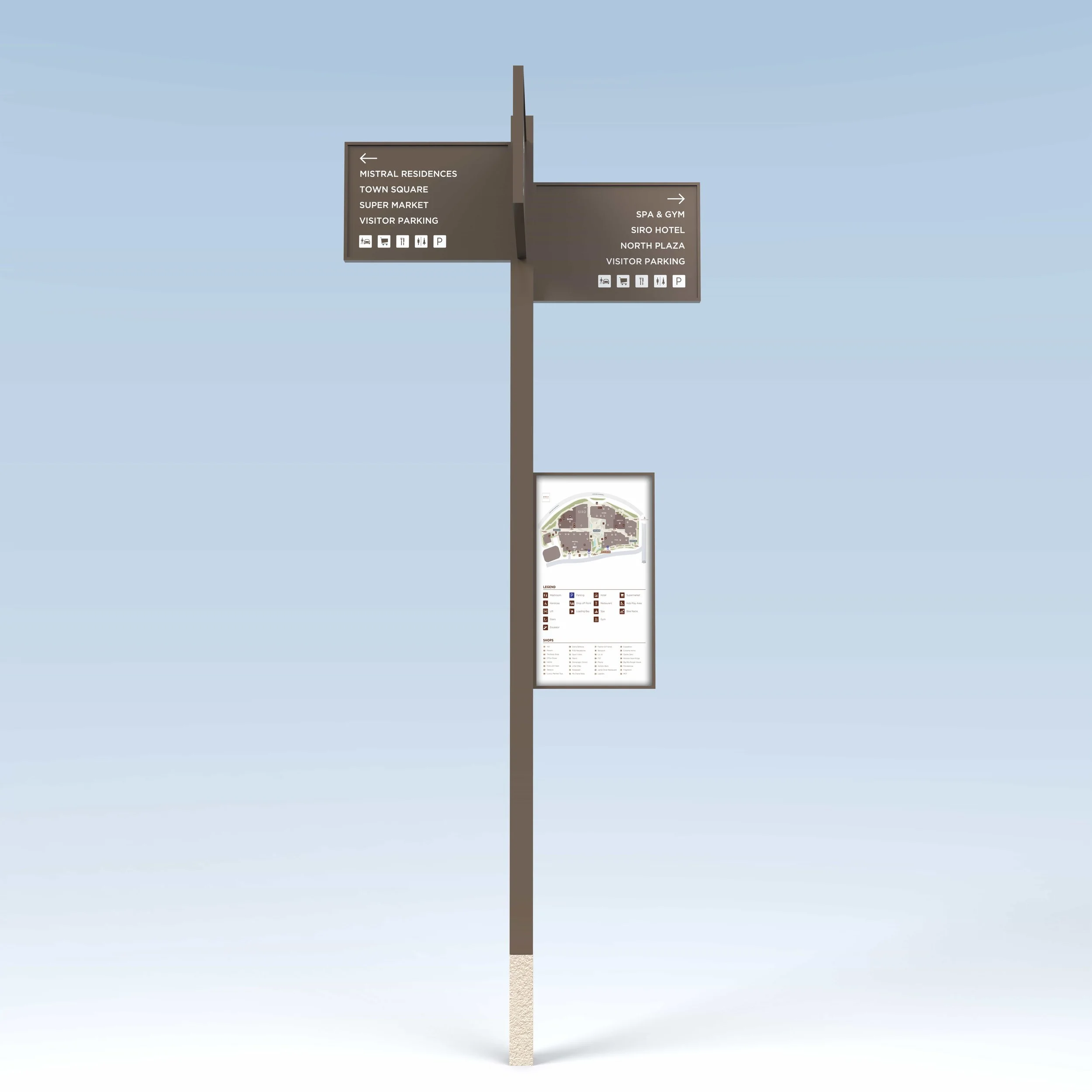
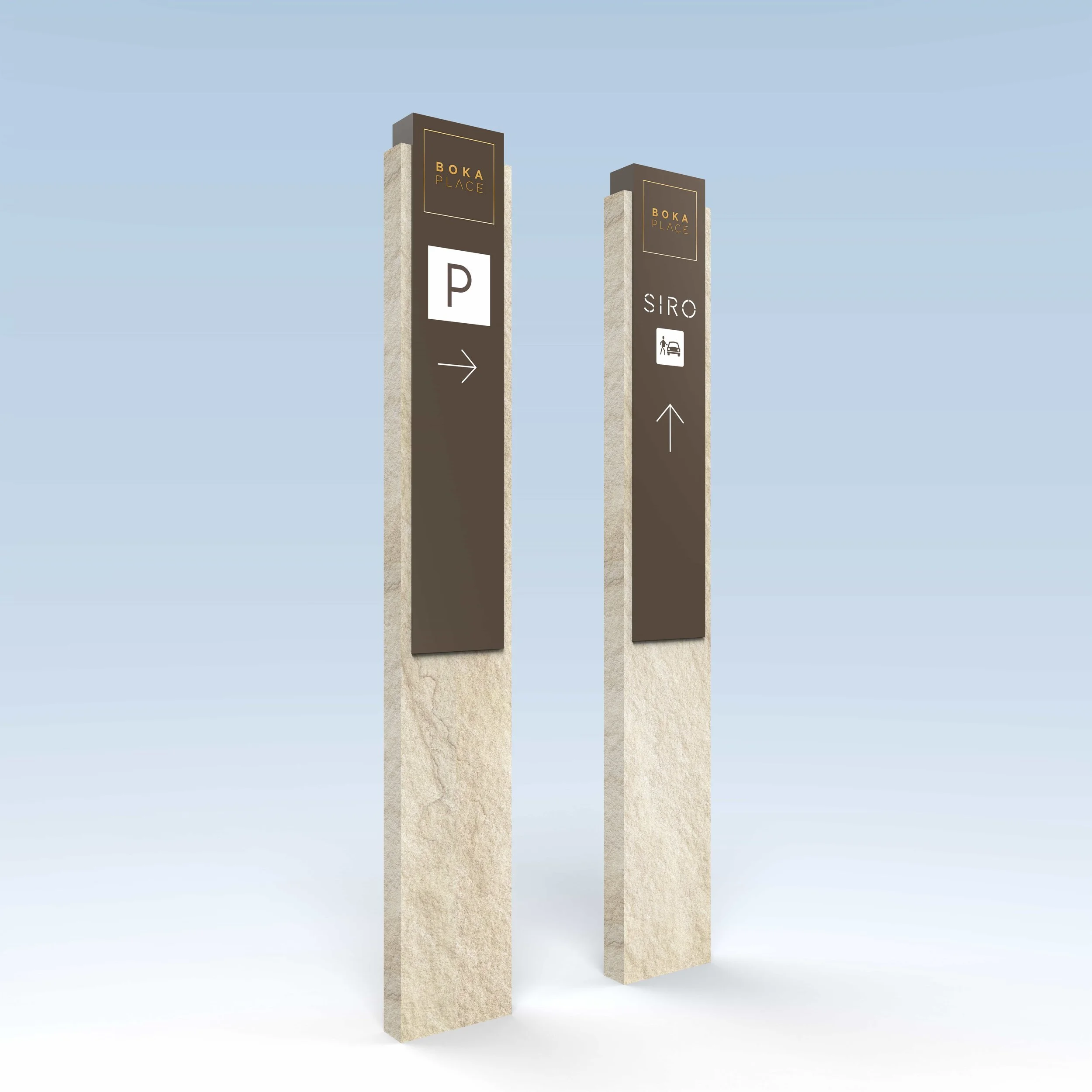
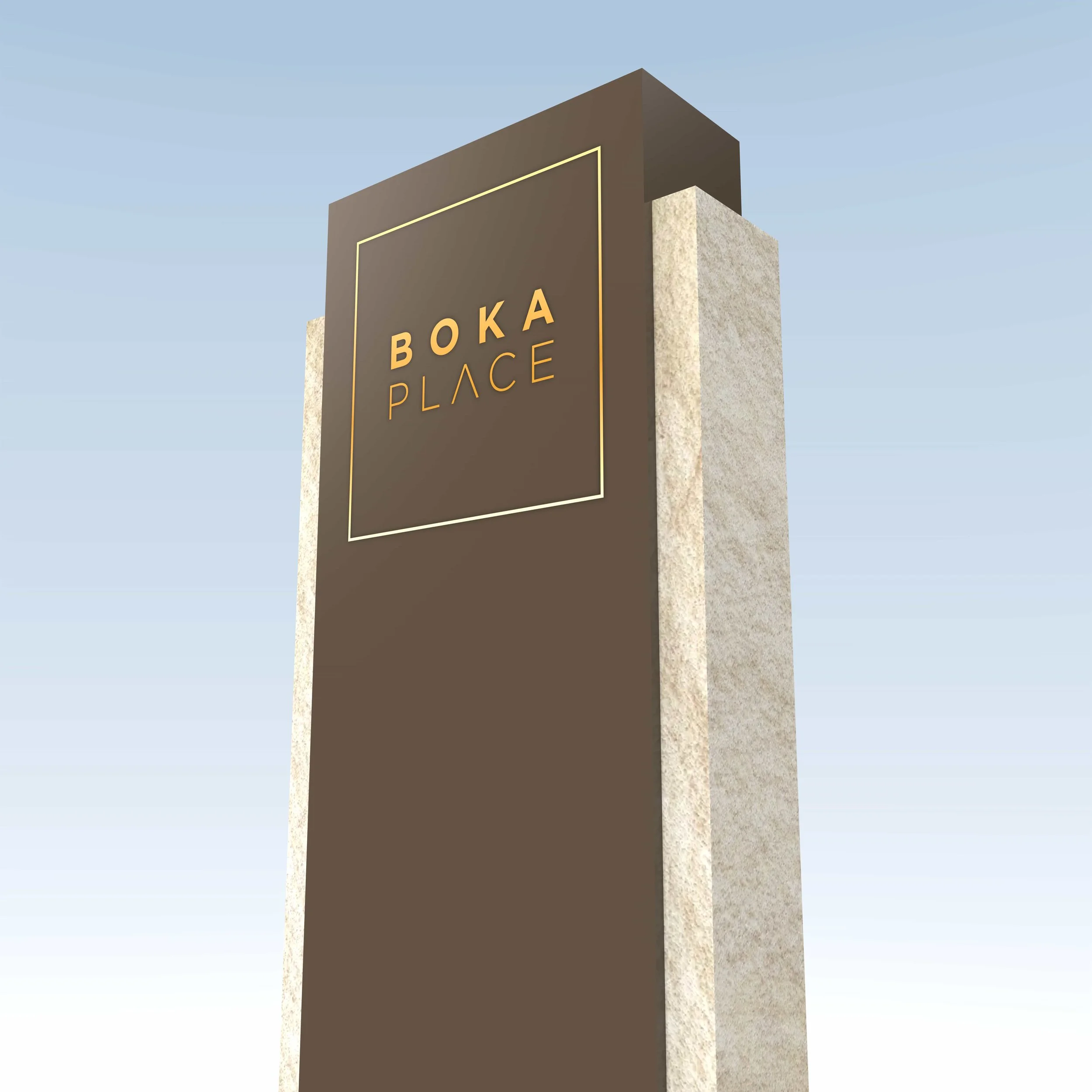
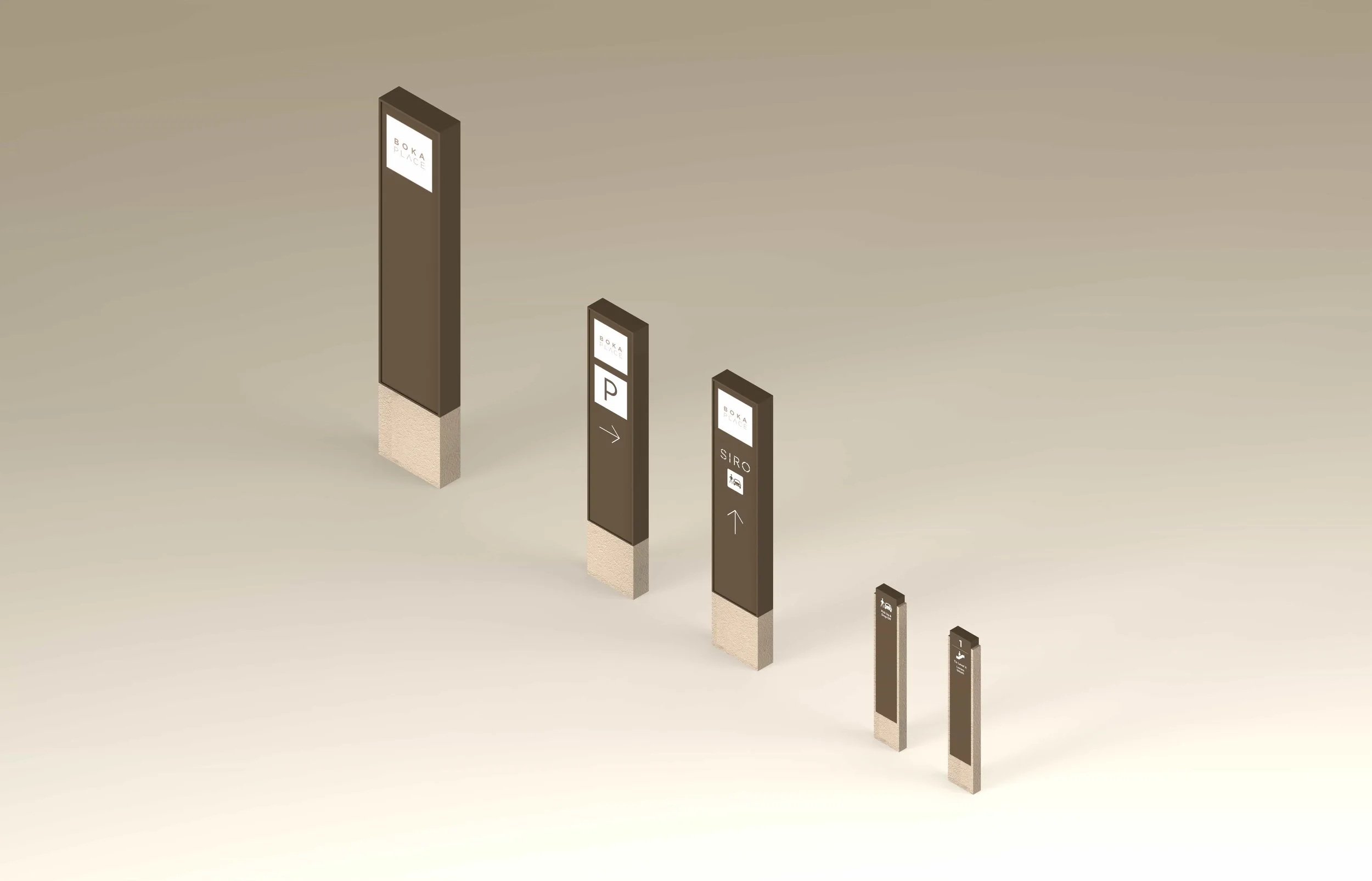
Drawing on the architectural vernacular of the destination and a sophisticated material palette of engineered sandstone and anodised aluminium, the team delivered a navigation system that reads as part of the fabric of the place — highly functional, intuitive and unmistakably Adriatic.
Expertise: Wayfinding Strategy, Signage Design + Implementation
Sectors: Mixed-Use, Residential, Tourism
Location: Tivat, Porto Montenegro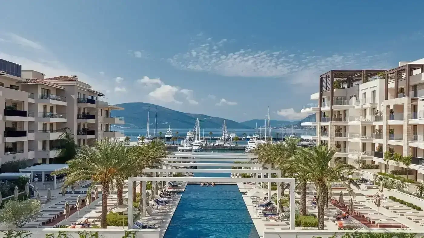
Objective
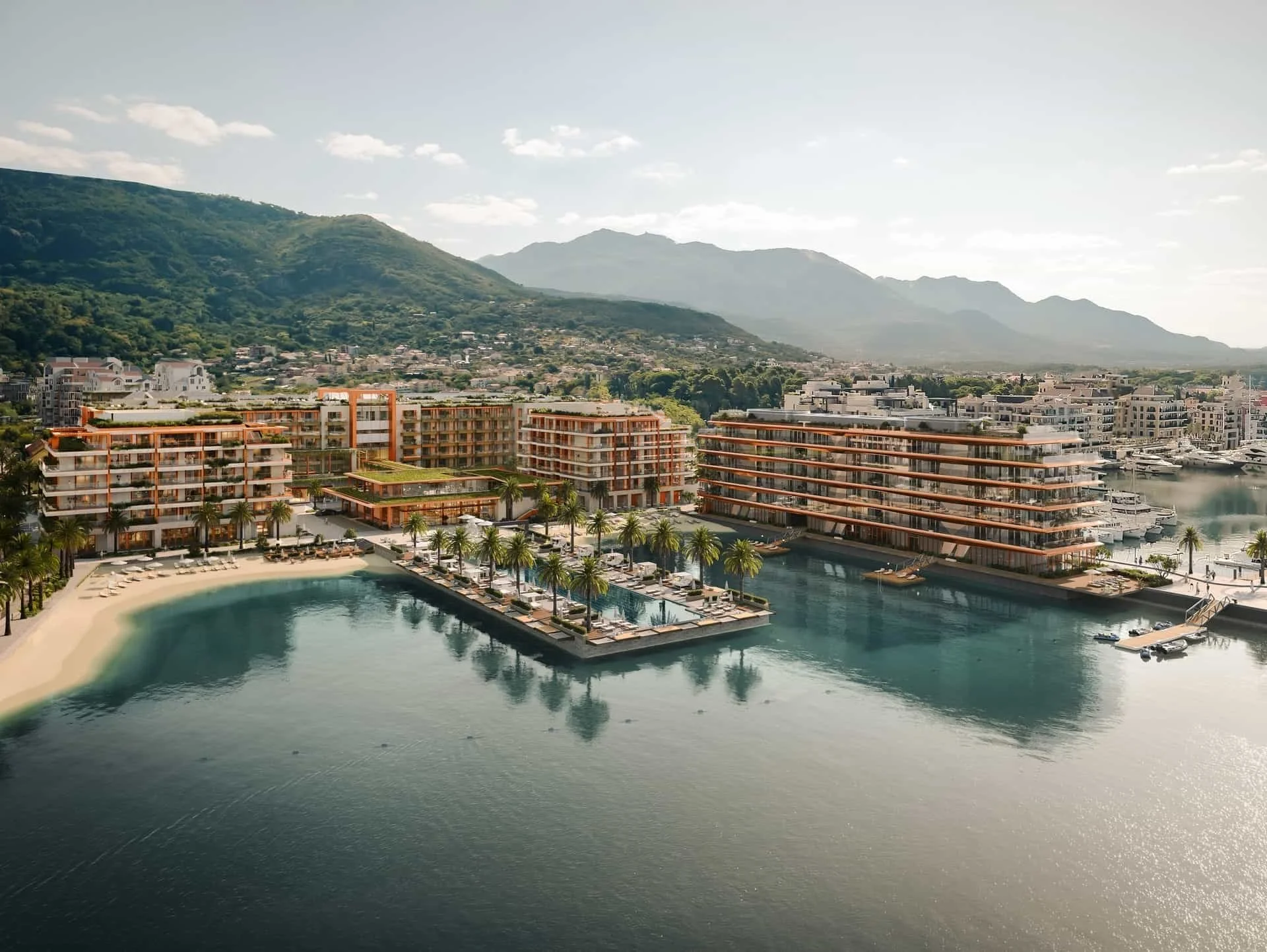
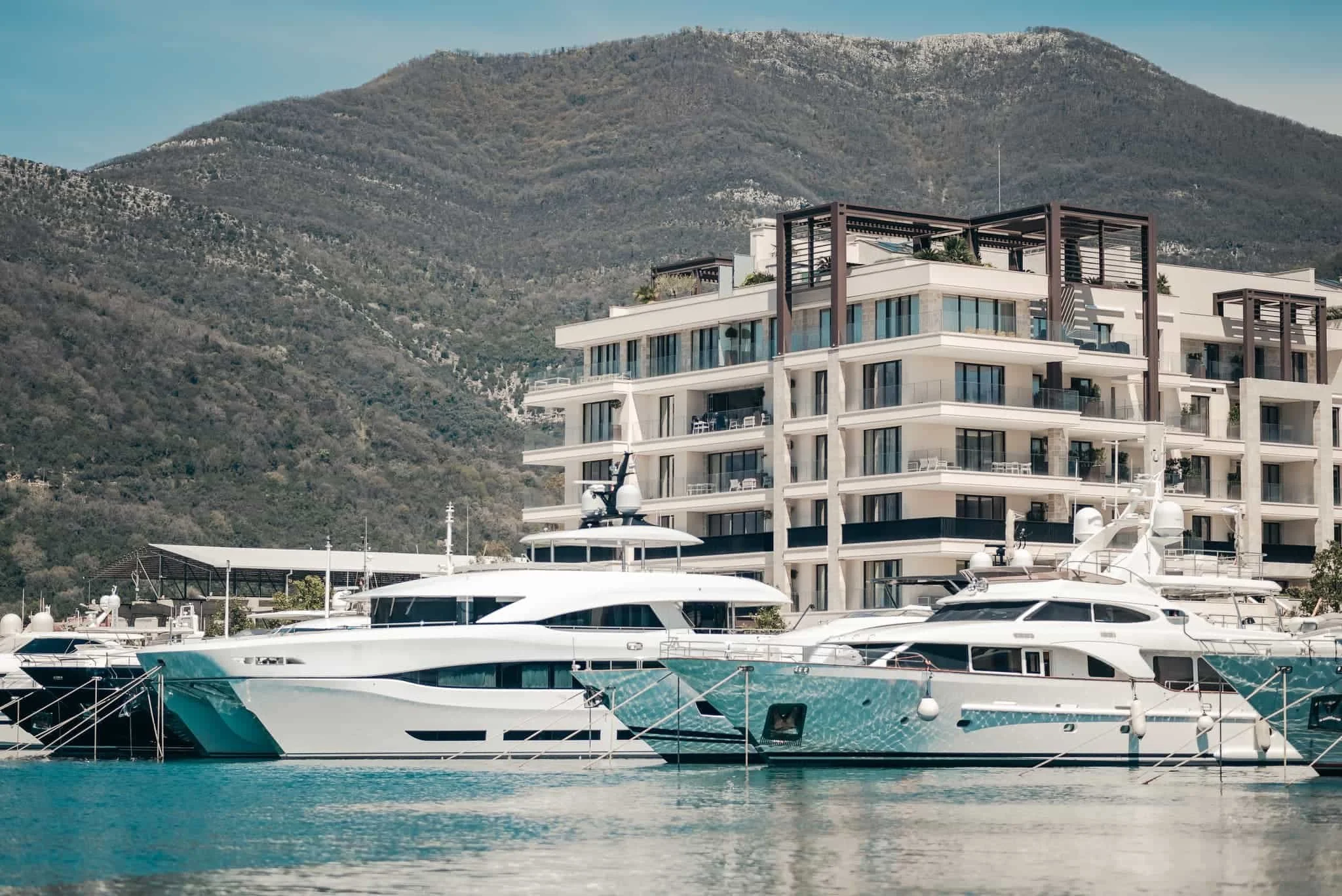
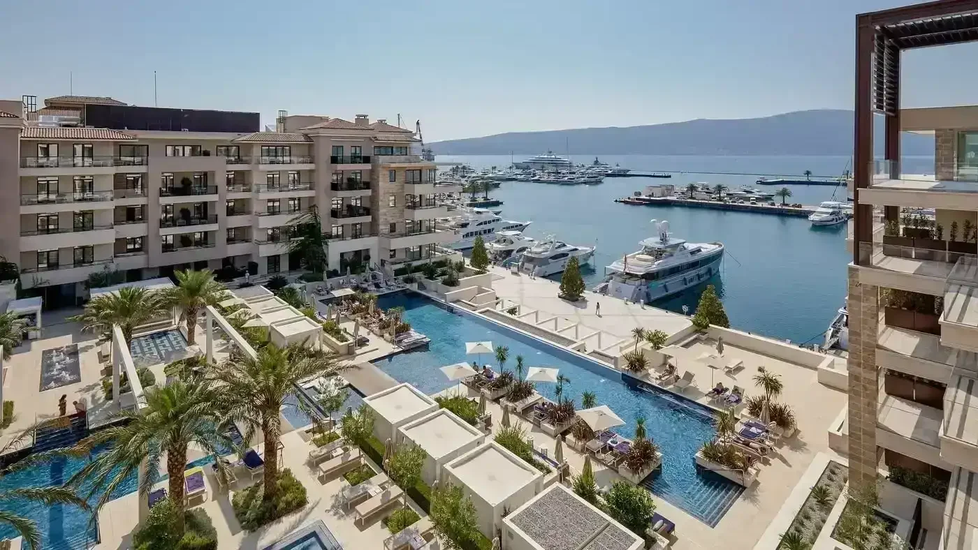
Boka Place is the flagship mixed-use development of Porto Montenegro — an idyllic Adriatic location in southern Europe where upscale living meets aspirational shopping and dining. The destination combines a SIRO Hotel and SIRO serviced apartments with Boka Place Living, private residences, specialist shops, galleries and eateries clustered around a central square, alongside a lively market and food hall and a three-screen experience cinema.
Creative Dialog was appointed to enhance the visitor experience while respecting and embellishing the Boka Place brand, identifying an opportunity to provide a strong point of difference for the destination through a wayfinding programme that is highly contextual and matches the aspiration of the development.
Our Approach
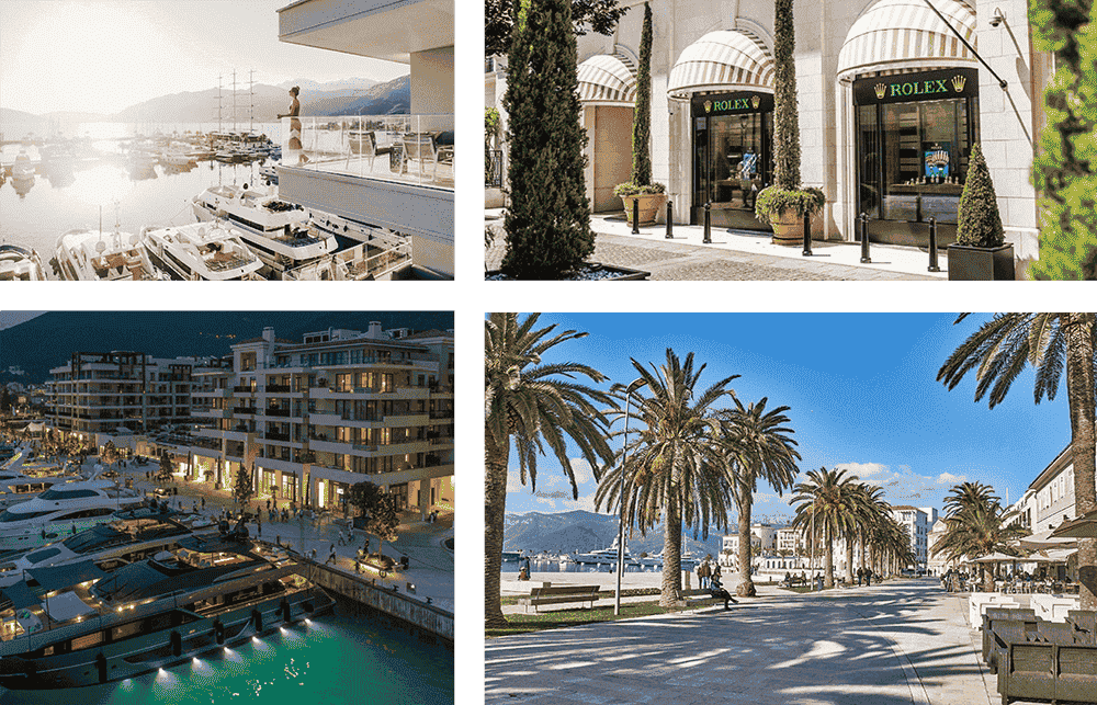
Creative Dialog approached the brief as both a contextual response and a brand reinforcement exercise — recognising that wayfinding for a small but complex Adriatic destination required different design language to the firm's GCC portfolio. The goal was a system that looked as though it had always been part of the place.
_We took a very close look at the navigational requirements of a relatively small but complex site, combining the learnings with a sophisticated materials palette.
_We took cues directly from the architectural vernacular of the destination, ensuring the signage felt born of the place rather than imported into it.
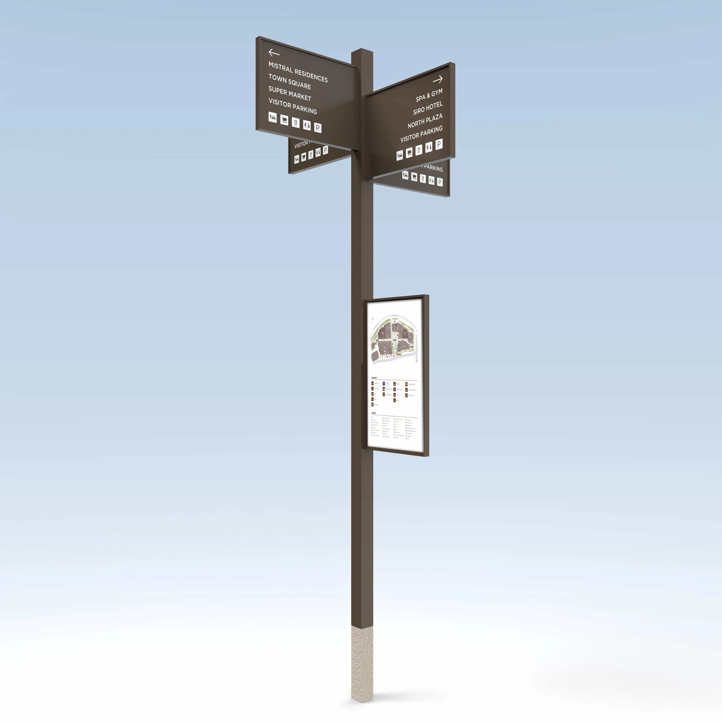
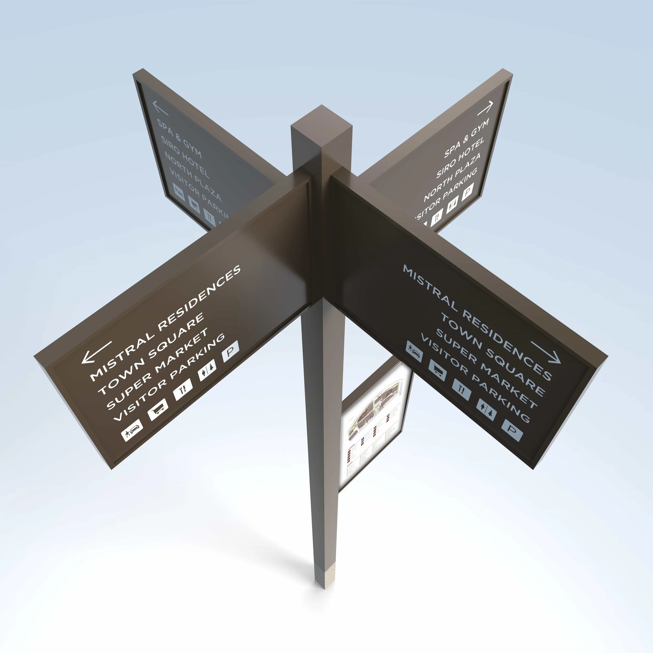
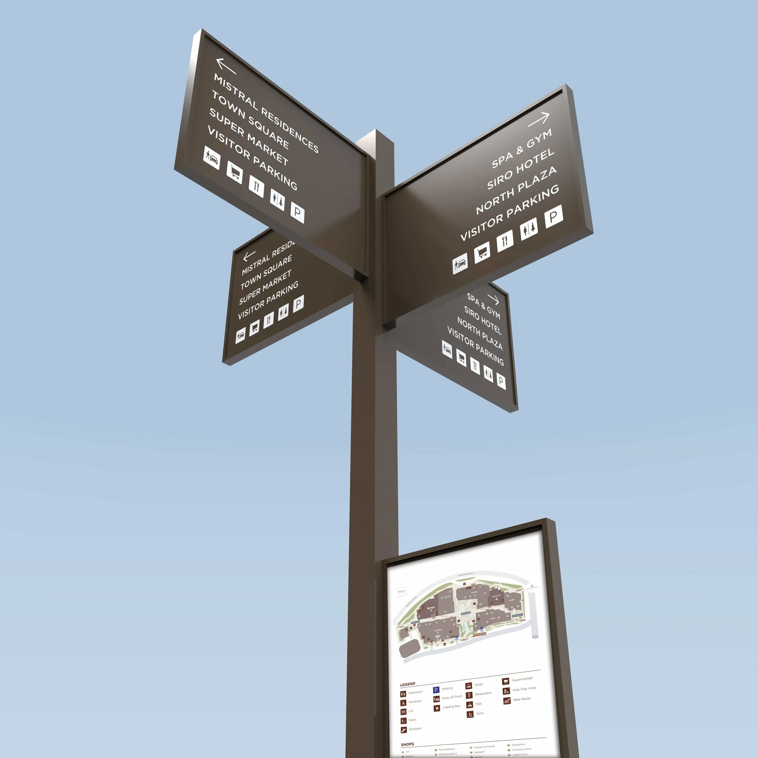
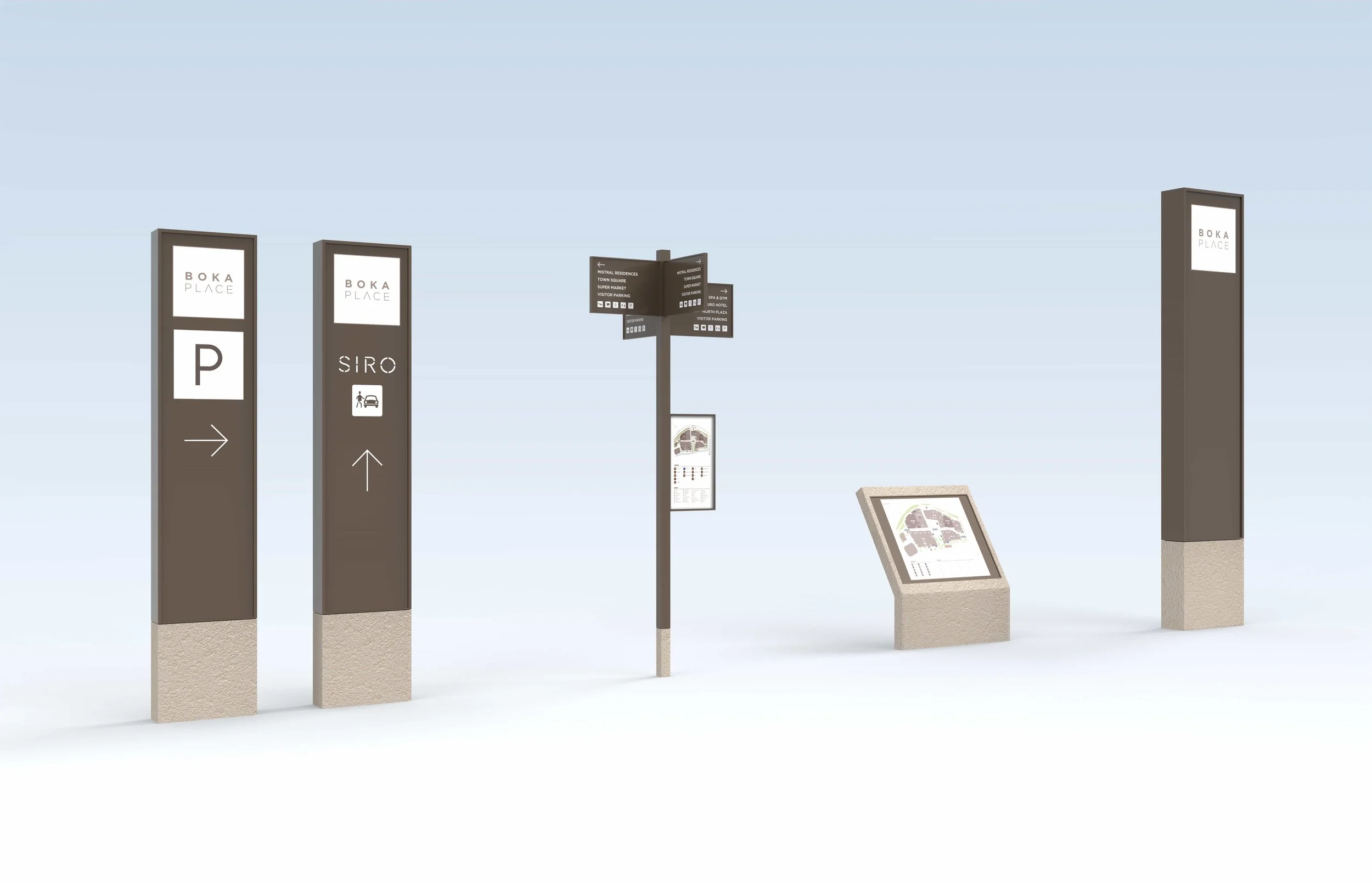
_We adopted a pared-back, minimalist style that combines engineered sandstone with beautifully anodised, formed aluminium signage faces.
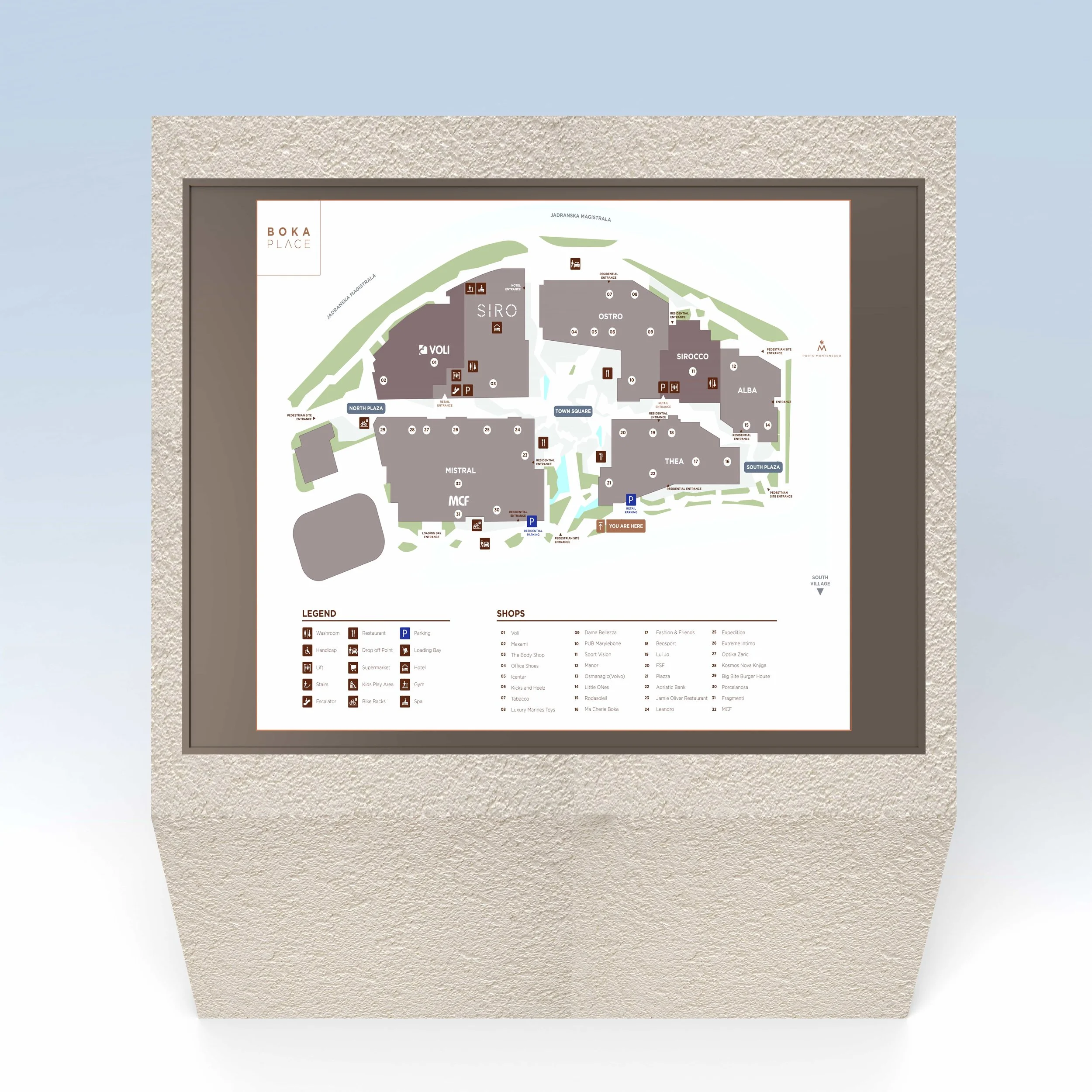
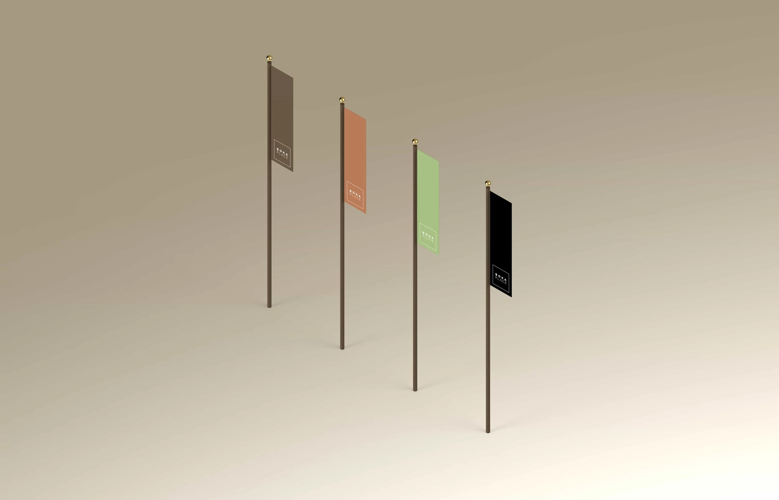
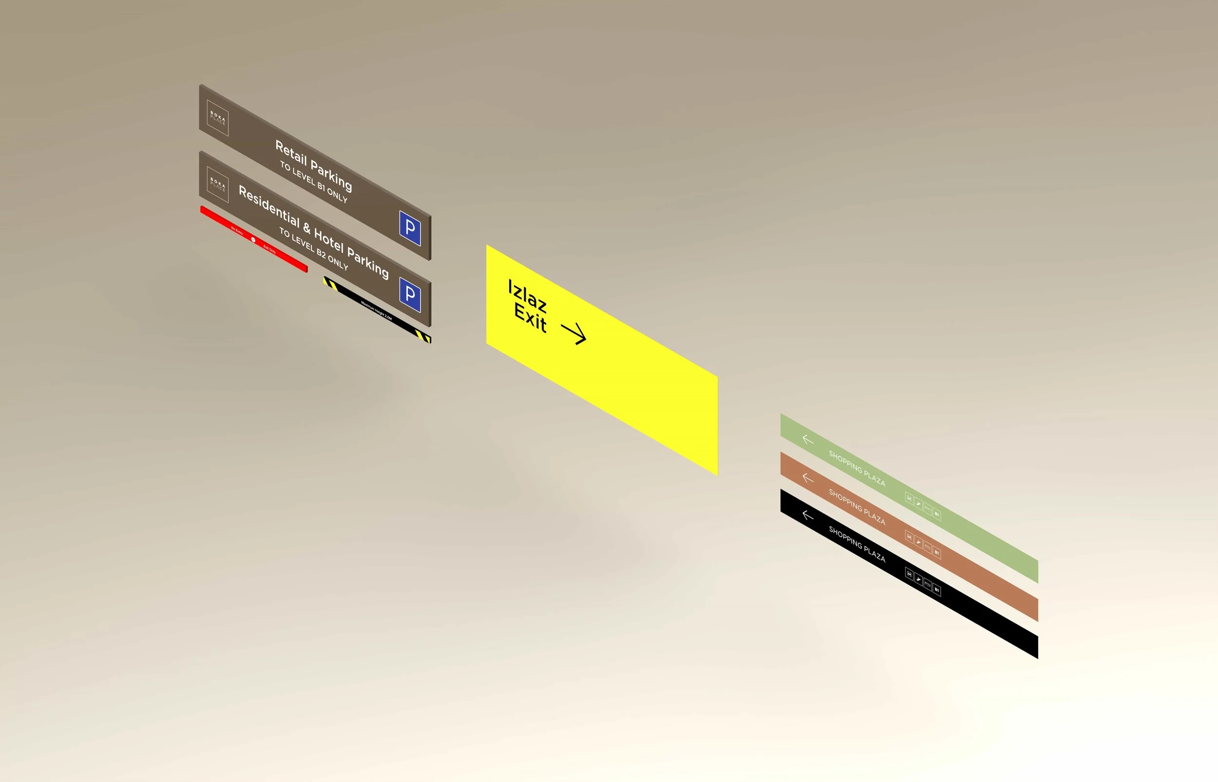
_We developed elegant graphics, a bespoke set of pictograms and a custom-designed orientation map applied across a tactical wayfinding toolkit.
_We delivered a signage family that is not only highly functional but intuitive — one that looks like part of the fabric of the destination, rather than something applied to it.
_We documented the complete kit of parts ready for fabrication and on-site implementation across the venue's central square, market, food hall, retail clusters and hospitality components.
The Outcome
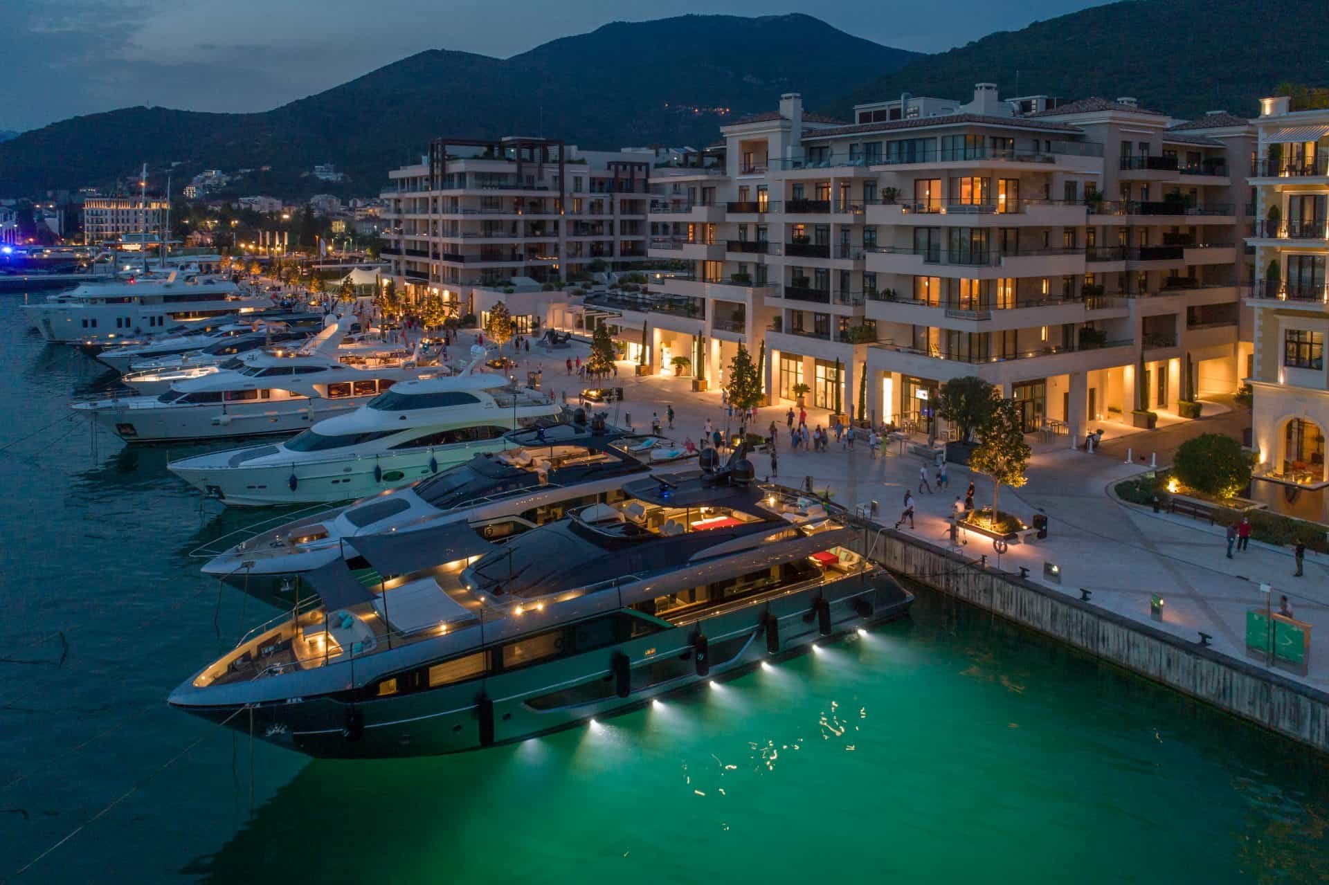
The completed wayfinding programme delivers a signage system unmistakably tied to Boka Place — material-rich, contextually anchored and quietly confident. The combination of engineered sandstone and anodised aluminium speaks the language of the architecture; the bespoke orientation tools handle the complexity of a small-but-dense waterfront destination. A wayfinding strategy that reads as part of the place rather than applied to it.
What We Delivered
Wayfinding Strategy & Concept Design
Site Navigation Analysis
Engineered Sandstone & Anodised Aluminium Sign Family
Bespoke Pictogram System
Custom Orientation Map & Tactical Wayfinding Toolkit
Bilingual Signage Hierarchy
Technical Documentation & Implementation Support