
Arada The Nest Student Community Wayfinding.
Arada The Nest Sharjah.
A radical wayfinding reset for the Middle East's premier student community.
Creative Dialog redesigned the wayfinding for the Middle East's premier student accommodation complex from the ground up.
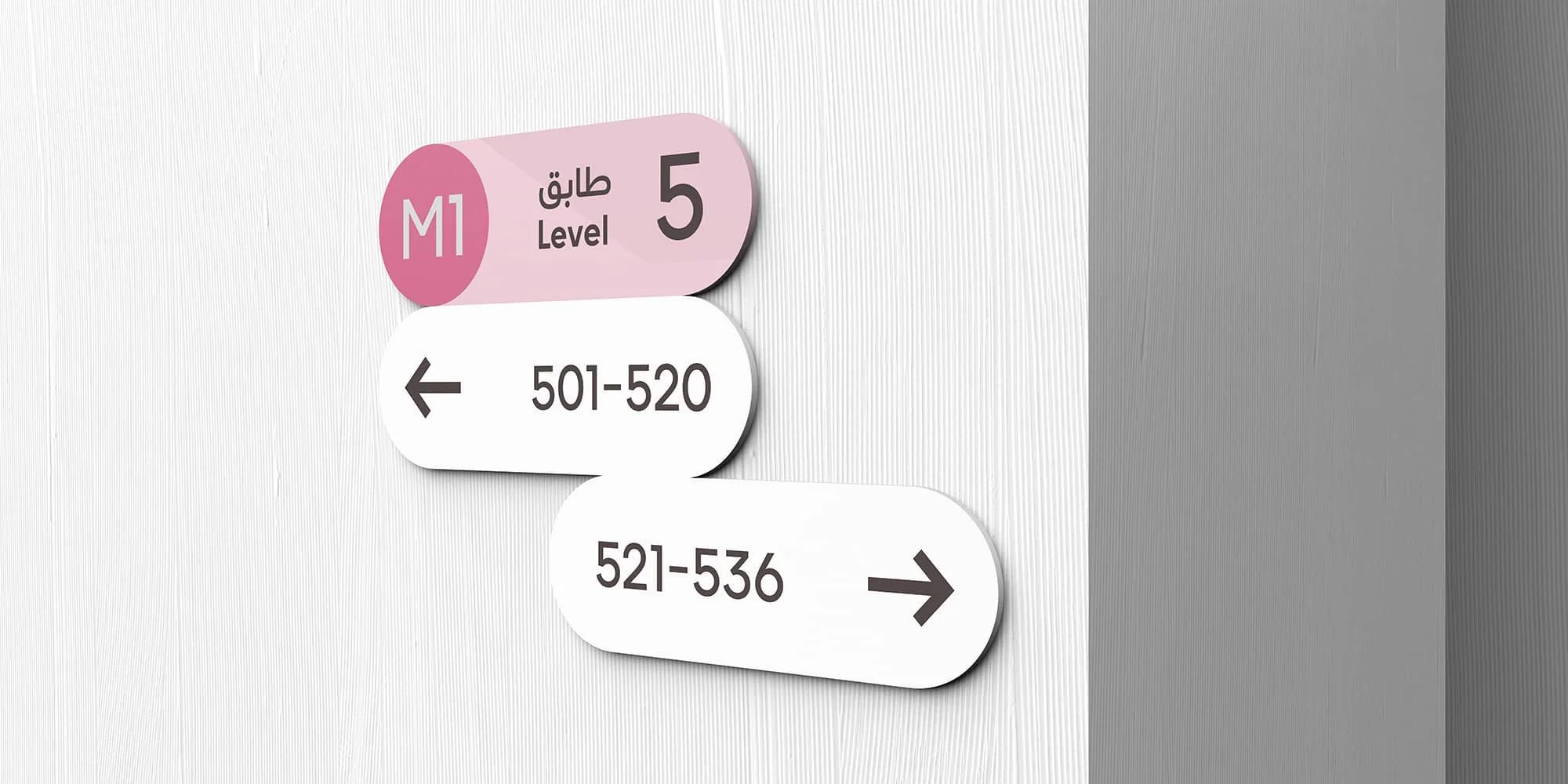
Inheriting what the client had deemed a failed project due to two previous consultants falling below expectation — we rebuilt the zoning, nomenclature and visual language across a 12-building campus, replacing dull-campus signage with a system rooted in fun, imagination and play.
Expertise: Wayfinding Strategy, Signage Design + Implementation
Sectors: Residential, Mixed-Use
Location: Aljada, Sharjah, United Arab Emirates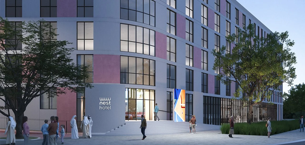
Objective
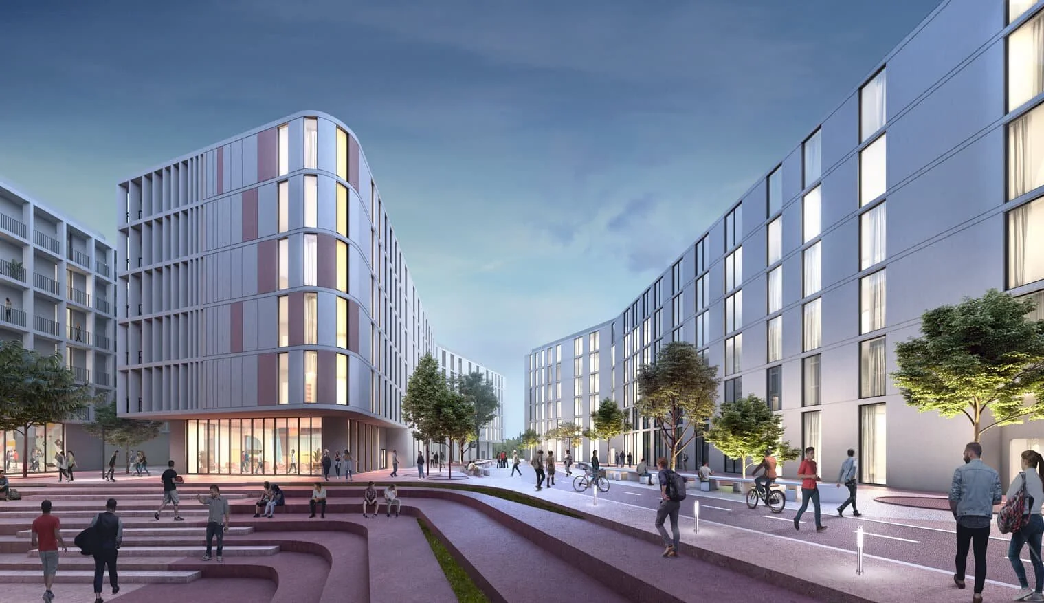
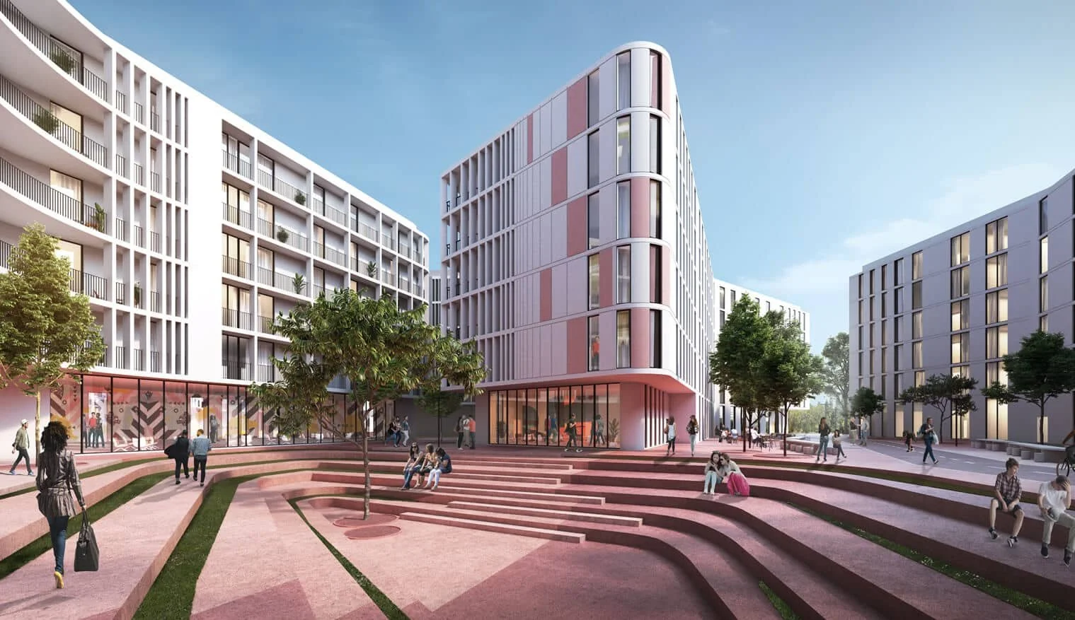
The Nest is the Middle East's premier student accommodation complex, located within Arada's groundbreaking Aljada community in Sharjah. Comprising 12 buildings shaped to provide shade and channel summer wind movement, the complex includes internal courtyards and shared spaces that serve as gathering points for residents. Beyond an exceptional residential amenity programme — lush green spaces, central dining hall, library, swimming pools, gyms and sports facilities — residents also benefit from access to the wider Aljada community.
When Creative Dialog was approached to undertake this landmark project, the brief was clear: the client had deemed the project failed under two previous consultants whose wayfinding work had not lived up to expectation. The task was to start over — assess the site, audit the failed work, and rebuild a system that genuinely supported the intended visitor experience.
Our Approach
Creative Dialog approached the brief as a complete reset — recognising that incremental fixes would not address the structural failures of the inherited work. The goal was a wayfinding system that did three things at once: provided clear gender-based navigation across the coed campus, simplified zoning and nomenclature, and elevated the overall look and feel from utilitarian campus signage to something closer to hospitality while delivering on our premise of creating places where people feel they belong.
_We undertook a site-wide wayfinding audit and a detailed analysis of the existing work, surfacing the gaps and structural failings that had compromised the previous attempts.
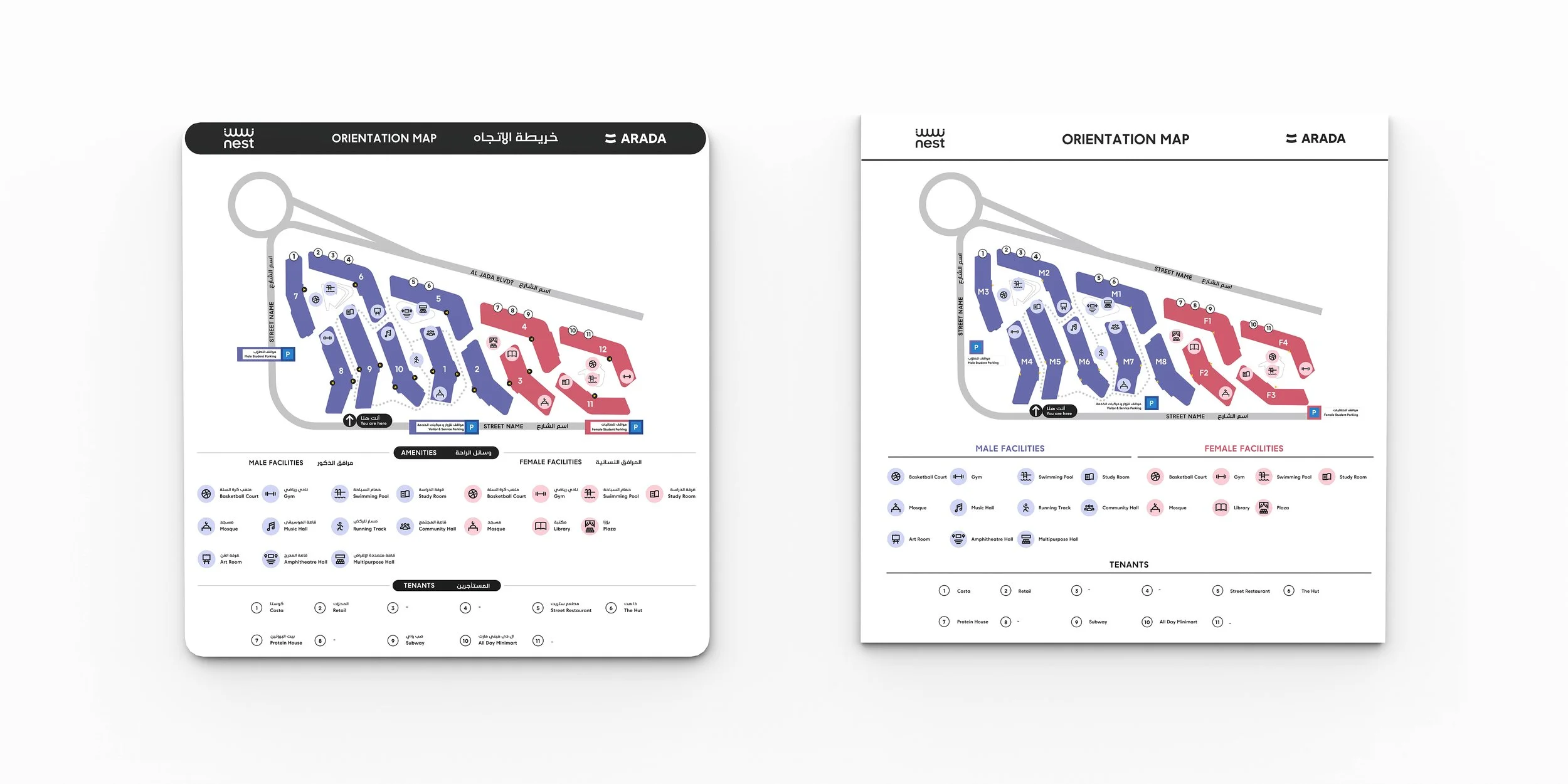
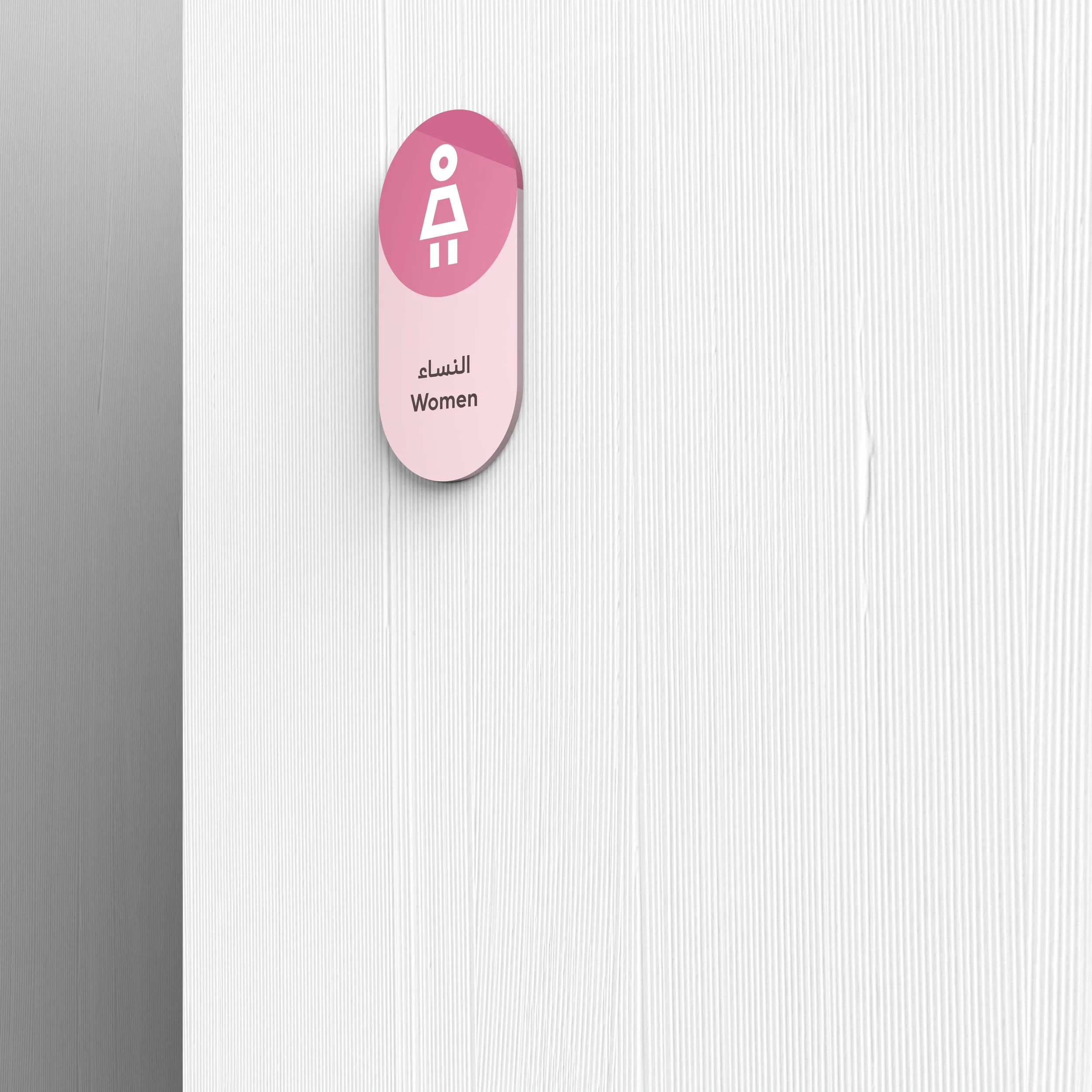
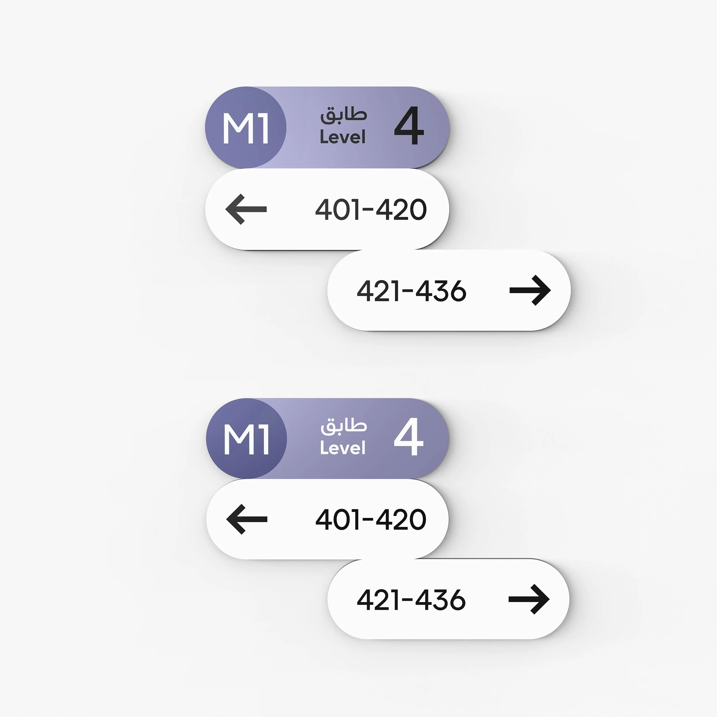
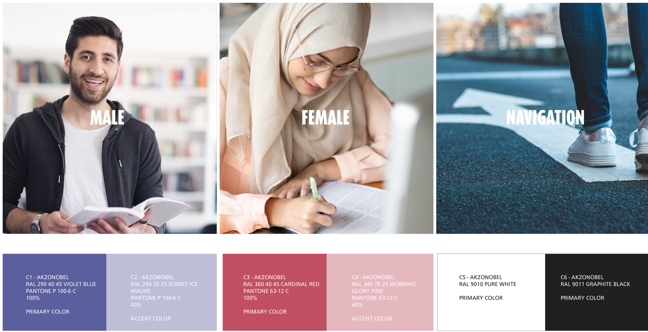
_We redefined the navigation and zoning across the campus, rebuilding the system to provide very clear gender-based navigation and information across the coed living spaces, with a logic that makes the campus infinitely more legible for all visitors.
_We rewrote the nomenclature across the site to be far more intuitive, eliminating the legacy confusion before designing a single piece of signage.
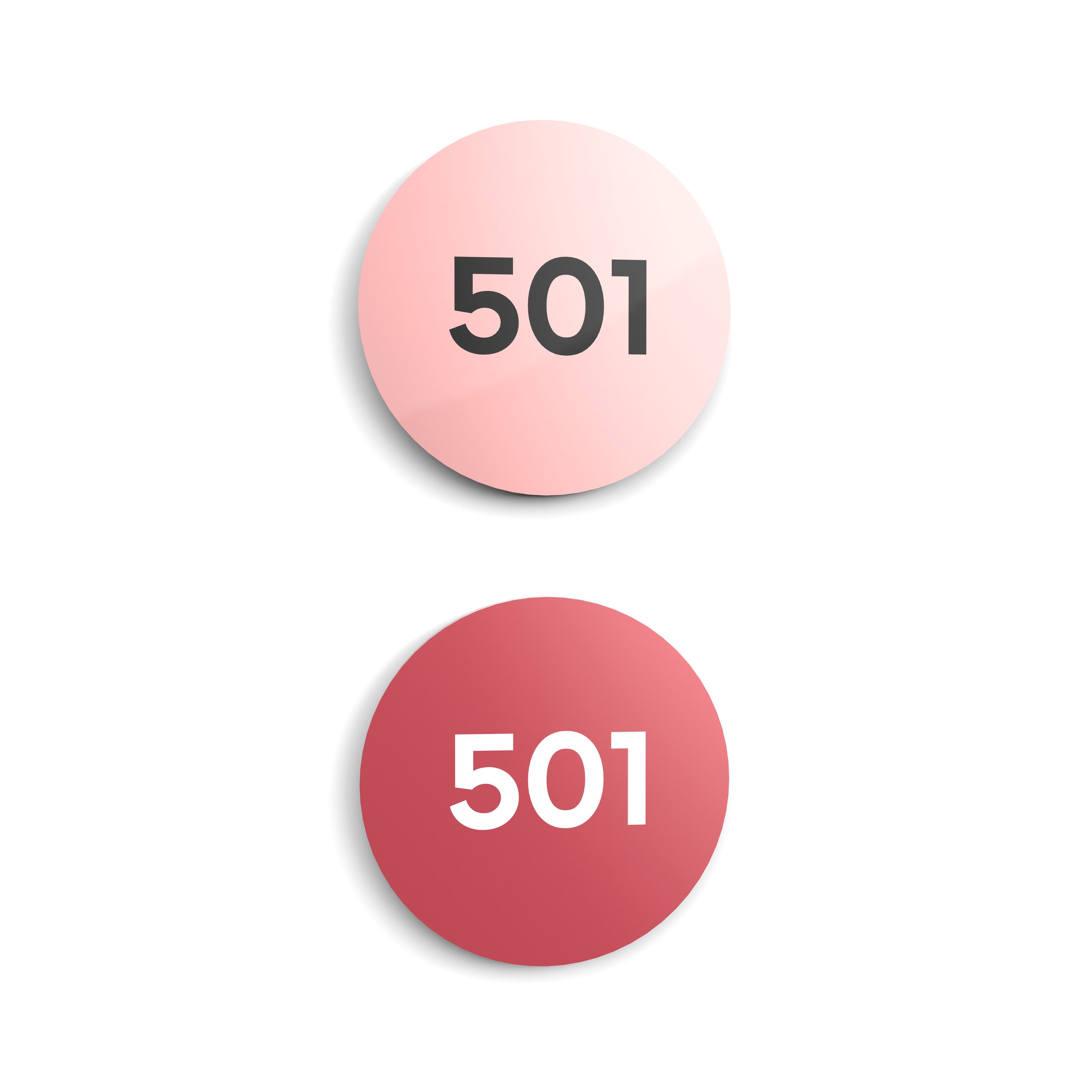
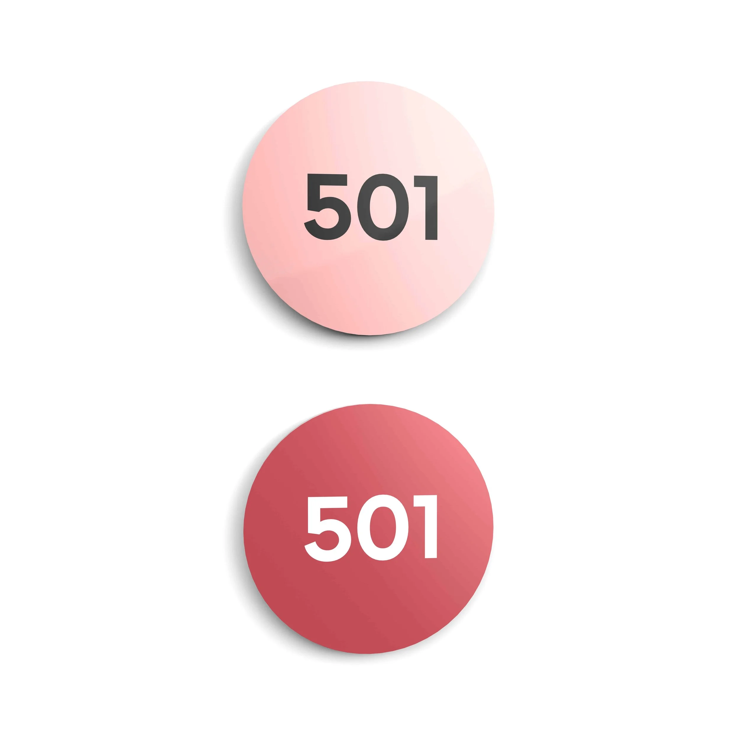
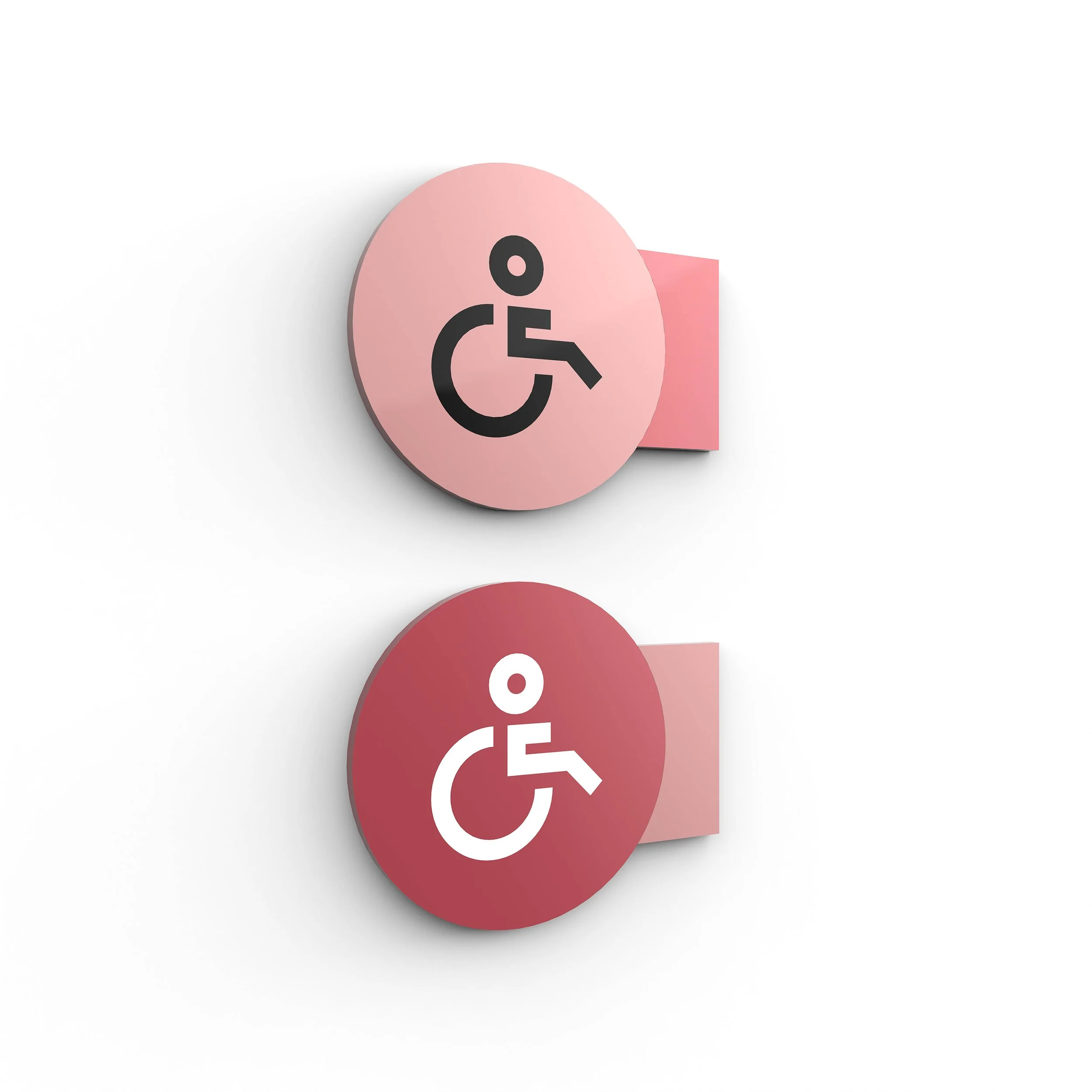
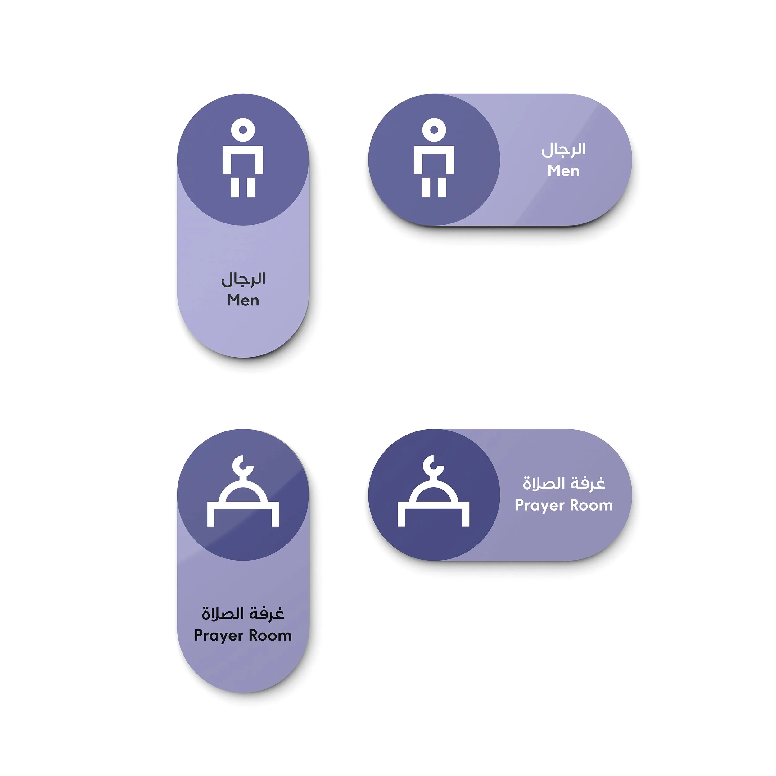
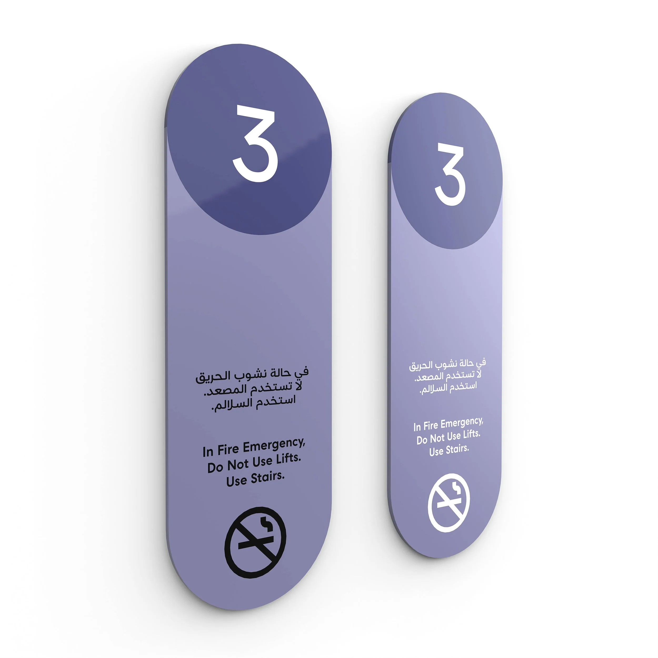
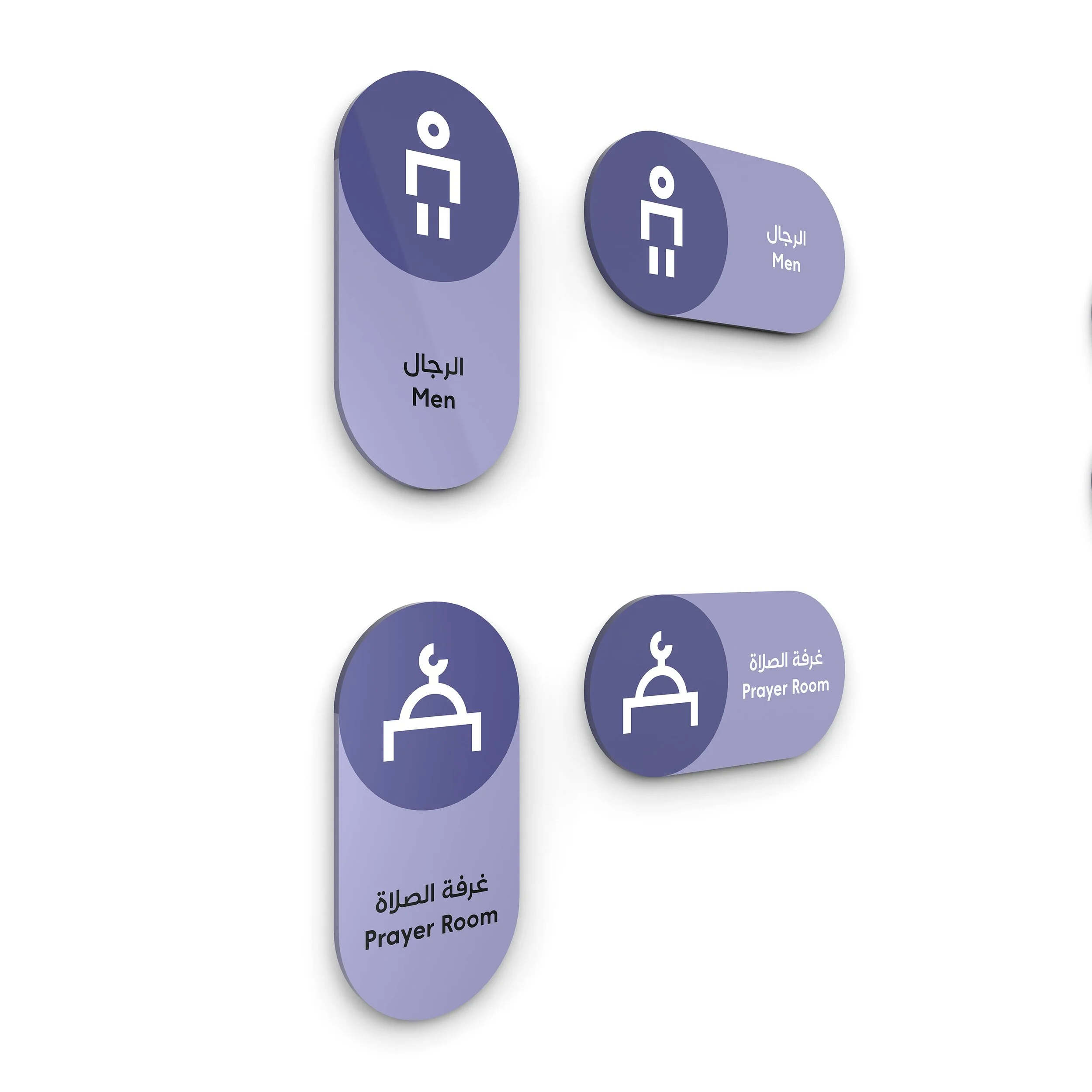
_We delivered a radical departure from the existing uninspired design — built around the notion of fun, imagination and play, anchored by two core gender-based colours.
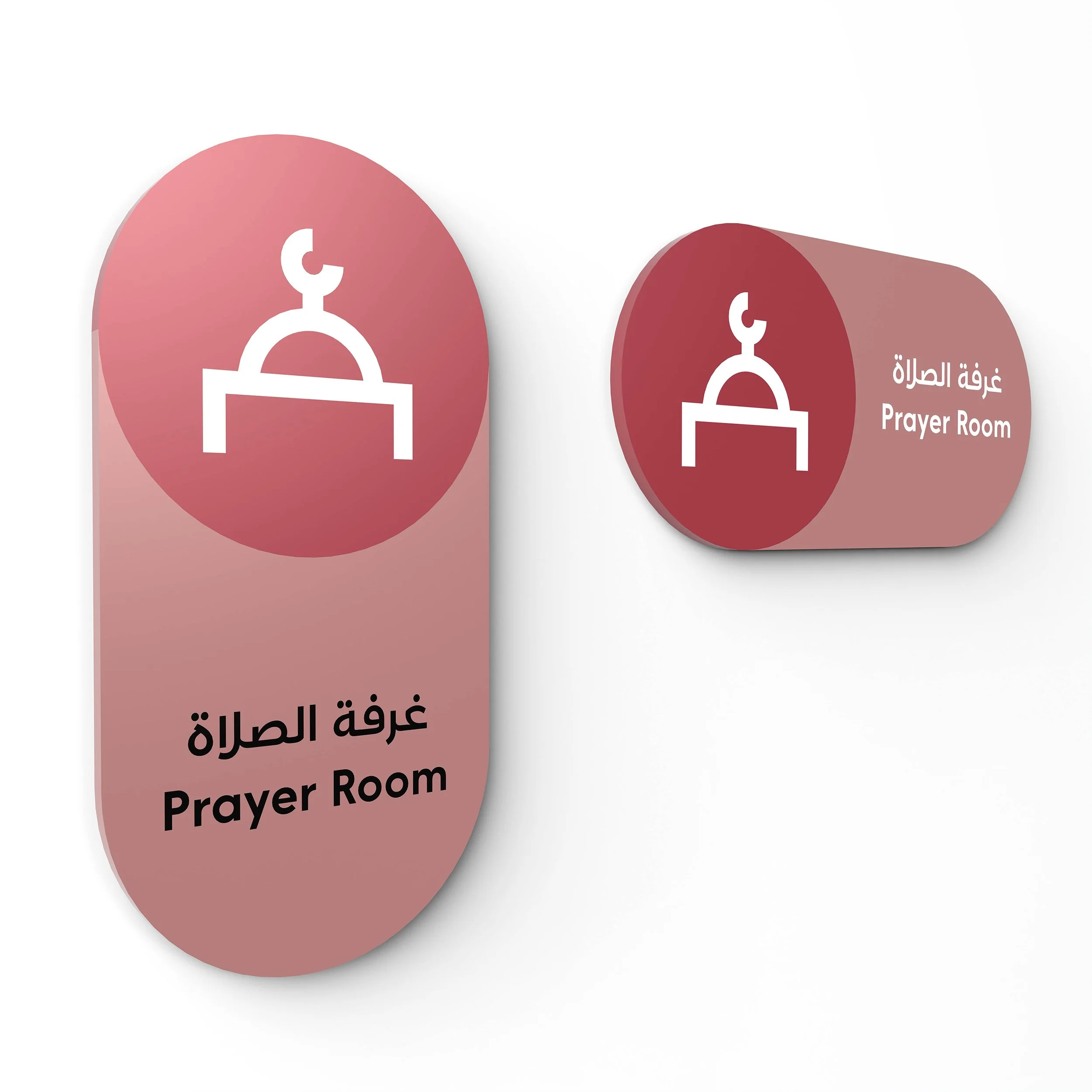
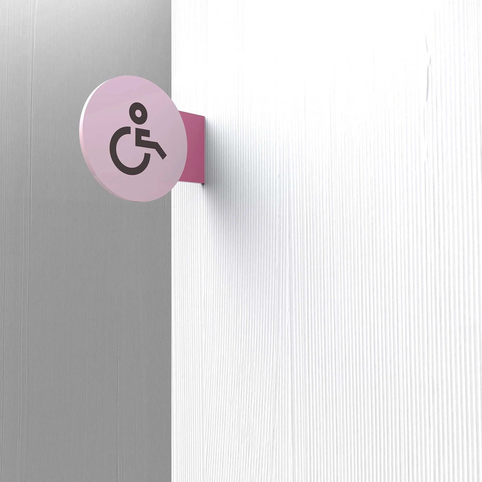
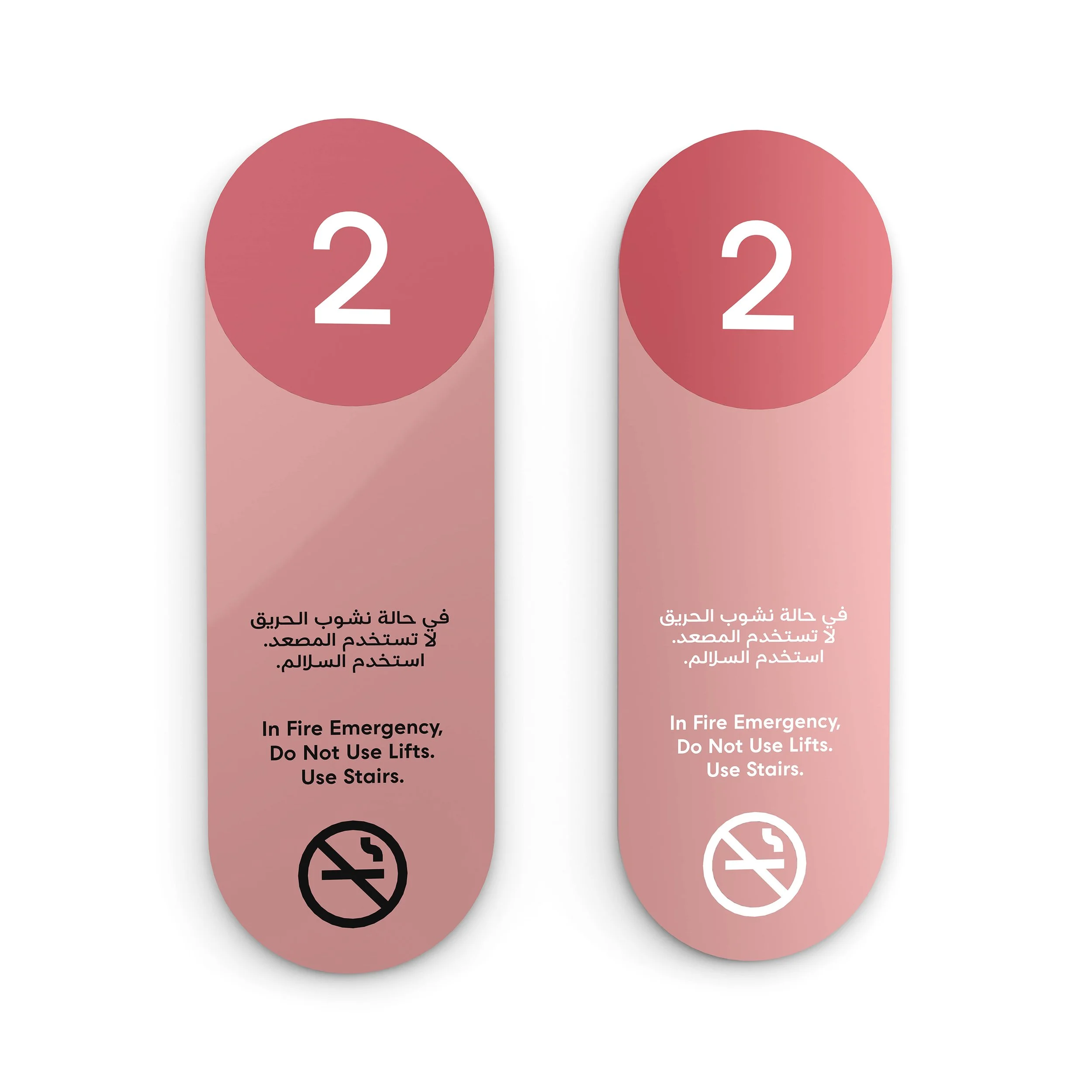
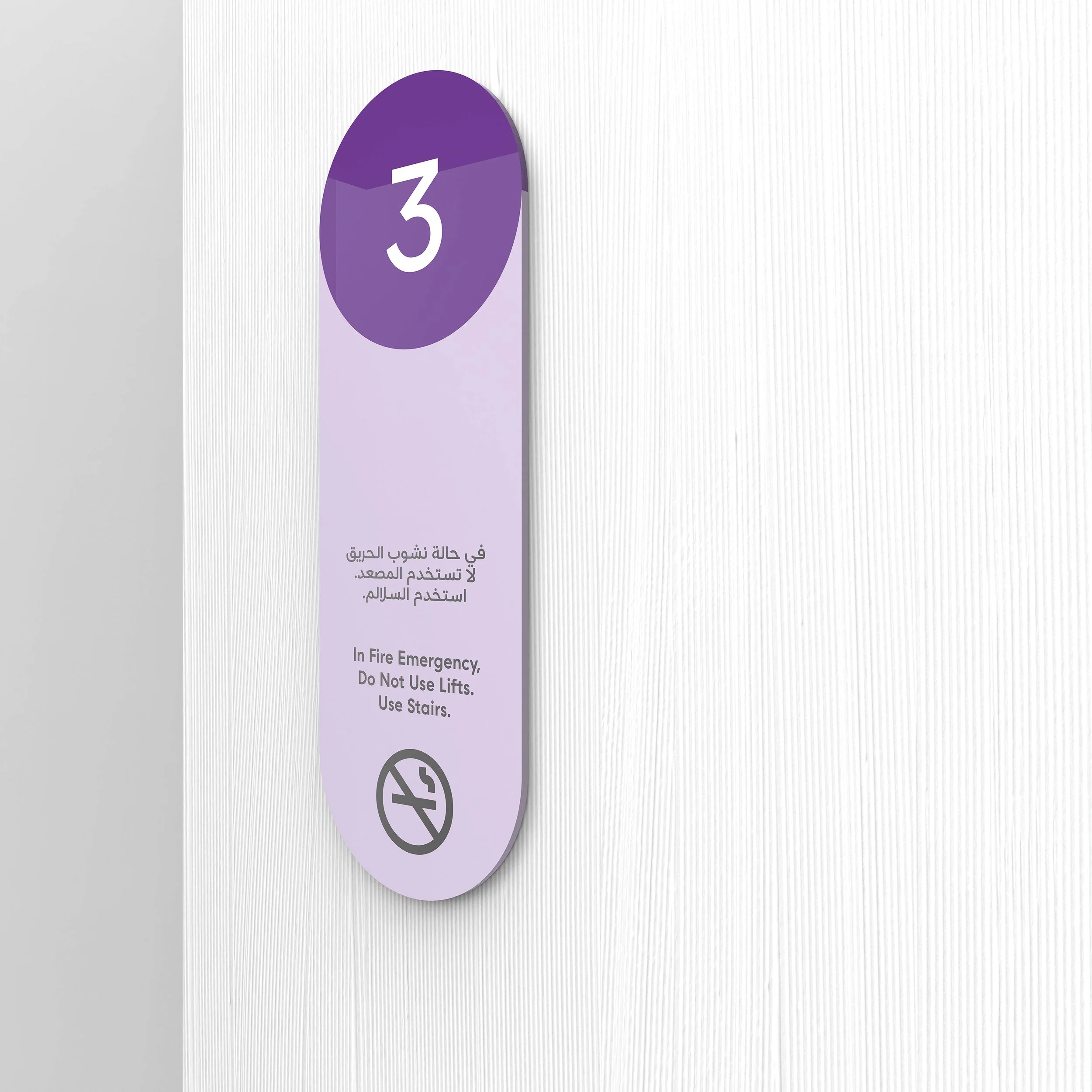
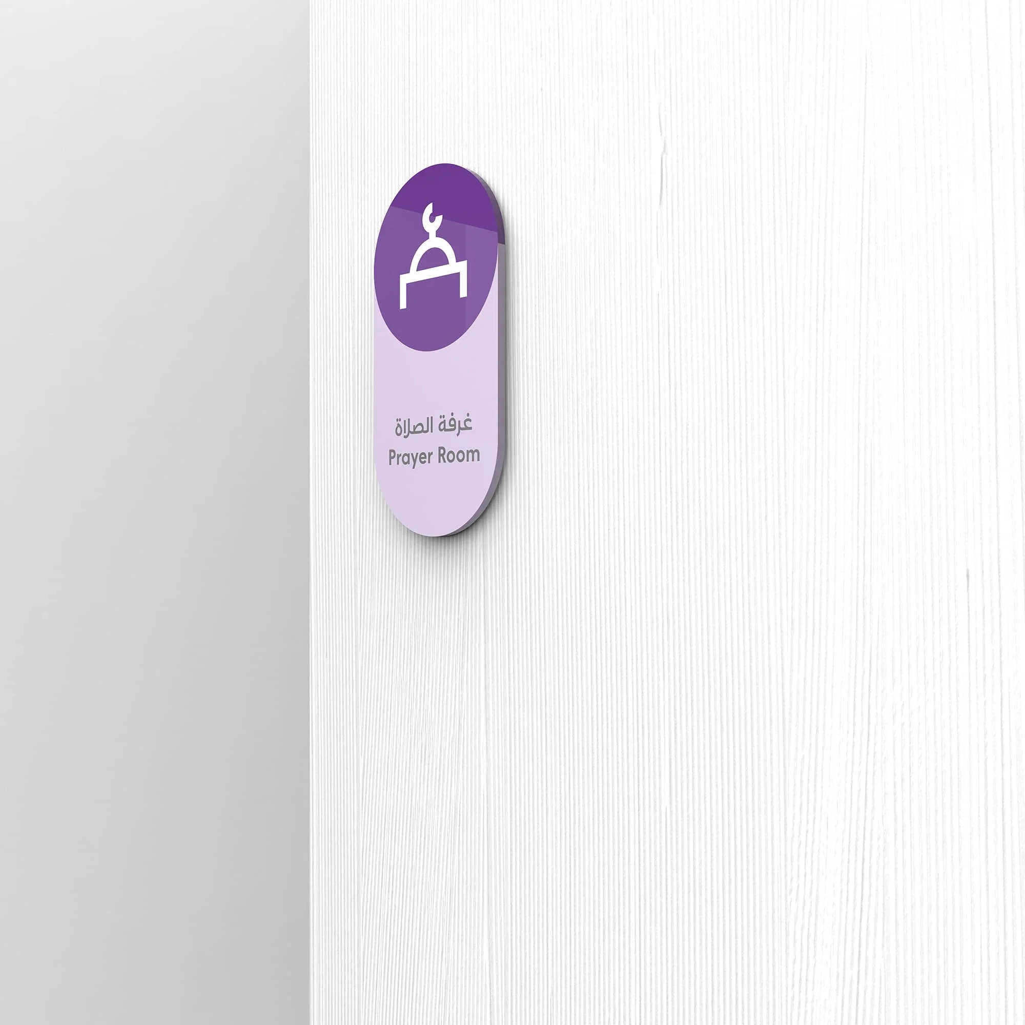
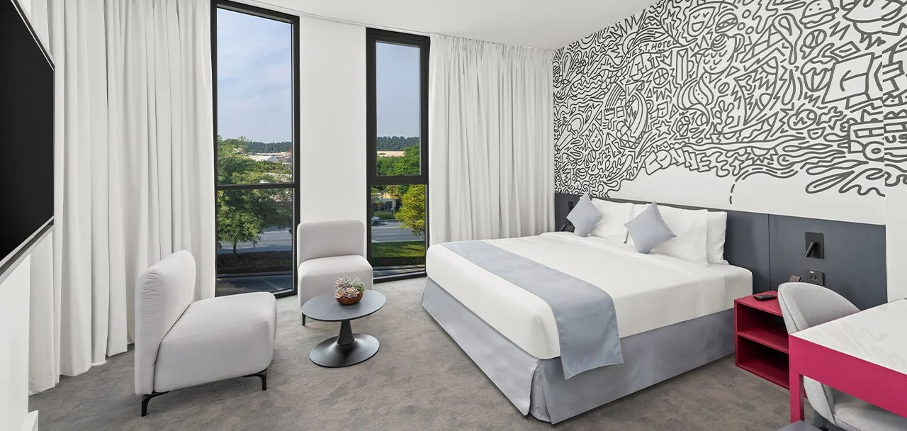
_We designed a custom set of pictograms and unique, engaging graphic applications that complement the overall signage design, using simple rounded forms to soften the look and feel and complement the curvilinear architectural vernacular of the campus.
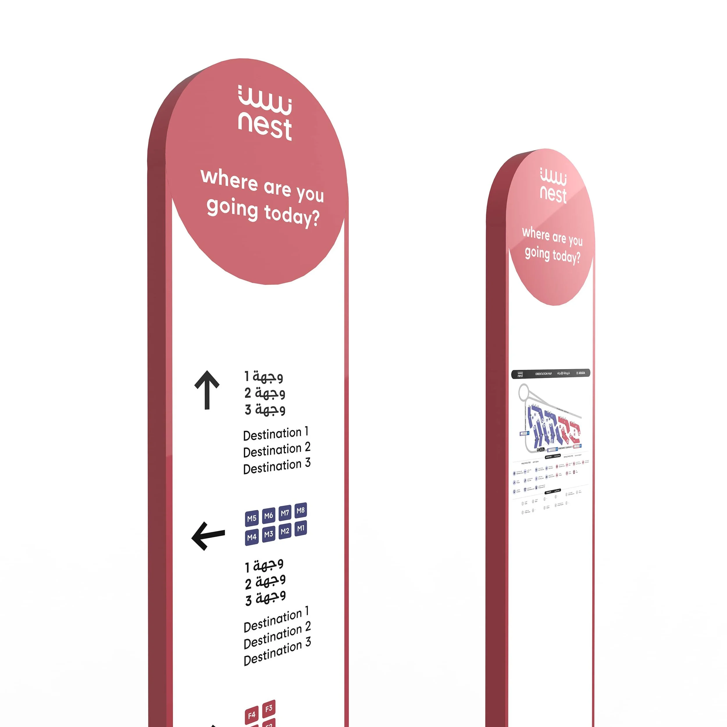
_We extended the system from exterior public realm wayfinding and bespoke mapping through to the interior navigation, delivering one consistent visual language across the full visitor and resident journey.
The Outcome
The completed wayfinding programme replaces a dull and dreary campus aesthetic with a navigational identity closer to hospitality than student housing — playful, clear, and unambiguously legible for residents and visitors alike. A radical departure from what was inherited, and a working proof of how much wayfinding can lift a destination when it is rebuilt rather than patched.
What We Delivered
Site-Wide Wayfinding Audit & Legacy Scheme Diagnostic
Zoning & Nomenclature Reset
Gender-Based Navigation Strategy
Bilingual Arabic-English Sign Family
Custom Map Design, Pictogram & Graphic Application Suite
Exterior Public Realm Wayfinding & Mapping
Interior Wayfinding & Area Identification System
Technical Documentation & Implementation Support