
Abu Dhabi Equestrian Club Destination Branding
Abu Dhabi Equestrian Club.
Refreshing the city’s oldest and most important equine destination.
Creative Dialog repositioned one of the UAE's most storied equestrian institutions for a new era of cultural ambition.
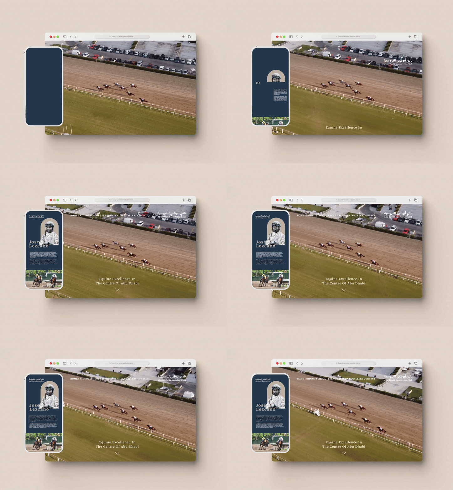
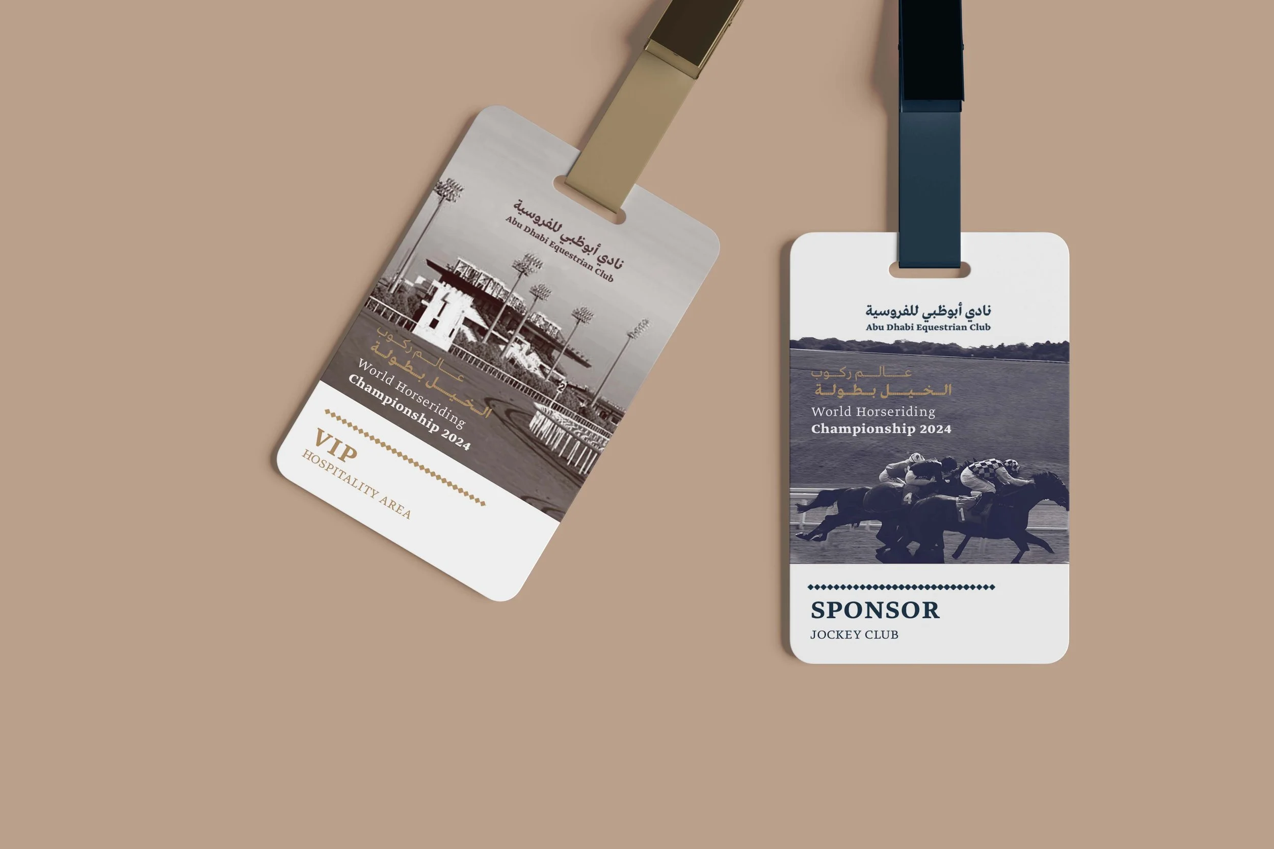
By unearthing the heritage at the heart of the destination and translating it into a restrained, regal visual language, the team built a brand identity that signals world-class standing without losing the warmth of place.
Expertise: Brand Strategy, Naming & Positioning + Creative
Sectors: Hospitality, Tourism, Sports
Location: Abu Dhabi, United Arab Emirates
Objective
With its strong historical and cultural legacy, the Abu Dhabi Equestrian Club is woven into the city's fabric. Under the auspices of the President of the UAE, H.H. Sheikh Mohamed bin Zayed Al Nahyan, this storied destination is currently undergoing a major facelift — the ambition being to develop a world-renowned equestrian centre of excellence in the heart of the capital.
Creative Dialog was directly appointed to develop an all-new brand to enhance the destination's positioning and replace what had become a dated and stale visual identity. The brief was clear in its commercial purpose and demanding in its cultural weight: produce a brand that signals international standing while remaining unmistakably Emirati.
Our Approach
Creative Dialog approached the brief as both a brand recalibration and a cultural recovery — surfacing what made the destination distinctive and giving it the visual language it deserved. The goal was to deliver an identity that signalled international standing without losing the specificity of place.
_We undertook a deep historical and cultural dive into the club's role in Emirati equestrian life, drawing on archives, stakeholder interviews and a survey of the wider regional racing scene.
_We mapped audience hierarchies in detail — members, the racing community, dignitaries and international visitors as distinct cohorts, each requiring their own brand register.
_We benchmarked the category across regional and international equestrian institutions to establish where ADEC could credibly stand, and framed competitor positioning to identify the white space the new brand could occupy.
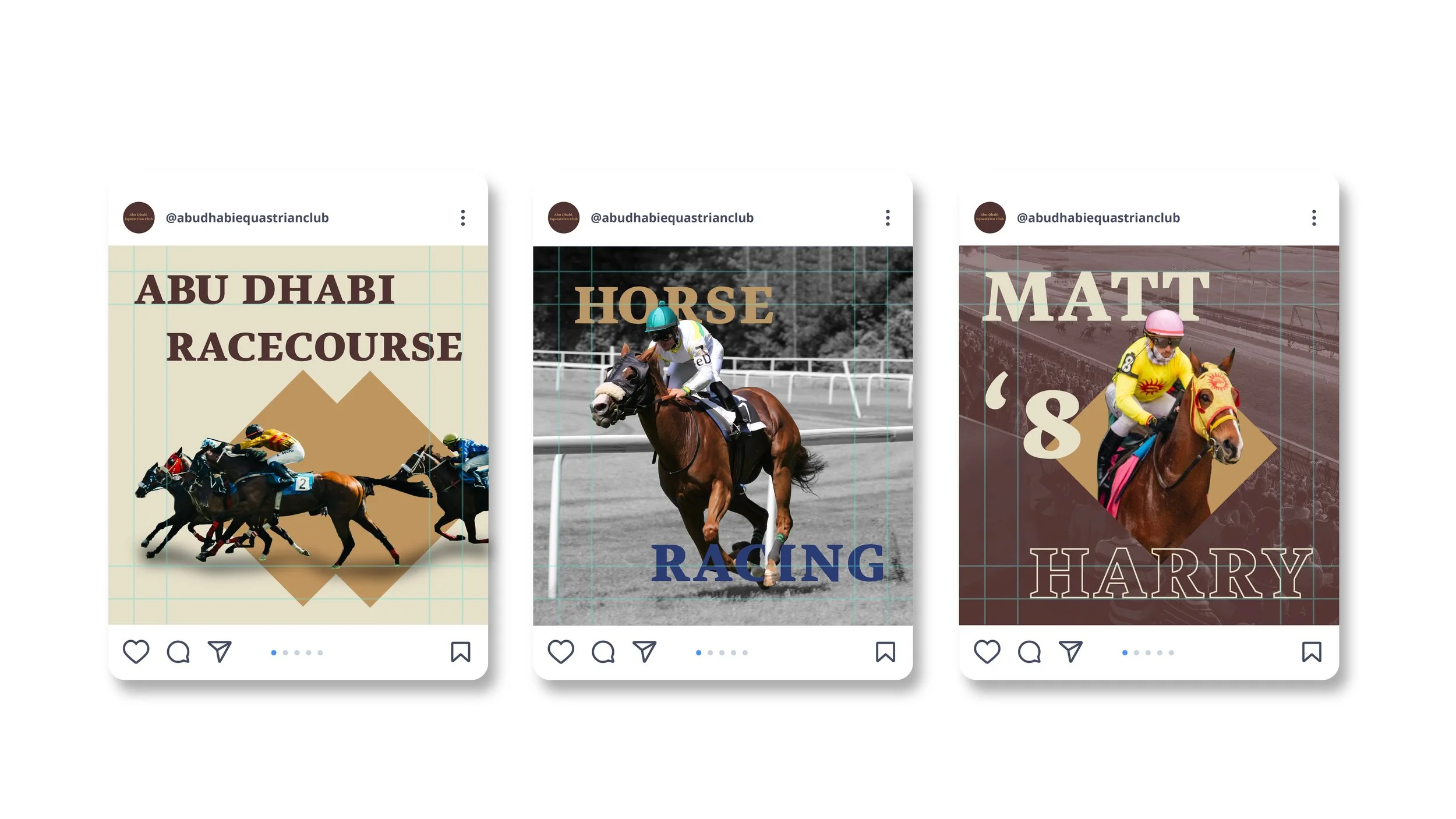
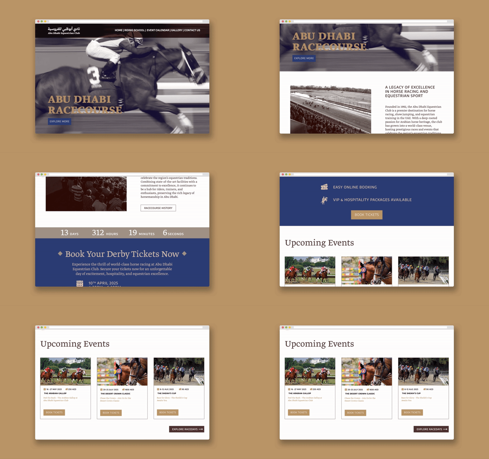
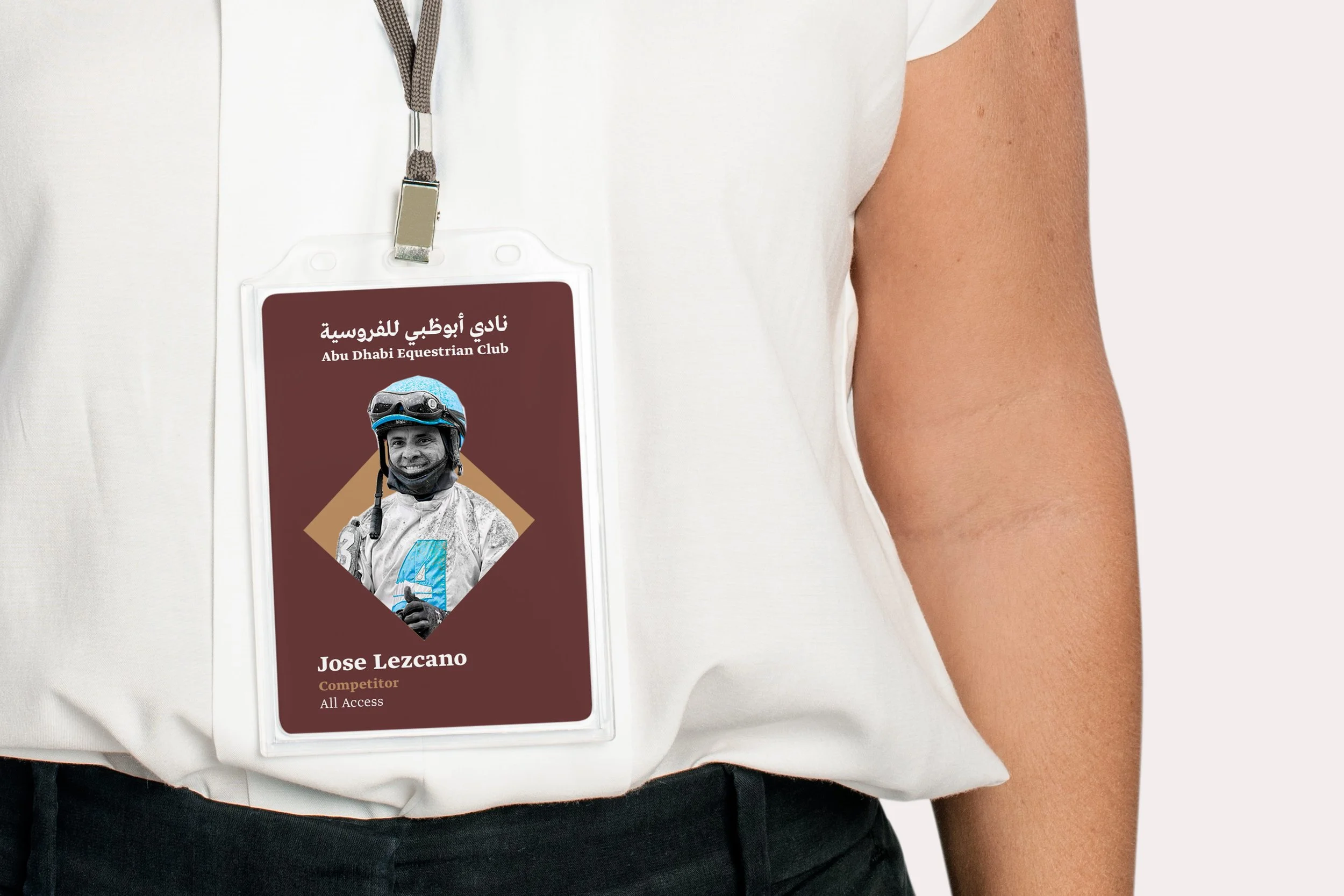
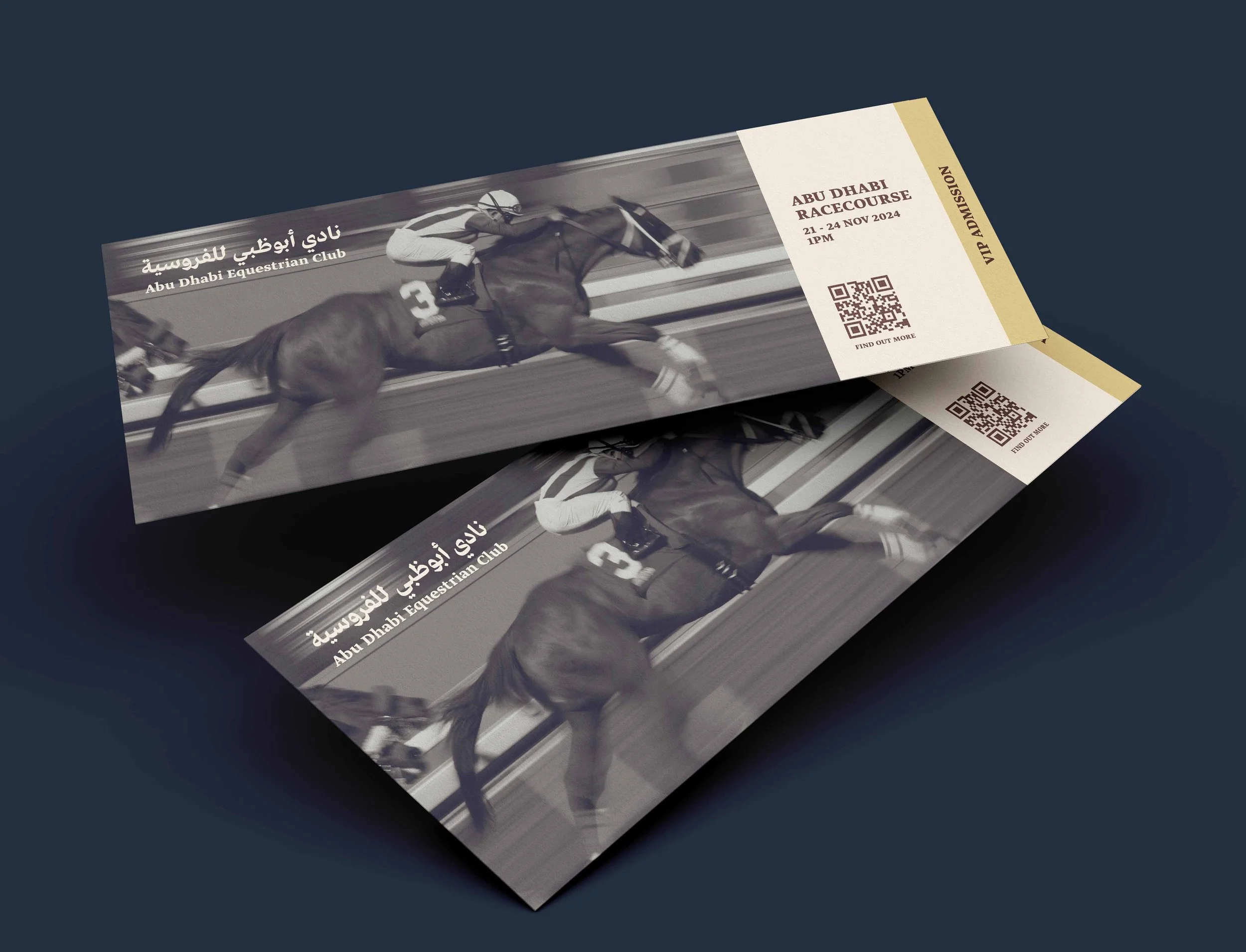
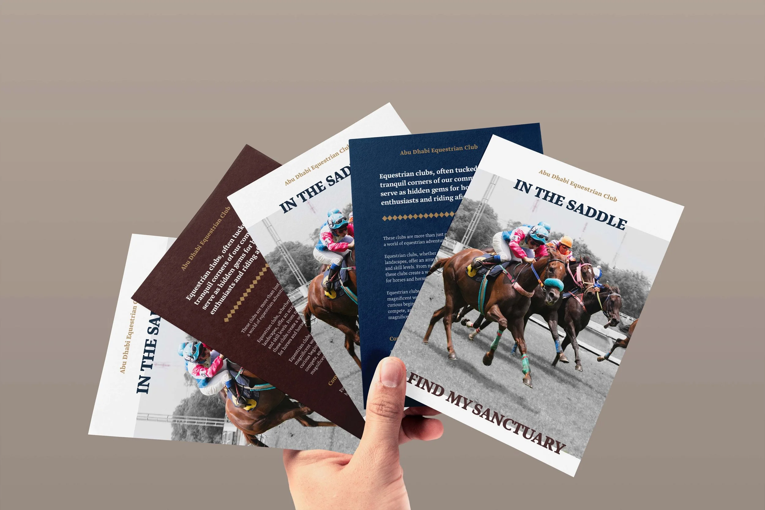
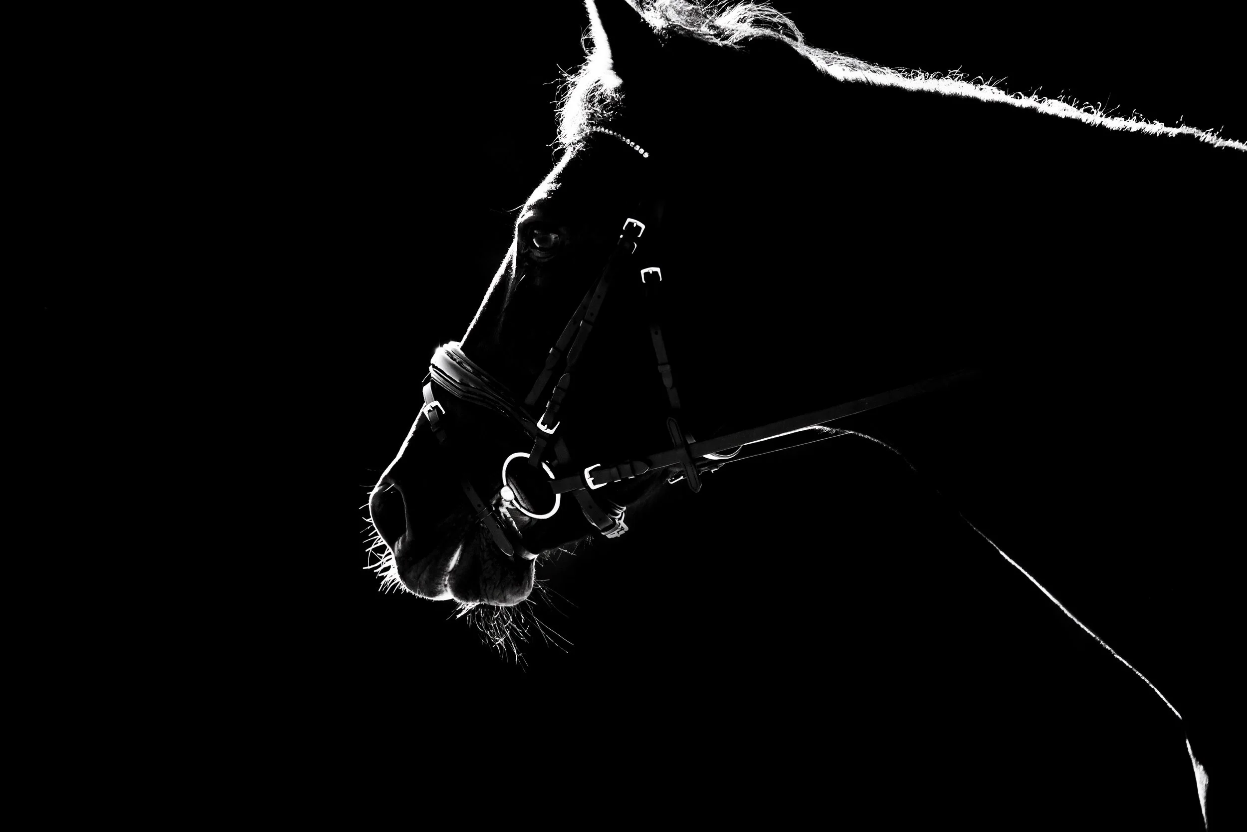
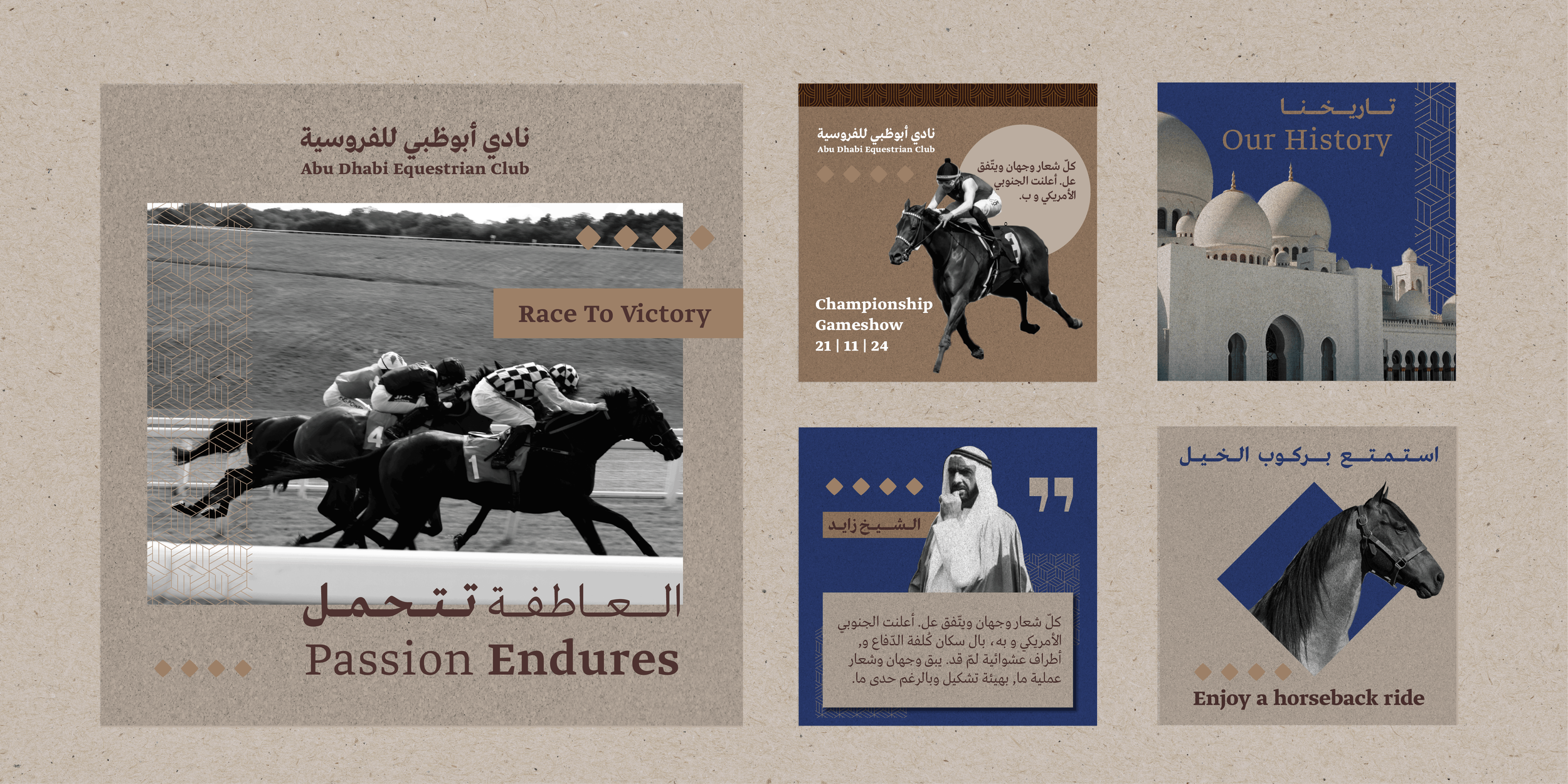
_We explored creative directions widely — from illustrative sub-brands and motif-led identities through to a far more restrained monochromatic look and feel, interspersed with punches of full-colour photography placing the stars of the club and the racing scene at the centre.
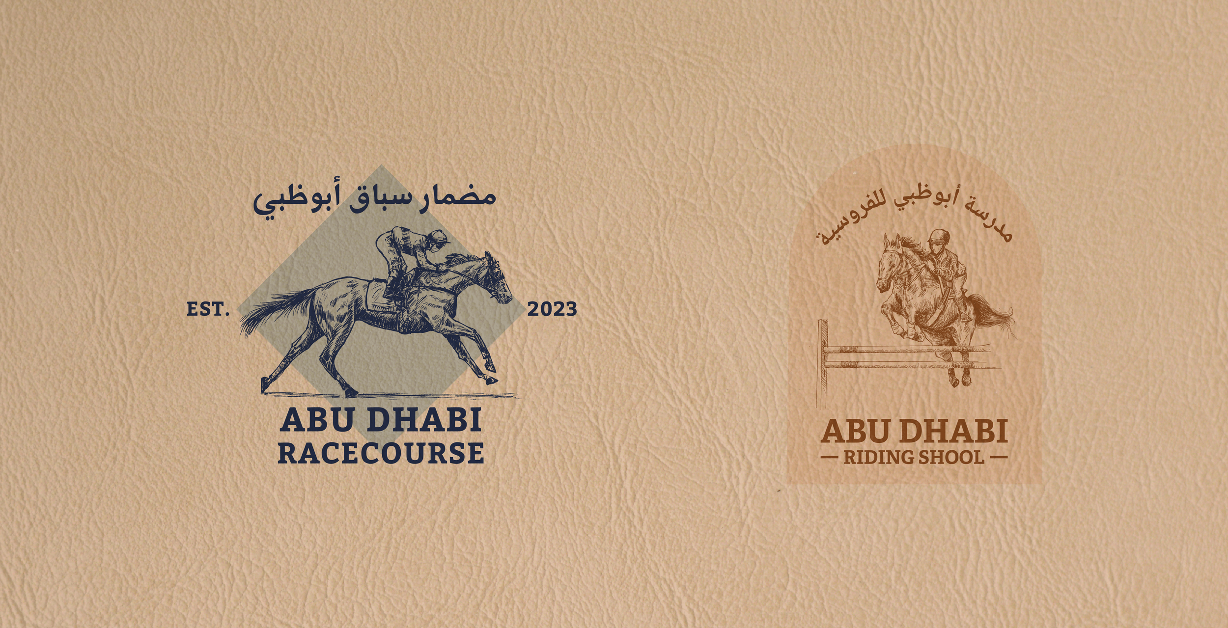
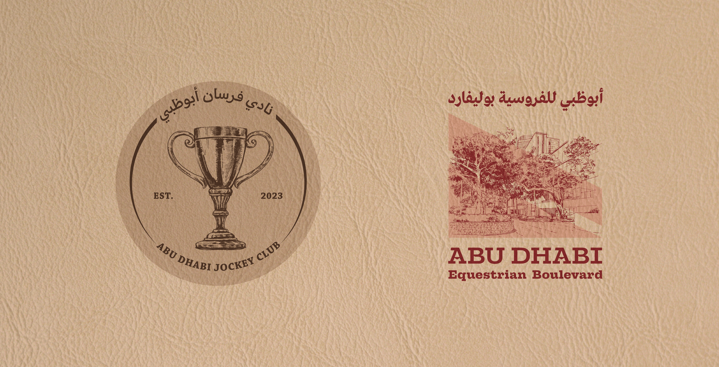
_We developed a complete identity system, sub-brand architecture and brand application toolkit ready for rollout across every visitor and stakeholder touchpoint.
The Outcome
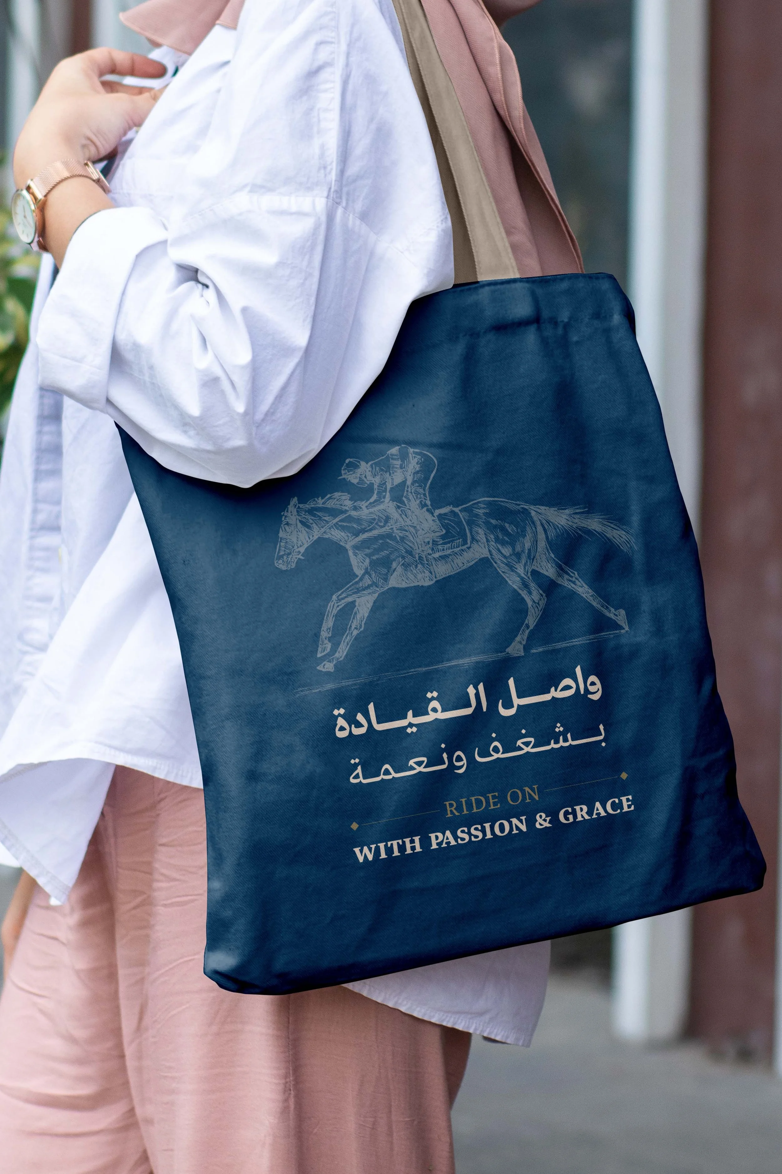
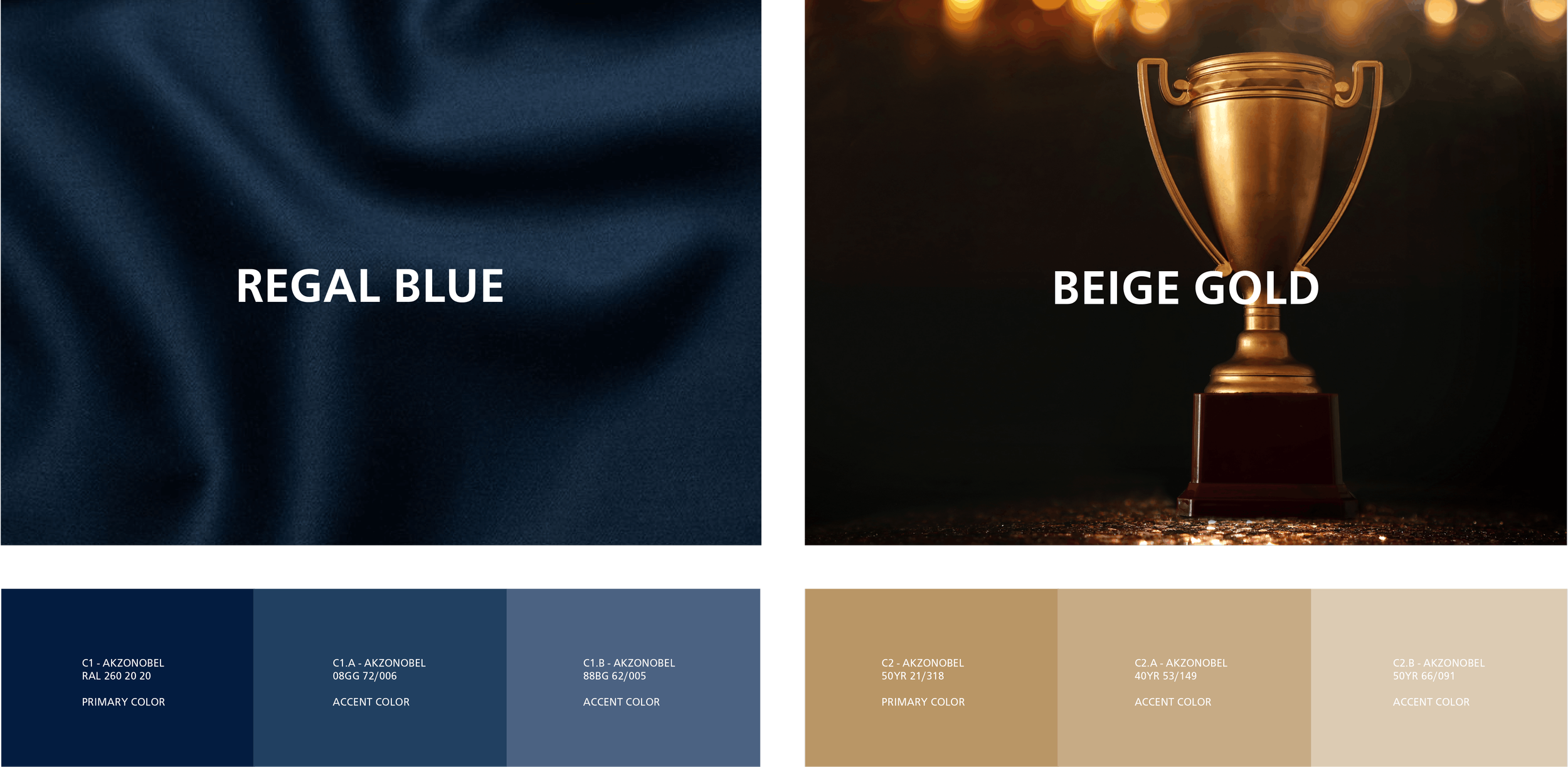
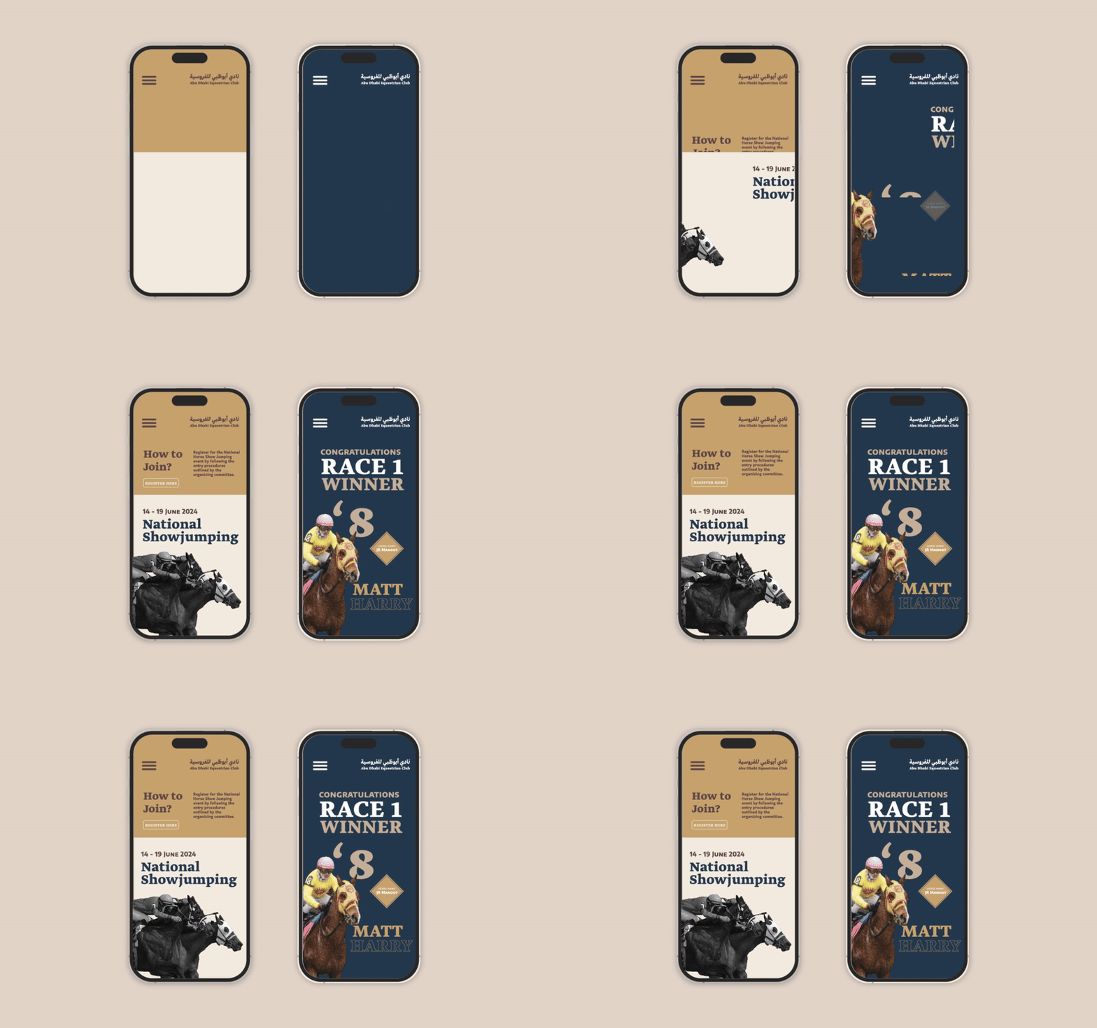
The resulting identity adopts a regal yet unexpected muted colour palette. The intent is precise: unlock the brand story, express the cultural and historical significance of the destination, and create a suite of aspirational visual communication tools that capture the essence of the club in an elevated, memorable way — setting ADEC apart from anything else in the category.
What We Delivered
Brand Strategy & Positioning
Naming Architecture & Sub-Brand System
Logo, Wordmark & Identity Suite
Colour, Typography & Photographic Direction
Print, Digital & Environmental Brand Applications
Brand Guidelines & Implementation Toolkit