WEST WALK DOHA QATAR CREATING DOHA'S NEXT PLACE TO BE.
When Energy City Qatar approached us to collaborate on their flagship destination, we suspected that it may be an excellent opportunity to roll all of our creative and strategic output into a holistic approach that covered every facet of the project from a visitor journey perspective. Upon further evaluation, our hunch was correct and we were able to embark on a two year partnership to bring this destination to life.
Our approach to developing the brand identity for West Walk began with undertaking a city wide and regional competitive analysis to firmly establish where this new destination sits within the competitive landscape. Visually, the identity plays off the varied placemaking elements across the site and adopts a clean and modern typeface that is underpinned by an eclectic color palette and graphic language that signals a break from the norm.
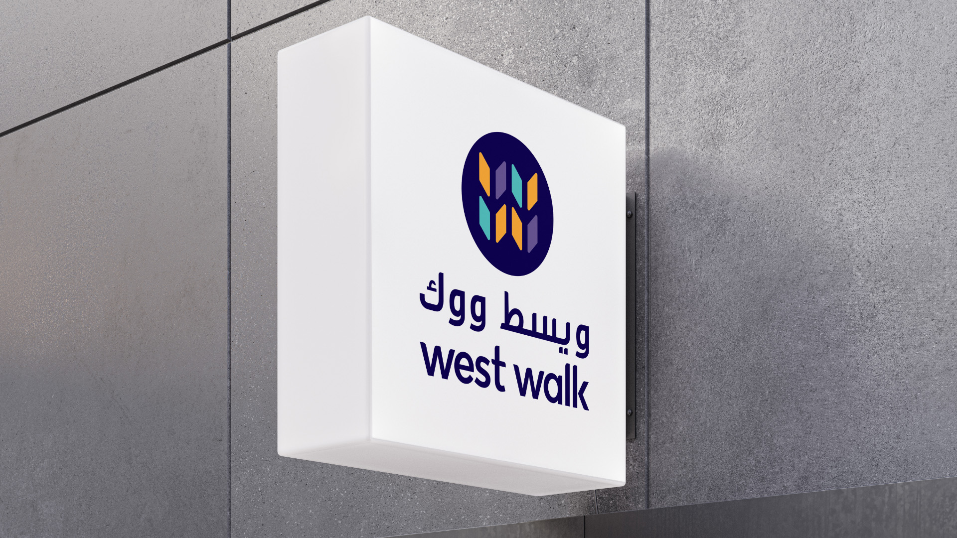
The first noticeable element of difference is the use of all lowercase type for the word mark. This clearly emphasises a break with tradition and the resulting identity presents as quirky and approachable, while remaining upbeat and sophisticated. Next up is a unique reinterpretation of the Qatari Ghitra that forms the graphic pattern seen across the brand implementation as well as being used as the basis for the wordmark. Further breaking with the use of expected local colors, the adoption of deep purple and the accompanying teal and tangerine segments that make up the graphic device of a stylised W all hint that this is retail destination with a difference. The final identity was then developed and showcased across a range of visitor touch points that included, website and social media usages, magazine and associated marketing materials as well as signage, accessories and related merchandise.
STYLISTICALLY, THE IDENTITY IS QUIRKY AND APPROACHABLE, WHILE REMAINING UPBEAT AND SOPHISTICATED AND IS BASED AROUND
A UNIQUE REINTERPRETATION OF THE QATARI GHITRA THAT FORMS THE GRAPHIC PATTERN SEEN ACROSS THE BRAND IMPLEMENTATION AS WELL AS BEING USED AS THE BASIS FOR THE WORDMARK.